Park / Aetatum Auream
-
 11-July 17
- Views 3,519
- Downloads 792
- Fans 0
- Comments 9
-

-
 55.63%(required: 50%)
 Bronze

Jaguar 65% CoasterCreator9 60% SSSammy 60% bigshootergill 55% Coasterbill 55% Faas 55% G Force 55% Liampie 55% Cocoa 50% trav 50% 55.63% -
 Description
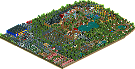
My very first big park here on NE! Situated on the edge of a town, Aetatum Auream is a small park based on the Dutch history on the water. That's why it has even three water rides. It's built in 3 months, which is very fast. I'm really looking forward to your reactions, enjoy!
-
 No fans of this park
-
 Full-Size Map
-
 Download Park
792
-
 Objects
459
-
 Tags
Tags

I love the context you created and the unique rides. That IKEA store is epic.
I still think that foliage is your weak point though.
I voted this 80%, hope it will be gold.
Can't wait to see your next projects.
First of all, congrats on finishing this project. The screenshots showed us a nice project with some great archy, which I think is the real ticket seller here. Eventhough I do think that some buildings were a little too square, the facades were truly magnificent.
The thing that bothered me here though was the layout of the B&M (Or Intamin?) standup. It has only 1 inversion, and a ton of airtime hills. I've never ridden a standup, but after doing some (rather) quick research on the interwebs, I found out that most standups have more than 1 inversion, and not only airtime hills. The section after the midcourse-brakerun is a little too long in my humble opinion, as it contains only airtime hills and some turns. But the supportwork was great and the fences added a nice touch of realism. I wouldn't be spending my days in that appartment near the coaster's only inversion, if that were real, though. I would've brought some spare eardrums or some earplugs in order to save my fragile abiltiy to hear.
The accomodations next to the park (such as the camping, which was just amazing) were brilliant. They only needed something more than 4 lampposts to liven up the area a bit.
I loved the village and the stores. The village reminded me a lot of a typical Dutch suburb, maybe even an English one. It contained a lot of great details.
For me, it's a 75%. I too hope it will be gold. Best of luck with your next projects, and let's hope this is the start of something great.
Thanks a lot! The placement of the accomodations is bad indeed, but I mentioned that when I already built too much of it lol. Thanks for the 75 and 80%. That's really high!
well this looks impressive.
Quality wasn't bad though. 55% for me.
interesting park. I think you really nailed the park surroundings, with small details and interior views. solid if slightly overdone these days surroundings. the camping spots and pool were also really good. the actual park, on the other hand, felt a bit more confusing. the layout was funky and small, and it felt a bit 'themeless' and confused. I wasn't really sure what anything was supposed to be and maybe the object choices were a bit confused. I wanted to enjoy it more but couldn't really get into it so much
If I were rating this on just the outsides of the park, this is probably 60% - 65% quality work. If I rate it on just the insides of the park, it's probably 45% - 50%.
The outsides were nice. The Ikea was cool, the little campsite was cool and the roads were well done.
The park wasn't great unfortunately. It was an L shape, which I'm really not a fan of from the start. Maybe it's more of a mainland Europe thing, but I really haven't seen many parks that are basically just a big dead end like that.
And I feel like that lack of planning hurt the park across the board. I'm really not sure what was going on with the B&M at the back of the park but I wasn't a fan. The architecture in the park was very one dimensional and wasn't very interesting to look at, and the ride selection was very uninspiring.
In fact, it feels like you just wanted to create a town and the external of a park, and then kinda just ran out of inspiration when it came to the actual park.
You've shown that you can build some quality work, and I think you can make a big step up from this in your next work.
Thanks for the comments, I agree with most of the points. The park is indeed worse than the surroundings, but it has nothing to do with planning. I even made a map out of land textures before building the park. I think that the cause is that I began with the park, improved a lot and then made the surroundings. Also, the surroundings were way easier to make. It needs more sturcture and cohesion for sure, I'll take that with me in my next parks.
to echo everyone else, the things i liked most about this park were all the nice touches around the outside of the park. there was a lot of charm out there where there wasnt so much inside. the big coaster wasn't too great but i did quite like the little one. the pirate ride was cute as well.
congrats on finishing the park, im interested to see what else you can surprise us with. keep up the great work