Park / Erlebnispark Haslach
-
 10-July 17
-
 Erlebnispark Haslach (Finished)
- Views 4,142
- Downloads 662
- Fans 1
- Comments 23
-

-
 63.75%(required: 60%)
 Silver

Kumba 70% alex 65% bigshootergill 65% Jaguar 65% Liampie 65% posix 65% trav 65% CoasterCreator9 60% G Force 60% SSSammy 60% 63.75% -
 Description
OpenRCT only
-
1 fan
 Fans of this park
-
 Full-Size Map
-
 Download Park
662
-
 Objects
1
-
 Tags
Tags
Congrats on the silver and your first solo accolade mate!
Really happy for you. I hope you find some more motivation to top this one, because I know you can do it if you stick with an idea long enough.
I´ll give you my thoughts on the park once I find the time for it.
__________________________________
Review Time!
Okay, I had a look at this, here is my opinion:
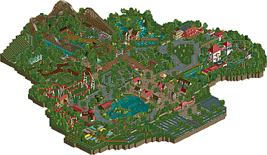
-Coasters: The Mack and the Woodie were great. Really liked the iSpeed Vibe I´ve got from the Mack launcher and I cant stop to feel like the woodie is inspired by Robin Hood in Walibi World. Either way, I really liked those two. the Spinning Coaster is a very tripsdrill addition to the park. Not a huge fan of the layout, but the intent is clear. the interaction with the lofglume was exactly what it was supposed to be (based on the Trippsdrill Theme you used).
-Architecture:
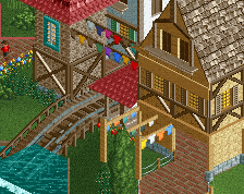
Sometimes a bit bare and blocky (eg. the entrance, the castle around the log flume drop and the restaurant) and in other parts really on point. The theme was executed very well overall. The station of the wooden coaster was a highlight for me.
-foliage.
Well, since I´m the last persojn who should critizise anybody about foliage, there´s not much feedback I can provide you with. The vineyard around the park looked very good and realistic though wich (in my mind) could be said for all of the foliage. But as I said, I´m not the one to judge.
Overall I really liked the park. Your best work yet and as I said, I hope you can do even better in the future. Not quite silver level for me, but a solid bronze. Never the less, congrats on the silver mate!
I loved this. It's easily your best work to date. The Mack (which has no launch track in the overview image BTW) was great, William Wallace had a great "Robin Hood" vibe and the park as a whole was a just a lovely piece of European style RCT.
The architecture was nice, the foliage was well polished and the atmosphere as a whole was superb.
Great work! I didn't get to vote on this but I would have probably given it a 65% so I think the score is fitting. Congrats on your first solo accolade!
I'm really sorry for the late review. Better late than never, I suppose.
Congrats on the silver. Silver is a very fine accolade if you ask me. Inselfieber by Jonny93 and MCI being my favourite park on NE got silver.
I think your park had more charme to it than many of the golds and spotlights that we have seen recently (Gröna Lund included)
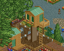
The entrance area was very cute. The architecture really helped to create a warm and inviting atmosphere. Some of the buildings looked a bit empty inside and could have used interiors. But that's a nitpick. I really liked the peepable jetty and the placement of the swinger.
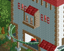
The log flume area was a treat. I really appreciate how the log flume interacts with the giant buildings. The bridge between the two buildings is a really sweet addition. My only complaint is the texture used on the (big) buildings. Never been a fan of it.
I think you did a succesful job on the Gasthaus and the river rapids station. Very solid architecture.
I really enjoyed the wooden coaster layout. It flowed well and framed the area beautifully. I also enjoyed the Mack. Thought it was a beautiful coaster. I loved how it went throught the windmill.
Die Weinfässer is probably my favourite ride in your park. Really like how you themed it.
All in all, I had great fun looking through the park. I think you did a very good job on it. I always thought you had great potential. This park confirms that you do. I hope to see more ambitous parks from you in the future.