Park / Erlebnispark Haslach
-
 10-July 17
-
 Erlebnispark Haslach (Finished)
- Views 4,142
- Downloads 663
- Fans 1
- Comments 23
-

-
 63.75%(required: 60%)
 Silver

Kumba 70% alex 65% bigshootergill 65% Jaguar 65% Liampie 65% posix 65% trav 65% CoasterCreator9 60% G Force 60% SSSammy 60% 63.75% -
 Description
OpenRCT only
-
1 fan
 Fans of this park
-
 Full-Size Map
-
 Download Park
663
-
 Objects
1
-
 Tags
Tags
Worst park on the site
Looking forward to checking this out V1
Oh wow, why didn't you tell anyone you'd submitted this V1?
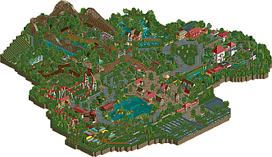
Sweet park. Unpretentious and built with heart. Super German, but in a good way. I like how you've consequently named everything in German, not trying to make this something it's not. Nice clean design everywhere too. Good macro layout overall, ie very easy to explore everything, good viewing flow. Good attention to smaller rides and aspects, but still good balance of what should be important and what should be secondary.
You've learned a lot. No idea where this rapid improvement came from. I'm very happy, even relieved, to finally know you have moved on. I was worried a few times you wouldn't make it.
Your main area of necessary improvement for me are your design skills. Everything you built is relatively easy. Nothing steps out or is very complicated or intriguing. That's the conceptual part. The more practical part of improving your design is the overall artistic look, the aesthetics. While nice, this all looks very safe and somewhat generic. I want to see you use bolder colours, shape with more sharp taste without just over-microing.
But enjoy the moment of having this out and voted on now.
Well done.
this is nice. the best parts for me were the little caravan park and the little stuff like that. your coasters need a lot of work. the woody was interesting but the others weren't that exciting.
i think everything felt a little too clean and i had trouble being immersed in it. i have to agree with everyone on the fact that this is a great improvement, and i only make the comments i make to see that you continue this great trajectory of improvement.
Very nice park. I agree, I would have worked a little more on ground textures to make some "empty" areas more immersive. (particularly the "sun bathing" area next to the log flume).
Speaking of the log flume, it's my favorite part of the park. I would have liked it better if you removed the spinning coaster though.
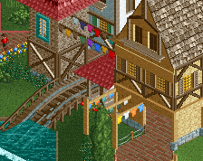
Other thing, I like the entrance area a lot, just too bad you made roofs so steep in this place.
Overall, I really like it, your foliage is amazing and I really like how you planned everything. I like every coaster except the spinning one. And that mini free fall. ♥
Next time, work a bit more on your ground textures, I would advise you to look at that screen Terry Inferno posted some weeks ago with the wooden coaster, I think it could work with your style.
75% for me
There's a fence missing in the Muhlenritt queue, literally unplayable.
On a more serious note, great job - I really liked it.
Wow, this park is wonderful. Hope to be able write some reviews next week. This definately deserves one. Great job and good luck on the AP vote!
Congrats on finishing this! It's pretty obvious you've come a long way and made a big improvement with this. You've managed to catch the Tripsdrill vibe very well, reminds me of our visit not so long ago.
I'm glad you used road lines near the edges of the path, makes it look cleaner than without The coaster line up is good and fits the park well. Gsengte Sau is my favorite here, the interaction with the log flume is great. The woodie is nice too, feels very realistic and Vekoma-ish.
I have my doubts about the launch coaster. Lay-out doesn't look that bad to be honest but I hated to see a brake after the top hat. Why dude? Coaster could easily run without that. Or is it because you wanted to make it as powerless as a real Mack launch?! The main issue I have with this coaster are the brakes. Way too short and not really aligned well. I think it would have been better if you moved your station so it would fit on one line with the brakes.
Also a bit disappointed you didn't recreate the nude tits show at the flume. But the laundry on the rapid river was a great touch. The weinfasser is also recreated greatly, it's a great ride irl.
Well, it would surprise me very much if you wouldn't win an accolade with this. I'd say a high silver or low gold. Whatever it will be, you can be proud on this park.
I think this is pretty good overall. It seems like you had a clear vision when you were building, and it also seems like you had fun while building.
However, I think it's lacking a lot of polish. There were items missing from buildings that would have just made it feel a little bit 'cleaner' and less rushed I guess? For me, that's what separates a bronze/silver from gold. The ideas are all there, they just need refinement and a little bit more care put into them.
I went for 65% on this.
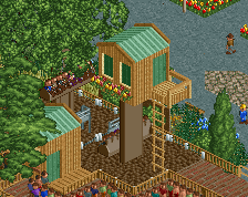
For me this is a surprising step-up from you. You showed some very creative ideas how an alternate Tripsdrill could be like, like the different use of the mills. Some parts show a lack in planning like the long straight path next to the tophat or the dead-end in scotland. Architecture is quite fitting, I loved the station of Waschzuber. Mühlenritt has an awesome layout.
Oh and this:
Hey, congrats on winning silver. I'm very glad to see your RCT maturity and skill growing. Keep up the good work!
Yay, I achieved everything I set out to when I started this stuff 5 years ago <3
Damn I missed the voting.
This is superb. You truly have made something special here. Really beautiful park, a bit sloppy in places, perhaps a bit rushed, perhaps just down to the fact that you have improved rapidly and still are improving. But this was fantastic, in so many ways, I think quality wise, yes silver is correct, but for what this park achieves, it is of higher standard.
By this, I don't mean it is on par with other golds or spotlights here, or that it should have been voted one, I just think that parks like this need to be highlighted more and appreciated more. I wish we had a better system to highlight new quality releases like this.
No other park on this site, besides maybe Thorpe Park, have managed to capture the essence of a park before. This is everything that Tripsdrill is. And a lot of people will not get that, but this hands down gives me the most unreal feeling. It is of course no where near being a rec, nor is that the intention, yet you've captured everything so perfectly, the feeling is so real.
Congrats on doing something so well that I've actually left a comment.
Congratulations V1! You got a silver! The Spotlight is in sight!
I didn't really comment on this during testing because I had some mixed feelings about it that other people expressed better than me. For me, the macro of this is very impressive and well done. It's the micro that lets it down. It lacks some small details that make it come alive, and sometimes things might be a bit too repetitive even though you could've easily made them more interesting. The entrance gate is a good example of this.
Nonetheless this is a great step forward for you. Coasters are pretty good and the atmosphere is there, even though it could've been fleshed out more. I hope you gained some confidence in your RCT skills and continue this evolution.
Congratulations, V1 - you've obviously improved since you showed the first few screenshots of this park, and I'm glad that you got this released.
Due to a voting SNAFU (which will be fixed) my vote got registered as 55% instead of the intended 60%; though technically it wouldn't have made a difference in the overall score.
I'll preface this by saying that I think the score is right on and this park thoroughly deserves Silver. In general, it's a pleasant park to look at, though I do agree with Jappy that it does lack some small details (the big things for me being that there is a lot of empty grass space around the park. A bit of that is perfectly fine, but I found that I was missing some tall grasses in areas of the park that I felt would have a bit more of it (such as near the park's fence). I don't know; I'm certainly not the best at foliage, but it seemed like a case of what Jappy mentioned; lacking a bit of the micro to bring it to life.
The entrance plaza is probably one of my favorite parts of the park. I'm not sure if you did this last or spent more time on it, but it seems to have more pleasant details and strong architecture. High points for me include the waterfront boardwalk and flower gardens along the paths. The entrance gate is a little simple - but I like the little planters you put around there.
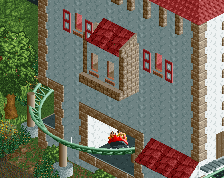
I also agree with what others were saying about the coaster layouts. The wooden coaster and junior coaster are strong, the spinning coaster and multi-launch are a little awkward. I think part of this is a result of how the spinning coaster was incorporated with the building, having large chunks taken out to accommodate the coaster. I was pleased to see that you added more details to the windmill! The launched coaster is an interesting hybrid of Maverick, Xcelerator and others, but I think it could have benefited from a bit more room to breathe.
I love the madhouse. I can't recall seeing one done in the fashion that you did it, but I immediately recognized it and thought that was very well done.
The vineyard ride was another high point for me. It feels a bit sectioned off like it was kinda just plopped there, but the level of detail put into the trellises and themeing is something I craved more of in the rest of the park. The Scotland portion of the park is also well done with a nice mix of details and that woodie station <3.
I know you mentioned this on Discord, and I'm sure it's true for many of us (definitely myself included!) - you knew there were parts of the park that you wanted to go back and change, but I'm glad that you got this released and congratulations on Silver!
Congrats V1. Been a long time coming.
My hope is you'll now relax your attitude and we can all be happier.
Out of most silvers we see on ne, i'd have to say this is by far one of my favorites. The only thing that kept this from being a solid gold release is ambition, as what posix was saying. It's clear now that you have the skills, now do something really memorable with them.
great work V1! definitely a massive improvement over your last work, with some good but possibly not-so-original architecture and a good atmosphere. the layouts were actually pretty good and the general park setting was well done, if a bit heavy on path and lacking in small details to really bring me in. also, very red. I wish you hadn't had the hat stall selling red hats, now everyone has them and they look silly!
definitely a solid and well-deserved silver, keep improving your style and flexing your creativity!