Park / NE's Sandwich Springs
-
 18-June 17
- Views 6,917
- Downloads 926
- Fans 4
- Comments 17
-
-
 68.13%(required: 60%)
 Silver

Steve 75% CoasterCreator9 70% Jaguar 70% posix 70% Sulakke 70% ][ntamin22 70% Austin55 65% bigshootergill 65% G Force 65% Louis! 65% 68.13% -
 Description
NE's Sandwich Creek is a family amusement park located in New Zealand which features a great variety of rides for all ages.
A big thanks to Tycoon Paradise for hosting the server. -
4 fans
 Fans of this park
-
 Full-Size Map
-
 Download Park
926
-
 Objects
1
-
 Tags
Tags
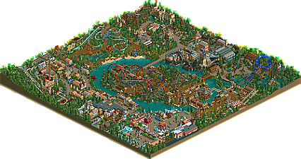
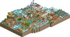
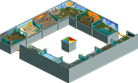

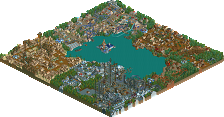
Finally, it took a lot of work, pulling this park up after NEDC4. But in the end it turned out really good.
This park also shows the capabilities of the tile inspector in openrct2, this park definitely wouldn't be the same without that codex like tool.
Glad to see this released!
It was fun working on this and watching it come together (though I really didn't do a ton except finishing other people's work and fixing technical shit).
I've got to say, I love Kumbaya. I thought that area was ugly as shit for most of this process but it really came together in the end. I love the rockwork.
Other highlights for me are the Aloha area (great sign!) and the dark ride.
Great work all around!
I enjoy this park more and more each time I view it. It's one of the best NSCO parks I can recall. Some highlights...
+ The Viking helmet is one of the best details ever, love it!
+ The aloha sign is amazingly creative
+ The entry to the French area has fantastic atmosphere
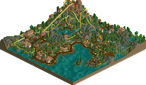
+ Mount Ventoux has a great layout and I love the chocolate bars being used as building detail
+ The station on the Flying German
The only area didn't enjoy too much was the industrial one. I think mine train was the wrong ride type and hurt the area, but otherwise it was really good.
Thanks I guess for the coaster name? lol, kinda silly, but you guys did a great job finishing it up. The hacking on the rocks/volcano object is epic!
Again, this park is really growing on me. I think it can be considered for NE Spotlight, but don't expect it due to its size and being NCSO.
Great work and thanks again for letting me show up one night and put down out a coaster layout
Thanks it took a lot of work!
Kumbaya is a good coaster name.
No offense to the other builders, but I don't really feel like this is deserving of gold. To me this is a clear step below a park like Imaginaerum, Piano Park, Forces of Nature, or any of the other 75% and below Golds recently. Sure there are some great ideas and small details here, but as a whole I don't really see how you can put this park above something like that, or even near that level.
Maybe I sound a bit grouchy here, but if this gets a gold I feel like there is little purpose to any accolades other than Gold. At some point we have to start drawing the line and differentiating between high quality parks, and good quality parks.
To me this is a 65% and 70% at the very best. Its messy, non cohesive, sloppy in places, un-organized etc... despite some of the great details, I just don't see how you can put this park at the level of Gold personally and not just give every solid park Gold too. And if that's the case, what's exactly the point to accolades anymore if it just becomes a stamp you put on everything that comes through?
So everything but my area? Dang it!
I agree with G Force. It's a great park and a fun team effort, but the quality is not consistent enough for a gold accolade. Also the park as a whole is a bit incoherent.
Some great bits here and there though! And we should continue doing these parks in the future!
I was sort of with you until you suggested it might be worthy of 70%... which would of course give it a gold accolade. lol
I agree though, this isn't a gold in any way, shape or form. I figured this was a pretty much automatic mid silver. I'm shocked by the score.
Very nice logo.
Amazing park, everything blends well together.
I will always remember the water coaster being the Vagina Lift.
I don't know which part of the park is my favorite, every area has its own qualities.
Id say its a 70% For being NCSO its pretty good. I agree some parts are that great, as they were rushed, but some parts are spotlight quality.
I said 70% in that it's the highest score I could understand someone giving it.
Even so, 2 65% and 8 70% is a Silver. Which is sort of what I expected initially.
From bronze to spotlight everything reasonable for me somehow lol. Always difficult to value NCSO work. Being curious to see the voting results.
I want to cringe when I look at what i've built on this map.
Park Map Added
this park actually ended up being a lot better than I thought it would be. there's some really quality areas (most of france, germany, scandinavia, asia, etc.) with some ingenious scenery use. (obviously the aloha sticks out, but there's plenty of good stuff here.) It must have gotten cleaned up a lot since I last saw it because it came together really nicely. I only didn't really like the central area, some of france in front of the pro tour, and the scottish area was almost there for me but came off feeling a bit cramped and confused, and lost some of the aesthetic/charm for me.
I also love all of the dumb NE references, and also the stupid names for things in the french section. I think we need more tongue-in-cheek parks and less taking ourselves too seriously maybe...
Calling it now, 'Aloha' sign will win Best Idea 2017.
Whew cool to see this released quite happy with my area in this park