Park / Montu
-
 14-June 17
- Views 6,568
- Downloads 657
- Fans 1
- Comments 20
-
 71.88%(required: 65%)
 Design

Coasterbill 80% Steve 80% Kumba 75% bigshootergill 70% Faas 70% G Force 70% Jaguar 70% Liampie 70% Sulakke 70% Louis! 60% 71.88% -
1 fan
 Fans of this park
-
 Full-Size Map
-
 Download Park
657
-
 Objects
1
-
 Tags
Tags

![park_3185 [MM2014 R2] Sands of Time](https://www.nedesigns.com/uploads/parks/3185/aerialt2821.png)


![park_4087 [H2H8 R1] All Coasters Go To Heaven](https://www.nedesigns.com/uploads/parks/4087/aerialt3818.png)

![park_3226 [MM2014 Final] Ode to the Ood - MMFinale by Stoksy](https://www.nedesigns.com/uploads/parks/3226/aerialt2837.png)
This is excellent.
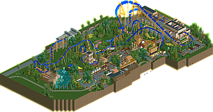
We were actually at Busch Tampa a few days ago and while you obviously took a lot of liberties here, you really captured the atmosphere of Montu really well.
As for the layout itself, it flows really nicely and has great pacing. I sort of wish you could have buried the final corkscrew a little since that's really an iconic moment of the ride but I enjoyed the tower you added after the small loop and little details like the flamingos and clever use of that candy fence on the station more than made up for any small omissions like that. 80% from me. Awesome work!
^I was just there, too. No wait on Montu all day so we rode it a ton. Still an amazing coaster.
Like Bill said, you took some creative liberties here. I would've loved to have seen Cobra's Curse somewhere, but I can't judge what's not on the map. Layout was solid, and the supports were good but they weren't consistent. Architecture was less than your usually excellent buildings, but you made up for it with clever ideas like the flamingos. 70% from me.
This was quite nice Shogo, though unusual coming from you. The coaster was definitely the best part, the layout and supporting was fantastic. Especially for NCSO, it was probably one of the highlights of the map.
Also really strong was the foliage/landscaping and the backstage stuff, which really added some good context and depth to the map which we dont often see from you. Glad you decided to add that in this time.
However, unusual for you the path planning and archy was kind of weak. I don't really know if you rushed a bunch of kind of were handicapped by the park boundaries, but the buildings were all kind of underwhelming. If you were able to combine this coaster, foliage and landscaping with your usual archy and composition it would probably be a 75-80 it not higher.
Though, in the current state its probably a 70% at best for me, really nice work but overall a bit underwhelming compared to your usual archy and parkmaking. Hope to see more of the strong aspects of this going forward from you, as it could combine to create some really great content.
Nice but sadly lacking your usual qualities. Too clean and correct for me. Coaster ratings just off too. Lots of effort everywhere though which is nice, just looks a bit forced sometimes (white awnings..?). Looks as though you weren't relaxed when building this.
Was unsure what to make of this. I assumed it was a rec, but it does not seem to be a full on rec attempt. Whatever the intention, it's really good NCSO work. I love the vertical signs as supports and the flamingos. Would have loved to seen this done on a bigger scale.
Of course this was a simpler style from your usual work, but it's still a really enjoyable design, it feels sunny, cheerful and bright. You showed obvious creativity with the jelly bean walls, trackitecture, the flamingos etc. Though you're support work for the coaster seemed to be all over the place, way too many varieties of objects, tracks and styles... it just seemed messy. But the coaster layout was really nice, great flow and pacing. Well done!
Messy in some places, great in others, and overall worth a 70%! I really liked the station and the ride entrance sculpture. The whole thing had very nice colours and textures, pink flowers helped a lot. The middle section was the most messy, with some more space things would've been fine though. I don't know what you changed but the trees look a lot better than they did on the screen you posted earlier.
Good job!
Was meant to vote 65% not 60%, sorry about that. I'll get it changed.
Nice design, but to me it only just is a design, a bit too messy, being labelled as a semi-rec that is no where near a semi-rec is also odd, I felt that, like a lot of your NCSO work, it was gimmicky in places, as opposed to being natural. But still good stuff, hence the (intentional) design vote.
full size overview? not got rct atm
Full size map added, sorry for the delay on that.
The map was available when you first released it!... for like 5 seconds ... and then you took it away from us...
  ... and now it's back. Oh happy day!
so shotguns? isn't just a one hit wonder. (I'm excluding all h2h entries)
Guys I am trying to open the open the park, its say
error trapper
exception raised
I don't know what to do, could anybody help
You need to open it with OpenRCT2.
https://openrct2.org/downloads
I would recommend getting the launcher, that's probably the easiest way to start off.
Raising the exception will always crash the game. Try lowering the exception first and then try to open the park again.
And you just won NE for me with that comment. No need for anyone to do anything else anymore, this guy won.
Fuck Bitches Raise Exceptions
... for once coasterbill is the high vote. Was getting worried that the buttons over 65% weren't working for him.
im slowly getting around to this stuff. nice work, good, clean atmosphere and detailed building, with some nice themeing and new uses of objects. I just wish you had pushed the map out a bit more, it felt really cramped where the paths and buildings were but was nice and open around the coaster
Would have loved to have seen the more expanded version of this, it had some brilliant stuff.
Overall just very solid, the anubis entrance was phenomenal, as were the flamingoes, and unlike others I actually adore the combinations used to create larger trees - just adds so much more scale and context to everything else.
Wasn't too much archy unfortunately, so not a lot stood out in that regard but I was very impressed by the foliage and how you managed to create an interesting environment without over-treeing [which is a huge problem for me].
65%, bordering on 70%