Park / The Terraforming of Mars
-
 13-May 17
-
 The Twilight
- Views 3,100
- Downloads 713
- Fans 2
- Comments 10
-
-
 64.38%(required: 65%)
 Design Submission

Steve 80% CoasterCreator9 70% trav 70% bigshootergill 65% G Force 65% Stoksy 65% alex 60% Coasterbill 60% Cocoa 60% Faas 60% 64.38% -
 Description
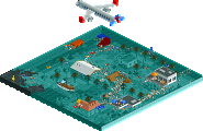
If we got a second chance, a clean sheet, would we do better? Or will nostalgia drag us down? Can mankind change its ways?
-
2 fans
 Fans of this park
-
 Download Park
713
-
 Objects
1
-
 Tags
Tags
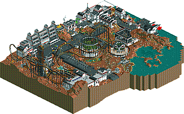
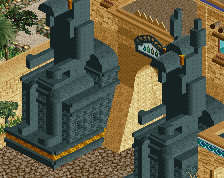
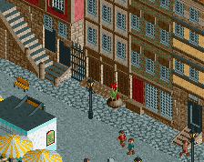
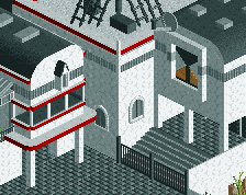
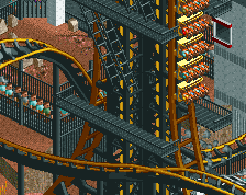
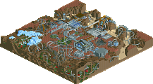
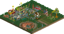
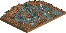
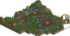
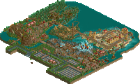
Very nice little release, enjoyed looking at this. You've improved your jagged rocks I feel, they look more tasteful. Love the hill of the main coaster. Simple WME-ish hack but clean and good to look at. Nice dedication to the theme too. Sometimes a bit too many small objects for me which break the aesthetic clarity and make everything too busy. Also the map height level would ideally be lower. It just makes it much easier to view. I hope this is something ORCT2 might offer in the future: lower EVERYTHING in the park by x height steps.
Aside from the 1k ruin spam and lack of supports, this was pretty nice. Some cool little details like the submarine vehicle and satellite disks on the buildings gave it some nice life. The archy was good but kind of stale one you got away from the coaster station and buildings around the queue.
Overall a nice little map, and like scoop I'd probably put this in the 65-70 range... perhaps a bit closer to 65.
This was really nice.
I love the clever lift and unique coaster layout. The entire thing was fun to watch and flowed very nicely.
Gengineering was cool, but I wish you'd have left the back wall off and worked on a cool, visible interior. I would have loved to see the same thing with the Earth Museum.
This is a tough one to score, but I guess 60% from me. It's really close to being design worthy, but the lack of supports and a limited amount of detailing hold it back a tiny bit for me. Still, this was really nice and a lot of fun to view.
The pros for this design for me would be the coaster layout which although unusual flowed great and fit the map well. I also liked some of the tiny touches to the building like solar panels and vehicles. Overall the atmosphere was great and I believed in the parks concept.
The downsides would be the landscaping was really distrcacting and unusual. It overall lacked some of the details most of your work has. Overall I would vote 65 and a design on this though.
who cares about custom supports? looks far better without them.
Cool park, it has some really nice details in it. I love the spaceships! It's more worth than 65% in my opinion.
hmm not sure what to think of this. I think the layout and especially the coaster colors are really not great, or particularly interesting, which is a shame for the 'center' of the park. also, I feel the wide paths and stuff don't really mesh with the whole 'tight colony' sort of feel. that said, the archy and vibe is pretty great, although I'm not a huge fan of the brown rocks scattered randomly everywhere which feel really messy. I really liked the greenery domes/buildings, and some of the structures were really fantastic. It did seem like a cool colony and had a good atmosphere. so maybe not quite there for a design- I feel for a mars design, I would have made the coaster sprawl way away form the center of the colony and have some fun adventures out of sight and in caves and stuff. that would really help capture the sort of isolation and wildness of it all.
This was nice Liam. Wasn't *that* big a fan of the layout itself seeing it in a design context. The interaction seemed slightly forced (eg around the main bio-dome, 270degrees was acceptable, but a full 360degree helix seemed too much for me) but I certainly like the lift hill merge. It just added *something* which made it feel more unique than coaster with the same elements.
The overall park macro was really great, seemed quite a few people didn't like the scattering of 1k ruins but it didn't bother me too much given the bigger picture it makes a lot of sense the landscape would be rocky in this way. The tiny outcroppings in the water look SO GOOD from zoomed out.
Archy was fitting of the theme, maybe it's just beyond my style though so I wasn't suuper taken by it. I think Cocoa's comments about the colony *feel* are most accurate as to why I only think this deserved a 65. Yes, custom supports, but ultimately that's at least partly about personal preference. It felt more like a park on mars rather than mars itself, which makes sense given this was cut out of Twilight but I think it would have felt more impressive if, after cutting it out, you'd revisited how the theme was being portrayed. I was looking for central hub rather than sprawling pathing I think.
Wow, sooo close.
I think the score was fair, I could see this going either way for sure.