Park / Parenzo
-
 21-May 17
-
 Port of Parenzo
- Views 5,570
- Downloads 744
- Fans 3
- Comments 24
-

-
 66.88%(required: 60%)
 Silver

bigshootergill 75% Coasterbill 70% Jaguar 70% trav 70% Faas 65% G Force 65% posix 65% Stoksy 65% ][ntamin22 65% Sulakke 60% 66.88% -
 Description
Hey everyone,
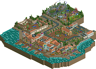
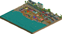
I'm proud to finally present you Parenzo, my kinda first major project to submit to New Element. Started during last Head-2-Head inspired by a journey with my football club to Porec in Croatia the building process lasted almost 3 years.
Many reworks happened during that time. With myself growing with every one of them, i kept redoing things since i was fully satisfied. This caused that the church has been rebuilt for 5 times for example.
But i did it, and i'm very glad that i'm finally able to submit it now. At the end at least in my opinion i reached the goal i had quite well, which was to create an italian tourist city that is based on real-life cities and mainly on my personal imagination of how a cool city like this one could look like.
I definitely recommend reading the readme and looking on stuff carefully to understand what i went for and to get the atmosphere of the city.
A great 'thank you' goes out to CC9 who helped me a lot with the fun fair - ish park you can find in the submission and to everyone else who helped me with motivation, criticism, testing etc.
At the end i want my work to speak for itself, so looking forward to all your constructive feedback and your thoughts on this. I will try to answer you all as extensive as possible!
Cheers, RWE -
3 fans
 Fans of this park
-
 Full-Size Map
-
 Download Park
744
-
 Objects
362
-
 Tags
Tags
Didn't realise how far behind I was with comments, apologies.
Two things killed this for me, the water and the mass of same-textured paths. Other than that, this was really solid.
The Parenzo Funland was nicely done, although I'm not sure I agree with the use of crazy paving here. It would have helped differentiate the area from the surrounding city landscape - I'm not convinced that a quite fancy path such as crazy paving would have been used for essentially a small travelling-fair style park. Even though it appears non-American members hate tarmac I actually think it would have worked nicely here.
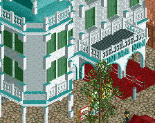
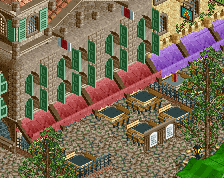
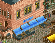
Although personal preference I think that your archy suffers from inconsistent scaling at times and also detailing for the sake of detailing without thinking about how things blend together in-game. For example, most of the waterfront archy had random 1/8tile brick objects on the front facade which made no sense to me. Either it's a necessary detail attempting to add some sort of texture/colour in which case it should not be jutting out of the facade like that, or it's attempting to genuinely signify an imperfection jutting out of the wall in which case it should blend as best as possible with the colour of the wall itself and shouldn't be nearly as big. In either case a lot of the archy felt a lot weaker than it should have [good examples were the 'castle' walls and the non-cinema archy square] When your park is focused so heavily on architecture you really have to nail it.
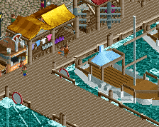
Not too much else to comment on other than that, nice use of that weird info stand object [although it'd be a lot more useful if the large "I" wasn't there], good way to incorporate colour onto the docks via stalls, and this was certainly a nice if relatively simple conceptual idea.
65%
Sorry for the late review.

This was a pleasant little "park". I really liked how the colours, textures, along with the foliage created a very warm and nice atmosphere. The little stores, stands, and restaurants also helped a lot. I also liked the peepable jetties.
I also liked:
- Looping Star. So beautiful. Nice layout. Love the wide turns. The supports were amazing.
- The moving cars.
- The castle was beautiful.
It wouldn't be a RWE park without those colourful tent roofs. I do however think some of them had almost too bright colours on them. At least the bright purple ones. But it's not a big deal to be honest.
There are a few things that weren't as great though.
- I agree with Bubbsy on the deco pieces on the walls. There were just too many in my opinion.
- I know the boats weren't the main focus, but I think you should've built your own boats.
- The speedboat didn't work for me. It just looked dangerous and unnecessary.
- You should've done the castle peepable! It screamed for tourists
Anyway, nice job with this. For me this is a very solid and tasteful entry. I like it a lot and I think you should be proud. I'm sure you're going have a very bright future with this game. Keep it up!
Just have seen the newer reviews! Great to see people are caring about this entry that much, that it gets so many late reviews! I really appreciate all the criticism and it's still pretty useful for me!
Oh I just remembered I owe you a review here !
Parenzo was absolutely beautiful overall. You have a lot of good taste and you proved it one more time here.
The "village" was incredible. Each building fitted perfectly with each other. Overall, it felt very realistic and full of atmosphere.
And the well colored awnings added a lot to that feel.
To be honest, the castle wasn't powerful enough in terms of aesthetics for me. It was nice, but not incredible.
The church plaza + the fair gave me that same effect. It was nice, but I didn't had a wow effect. For the fair, I agree with Alex when he says it was missing some context, it was a bit too small to be immersive.
The rides were good but I would have liked to see custom rides instead.
I really enjoyed this, I think it deserved at least a gold. 70% for me !
And sorry for being late !