Park / Parenzo
-
 21-May 17
-
 Port of Parenzo
- Views 5,570
- Downloads 745
- Fans 3
- Comments 24
-
-
 66.88%(required: 60%)
 Silver

bigshootergill 75% Coasterbill 70% Jaguar 70% trav 70% Faas 65% G Force 65% posix 65% Stoksy 65% ][ntamin22 65% Sulakke 60% 66.88% -
 Description
Hey everyone,
I'm proud to finally present you Parenzo, my kinda first major project to submit to New Element. Started during last Head-2-Head inspired by a journey with my football club to Porec in Croatia the building process lasted almost 3 years.
Many reworks happened during that time. With myself growing with every one of them, i kept redoing things since i was fully satisfied. This caused that the church has been rebuilt for 5 times for example.
But i did it, and i'm very glad that i'm finally able to submit it now. At the end at least in my opinion i reached the goal i had quite well, which was to create an italian tourist city that is based on real-life cities and mainly on my personal imagination of how a cool city like this one could look like.
I definitely recommend reading the readme and looking on stuff carefully to understand what i went for and to get the atmosphere of the city.
A great 'thank you' goes out to CC9 who helped me a lot with the fun fair - ish park you can find in the submission and to everyone else who helped me with motivation, criticism, testing etc.
At the end i want my work to speak for itself, so looking forward to all your constructive feedback and your thoughts on this. I will try to answer you all as extensive as possible!
Cheers, RWE -
3 fans
 Fans of this park
-
 Full-Size Map
-
 Download Park
745
-
 Objects
362
-
 Tags
Tags
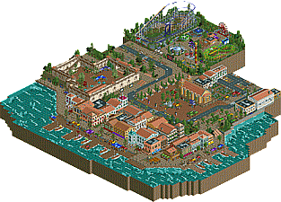
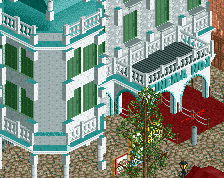
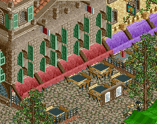
This is excellent! The waterfront area and architecture is lovely, the roadway is great... what's weird about this is that the only part about it that's not amazing is the park itself. I know you were going for a cheap, traveling fair look and you nailed it but I still feel like it could have been a lot more interesting. I honestly feel like this is an amazing architectural submission with a park shoehorned in just because it's an amusement park based game.
That being said, this is awesome. 70% from me. If you had done a park with that type of architecture it would be Spotlight worthy.
I honestly had an impossible time scoring this one because my gut tells me it's a little small for a gold considering the fact that the park itself isn't really up to par at all but I can't help myself. I almost went with 65% but every time I opened it and looked at the downtown area I realize that I can't possibly not give this a gold worthy score. The amount of detail there is amazing, I love that I keep discovering new things every time I look and more importantly the overall atmosphere is great.
I love seeing these city parks like this and Budapleasure. The architecture is obviously the highlight and is fantastic. The fort and the church plaza were excellent. I also loved some of the smaller details like the graveyard.
I agree with Coasterbill that the fair seems shoehorned in. It's nicely constructed but It doesn't really make that much sense in the context of the city that a fairground would pop up in the city center. My only other complaint would be with the water. Something about the object and the waves on top really messed with the perspective for me, but thats more of a nitpick.
Overall this is a great submission and right on the edge between silver and bronze for me. The architecture is all easily gold level, but the size might hurt it some.
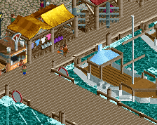
I found my towel, thank you I started my visit of Parenzo at the beautiful church. I really love this building. The castle was great too. Now down to the port, walking along the pier, watching the speed boats and reading the menu of the restaurants. You really captured that old, dense town feeling. Every building is unique, yet everything fits together. You could have translated 'Museum of history' though for even more immersion. Osteria 'Al porto' looks most appealing to me and I would certainly go downstairs.
But.. time for the fun fair. Nice to see a Pinfari, these compact coasters are hard to pull off nicely but you did a decent job I think. Rest of the park looks simple and clean, thats what you wanted to achive I guess.
Overall Parenzo is an interesting release, I only wish the fun fair was more integrated, as it feels a bit out of place the way it is now. I had a good time looking at your park though, great job.
You know I like this, I haven't got that much to say about it.
The mediterranean atmosphere is spot on. The shutters, the souvenir stalls, the ac units... It all fits. I can feel the blaking sun burning and me complaining to my parents how I want a break from our boring tour through the city to get an ice cream.
The park does feel like an afterthought. but you know that. It kinda sticks out. Maybe you could've expanded it a bit more? Now the coaster takes up half of it which is kinda funny.
Great little park, good to see it finished, and interested what you'll bring us next;
Wow RWE so glad you finished this after all this time. Very solid release. I'll just give a list of pros and cons because English skills are rival to that of Kumba's.
Pros:
-The little details are wonderful. The signs, maps, monuments, etc are top notch.
-Atmosphere is great. I feel like I'm in a Mediterranean town whenever I look at it.
-The church and castle are by far the best buildings.
-The pinfari is good aswell. Well done cc9 the layout is spot on and the supports are very well done.
Cons:
-The archy was not my favorite. It seems very spammy and the mass amounts of 1/8 stone deco blocks kills it for me. I removed a lot of them and the facades look sooo much better.
-These two are what you've heard before and they don't impact my score or anything but they're the parking and zig zagging cars. Easy fixes that'd make me happier.
-The tented markets are pretty good on the boardwalk but they are all over the place and I don't really think they work everywhere.
-I wish the park was more coherent with the town. The park is great and it's not bad where it is but it'd be so much better if you built upon the town near the peep entrance. I feel that since you didn't do this, the whole thing doesn't feel too coherent because the town is super cramped and the park/plaza is wide open. Making a cramped town section near the entrance would help with the macro of the park. This is why I get the feeling that the park is an afterthought even though I know it's not.
-The foliage is poor in some spots. Mainly underwater.
Overall solid park. 65-70% for me.
The additional deco pieces to the fort walls really improved it as well as the interior, perhaps I would have liked something a bit more authentic though, perhaps a "fort tour" or something, rather than a bunch more vendor stalls. Speaking of those vendor stalls, man you you really seem to like those.
The Archy was solid, but like Bubbsy stated that deco spam kind of went out of control at times. Seems like you just add deco pieces to walls in an attempt to make them look more interesting when you don't really have any strong concepts for the buildings. Perhaps going forward I'd suggest a trying something more minimalist so you can learn to create nice building without a ton of details, and learn how to restrain yourself from just add s bunch of objects to make something feel more complex.
Overall a strong submission, though kind of hard for me to score based on the content. I'm going to end up going with a 65%, though I think it would have increased a bit if you gave the park more context or perhaps left that out completely and did more with the town.
Also, I really wish you would have fixed that water and the height of the docks. That drove me nuts and was really an eye sore compared to the rest of the waterfront which for the most park was fantastic.
Just a comment to say that I will write a review later, I have to find the time. I will edit this message later
Glad this is released!
The Mediterranean atmosphere is spot on! It's a theme I love and you executed very well, it makes me want to hop in my car and just go for two weeks to this wonderful piece of Europe.
I'm glad you got rid of most of the waves, but it's still too many. The 1K rocks and foliage under water is very neat and the port side with the stalls and palm trees feel so alive.
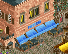
The archy is great! I don't think you overused those deco pieces, they really add to the buildings. The castle is great, but I really love the church. The square in front of it is also very atmospheric and very believable. I could see myself wandering around there, looking for an ice cream.
The funfair park is neat addition. It doesn't have to be bigger, as most of these funfair parks are quite small. I feel it is a bit too clean however, dirtier path and foliage would have seemed more realistic for me. The Pinfari is good, I really like the supports on it. But I think it could have been a bit more compact/smaller, as most of these Pinfari crap coasters have awkward and sometimes even painful small turn in them.
A piece of work to be proud of. I'd give you a 75%.
I figured I'd be the high vote, but if Fred was on the panel he would have given you the same thing. Fantastic park, very immersive, you did a wonderful job creating this scene & atmosphere! Congrats on the accolade!
Congratulations on the silver! Now get back to work on your other stuff.
really nice work. some solid archy and a great urban setting, it reminded me a lot of croatia which is pretty similar to the vibe you're going for I guess, so nice work capturing that. I was a little confused by the castle (or rather its lack of anything inside it) but maybe I'm just missing some historical context for why that would be a thing. also I'm not so sure the park really fit. it was nice fairground style rides but somewhat spoiled the hidden croatian-seaside sort of vibes. maybe its too bold to have a release on NE without rollercoasters but I'm not sure.
anyway nice work all up, looking forward to more from you
Congrats on the accolade, RWE.
I very much enjoyed your park.
I hope to able to write a review soon. Not sure when though. Good job, and keep working hard.
Thank you all reall ymuch for your comments. I'll read everything very carefully and try to improve things in future submissions.
I'm very impressed, you cocoa got that this is actually more croatian than italian, which is a true fact, cause it's mainly inspired by a trip i had to croatia.
to be fair, I haven't been to italy but have been to croatia so my only references for adriatic coastlines are croatia and montenegro
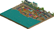
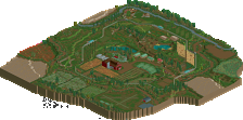
Will this get a full park map someday?
Liam's fault.
The map is added
I thought this was very cool, lots of nice details dotted around and beautiful architecture. One thing I was particularly impressed by was your skill at making very big open plazas work. Particularly around the church - it looked very realistic and I could imagine being there. You used planters, stalls and seating areas to break up the space really well. I love the use of elevation throughout the park too. The side of the fort that faces the sea looks particularly dramatic and powerful.
I’ve got mixed thoughts on the funfair… It’s certainly executed well and the bright colours nicely balance the awnings used by the docks. I also like the contrast between this rather classy port town and a garish fairground. However it felt very ‘tacked-on’.. as though you wanted an excuse to add some rides. I think it’s also due to the awkward cropping of the map (why do people do this?!) - since it doesn’t really have any surroundings on 3 sides it looses context somewhat.
Anyway, really liked it for the most part. Great work RWE.