Park / Ciadad Antigua
-
 10-May 17
- Views 2,613
- Downloads 720
- Fans 1
- Comments 12
-
 54.38%(required: 50%)
 Bronze

G Force 60% Jaguar 60% Liampie 60% bigshootergill 55% Cocoa 55% trav 55% Coasterbill 50% CoasterCreator9 50% posix 50% Stoksy 45% 54.38% -
1 fan
 Fans of this park
-
 Download Park
720
-
 Objects
1
-
 Tags
Tags
![park_3229 [MM2014 Final] Cavumus](https://www.nedesigns.com/uploads/parks/3229/aerialt2949.png)
![park_4178 [H2H8 Grand Finals] Heaven's End](https://www.nedesigns.com/uploads/parks/4178/aerialt3929.png)
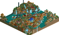
Is there a reason there's no map overview for this park? His screenshots looked pretty decent, I assume this could possibly win an accolade...
From now on Aerials will not be assigned to low-mid level releases until after they are awarded accolades. As to encourage people to download and view them rather than simply look at the aerials.
This park was kind of jumbled but fun. There were a lot of cool areas and rides but I don't know how well it all came together. It seemed like it wanted to half multiple themes. My favorite part was the giant structure by the dive machine. Least favorite part was probably the cliffs by the water coaster. If I had a panel vote I would probably vote this a 55%
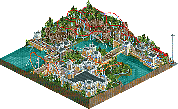
Very happy to have my first ever actual map release (except for my terrible MM2014 entry, but i'd like to forget about that ofcourse). First of all, i just want to mention that the naming has nothing to do with the theming. I didn't know what to name all the rides so i just named them all Spanish things, but the general theme of the park has nothing to do with Spain. In fact, i'm not even sure what the theme here is. I mainly created this park to see what i could do with the disaster bench, not to try and work within a specific theme or anything. I didn't really try to make this the best park ever, i just wanted to see what i could do with the bench, and then i figured i should try to finish it, so that's what i did. I'm not really expecting this to score very high, but i'm hoping for at least a bronze.
This is really nice.
Naranja was the star of the park for me, the building is a little rough around the edges but still super cool, the layout has a really nice flow to it though and everything just sort of works together. Great interaction across the board on that ride.
Le Bestia was a little weird, but nice. I like the cutaway helix section a lot. Mr. Bone's Cave Ride was simple but cute.
The only ride I didn't really care for was Big Splash. I admire the creativity but it needs a little more to it I think. I didn't really like the free floating aspect with no hint of a track.
Overall though I liked this a lot, you've come a long way and you have a knack for great interaction. I'm voting 50% on this, but more because of it's size than the quality of the content. If you built a larger park of this quality it would probably earn you a silver but this is so small that it almost seems like a micro to me.
I generally liked this park. I'll leave the comments about the coasters to others as I'm no expert. Only thing I can say is that in general I liked them.
Using the disaster bench seems to become less and less of a disaster but more of a test of skills. The more I see people use all those weird objects, the more I see a sort of separate style of RCT develop, a separate aesthetic with different but not necessarily worse textures. This is no exception. It also forces you to be creative which I love and totally suck in. I mean, wheelie bins for walls? Genius! The colours of the buildings were warm and I loved the style of archy used.
There are however a few little niggles with this IMO. While the buildings feel warm, the rest of the environment feels a bit cold. The blue supports on one coaster and the white track on the other didn't help this. Besides that, I sorta thought the landscape was a bit...empty. Can't really put my finger on what was missing though. Perhaps a few things to make it pop a bit more? I dunno.
Glad to see you release something however and hopefully we get to see more in the future.
this was a fun thing. you did a pretty fantastic job with this bench putting together clean and atmospheric scenery. I'm a bit confused about the general structure of the park though- 3 sort of sprawling rollercoasters and not really any supporting rides or indication what any buildings 'do'. So I'm finding it a little hard to really get into the park, because its small and the lack of context sort of makes it feel like a bunch of disconnected nice scenes. It could have been great if you'd made this a design, focused on one ripper layout instead of 3 more forgettable ones and made a real meaningful area around it.
that said it was still pretty fun, not really sure how to vote on it but the archy was defs the highlight (just wish the buildings had more purpose and were arranged with more intention!)
Unfortunately a park which was better in screens.
The architecture and ideas you showed early on were quite promising, it didn't really come together in the end for me though. Probably the weird height differential with huge buildings seemingly built on unnecessarily high paths. You still have a significant coaster layout problem; red coaster wasn't overly bad but the extended hills with too much shallow-steep track ratio, orange coaster was poorly planned with horrific underground sections, and then the white coaster seemed to do nothing of interest and was strangely glitchy for no reason (you didn't need to use junior track, none of the relevant hills were banked).
Agree with Cocoa, a single design in this park context would have been around trav's disaster bench release in overall quality. Bit of a let down as is; to be fair your recent screens and improvement is absolutely fantastic to see and I hope future releases continue in this vein just with greater appreciation for the importance of coasters.
45%
Congrats on your shiny new accolade!
Congrats on the bronze!