Park / Yankee Park @ Readington, NJ
-
 09-May 17
- Views 1,799
- Downloads 600
- Fans 1
- Comments 9
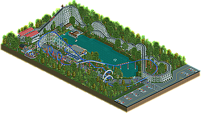
-
 40.50%(required: 50%)
 Spotlight Submission

Cocoa 50% Jaguar 45% Ling 45% posix 45% CoasterCreator9 40% G Force 40% Liampie 40% RWE 40% Xeccah 40% Faas 35% saxman1089 35% Scoop 30% 40.50% -
 Description
Help! I'm trapped in the NE moderators dungeon! This is my only way of contacting the outside world! Send Help!
-
1 fan
 Fans of this park
-
 Download Park
600
-
 Objects
1
-
 Tags
Tags

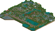
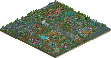
I think the best part of this for me is the color usage. It creates a very pleasant atmosphere. Obviously not having many buildings hurts this. But you seem to have already corrected that on your next project and I look forward to seeing it
You've already improved with your current project, keep at it.
Those layouts are great and there is a very nice atmosphere. Why didn't you expand it? I would say maybe try using black tiles and have more landscaping, it would give your work more character, it looks too rectangular for me, but that's maybe just me.
Quality of the coasters layout, and their stations: 75%
But there's not enough content and buildings: 55%.
Can't wait to see your next park that looks really promising.
I liked this a lot, the park is a bit small but the atmosphere is really nice and this has a cute, fun vibe.
My only critiques are that the Arrow layout is way too elongated which makes the interaction feel really forced, I think the path choice could have been better since the tarmac brings down the atmosphere a little bit and the crazy path accents are a bit awkward.
45% from me because it's REALLY small and lacking in content, but very nice. The score is more a reflection of the size than the quality of work.
i feel like I've seen every square of this park in discord before I even download it. I'd love it if you spent some nice alone time with rct and developed a crispy design without checking in with the chat every 5 minutes. give yourself some space to develop your own style and experiment! and don't just copy the bland old realism that's so pervasive here
Certainly agree with this.
I'm a fan entrances different rides, good work.