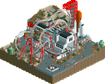
Park / [NEDC4 6/15] Xenoforce: Incursion
-
 25-April 17
- Views 2,704
- Downloads 615
- Fans 2
- Comments 17
-
 71.88%(required: 65%)
 Design

alex 85% Cocoa 85% trav 80% posix 75% chorkiel 70% Steve 70% bigshootergill 65% Coasterbill 65% CoasterCreator9 65% Stoksy 60% 71.88% -
2 fans
 Fans of this park
-
 Full-Size Map
-
 Download Park
615
-
 Objects
1
-
 Tags
Tags
![Park_3813 [NEDC4 6/15] Xenoforce: Incursion](https://www.nedesigns.com/uploads/parks/3813/aerialm3448.png)
![park_3796 [NEDC4 4/15] - Wildfire](https://www.nedesigns.com/uploads/parks/3796/aerialt3454.png)


![park_3790 [NEDC4 2/15] - Ghoul](https://www.nedesigns.com/uploads/parks/3790/aerialt3443.png)
![park_3808 [NEDC4 7/15] Panther @ La Ronde](https://www.nedesigns.com/uploads/parks/3808/aerialt3449.png)
Overall, I liked this.
What knocked this down for me was the map edge. It feels very incomplete, and I think it's kind of apparent that you were running low on time in an effort to complete this.
Given a more finished product, this probably would have been in the 75-80% range; I really liked a lot of the features around the coaster itself.
Congratulations on Design!
Voted 65%
+ Great coaster layout!
+ It’s refreshing to see some new textures and building styles. Those walls and roofs could be nasty if used in the wrong context, but you did a pretty good job executing them in the correct fashion
+ Some of the details you plugged into this map are really cool: Fighter jets and hangers, Gyro Rush (just loved the creativity in this custom flat!!!!), the burndome eatery was cool too
- That theatre was massive, just seemed like too much too me
- Felt unfinished on the edges of the map
Just bringing over my comments from voting:
Shame this was/felt unfinished, the idea and execution was really unique and quite a refreshing approach to RCT2 which actually utilised skillful object usage. The gyrocoaster custom flat was well-made, and I loved that you also utilised underground sections especially by the cobra roll to actually differentiate the coaster layout from other entries and the 'realism' base Louis! gave you.
I did find some of the texture work rather hit and miss. In screens, a lot of people seem to really connect with the tin roofs used but they didn't do much for me personally given the rather large expanse of roofs used (this was most evident by the Exoplanet Journey Theatre, although I'm guessing this was unfinished).
Surprisingly I found the foliage and landscaping to work quite well here to create an engaging and unique environment. Unfortunately, I can't bring myself to vote design on something this unfinished but I do think this was a great entry. Thanks for building RCT2 ][ :)
i think that was me.
Just fresh beyond belief to be honest. I really do love this. The industrial textures felt so new, the way you coloured them was spot on, as were the bright highlights you added in places. The forms of the buildings as well seemed really well thought out and you made huge but low structures work which I think is very hard to do. All the spacecraft sculptures were very cool as were the robotic arms and satellites. One negative was that I think you had too many different highlight colours, had you slimmed the colour palette down a tad it would’ve felt more cohesive and striking imo. I hope you build more RCT2 in the future because you are very very good at it and I actually prefer it to your LL parks. Sometimes I find your 'workarounds' in LL a tad clunky so it's great to see you be able to execute your vision without constraints. Sick job, well done on design! 85%
I very much enjoyed this. The little sculpture everywhere were great. The architecture was probably the weakest part of this, but was made up for with the unusual textures.
I would love to see a H2H style park between you and alex, the creativity would be insane. Maybe throw Liam into the mix just for a bit of aesthetic clarity.
I voted 80%, would have gone higher with a little more refinement around the edges. Definitely the dark horse of the competition for me.
So awesome. It still looks amazing even if it's rushed/unfinished.
In my opinion:
Pros:
+ Textures and colors, gives the park an unique feel
+ Attention to detail, cool ideas
+ The restaurant and the entrance of hangar 18
+ The robot arm flat ride
+ The tree in the building <3
Cons:
- Unfinished
- The green things around the station of the coaster, what is it by the way? Some kind of virus thing?
- Some parts/plazzas that feel empty, but probably because it's unfinished
85%
Yeah it maybe unfinished around the edges, but that station complex looked awesome. Loved the exit path over the breakrun into the shop. Gyro Rush was another cool idea. The integration of the cobra roll in the path is awesome. Your entry was unique and fun.
I really enjoyed this, and didn't even notice that it may have been unfinished. I assumed that was part of the desert/junkyard vibes. It reminded me a lot of borderlands and firefly and that whole genre, which is always a good thing. I thought the archy was fantastic and really novel, and there were a ton of cool details and new textures everywhere. everything felt detailed to a really adequate amount; enough to tell a story and keep my eye interested (and look aesthetically pleasing) but not too much to overload any part. the whole environment was intriguing and mysterious and it all combined to make the atmosphere great. I don't know what xenoforce is (unless its a thing you've just made up now) but I felt story and substance in the design. hence why i gave it such a high score. really great work, I want more rct2 from you!
cobra roll integration is nuts thats eyethamu1 level shit right there. textures make this design like without them and i can see this not getting it. that FLAT IS FUCKING INSAAAAANE omg like the way its integrated with the water and the ride FUCKin shit dude!!!! sadly there's a lot of clearly unfinished stuff on the map but whats there is 75% work
Awesome! I didn't want to get too complicated with a backstory, so I left a lot open to interpretation in hopes people would develop their own stories. The "xenoforce" is just this tremors-like alien thing that comes out of the ground. Is it a plant or an alien being, attacking the outpost or just growing up through it, are the space planes for attacking it or escaping it, you decide.
I'm not to thrilled that this won design seeing as it's unfinished. What's there is really good though. expect a video review later.
So bad this is unfinished. You're showing off that this game has so much more posibilities than we are using in modern rct. Your special object selection and your really special style are making this really interesting.
Would have definitely been a spectecular design, but the unfinishedness and the rushed parts ruined it, of course.
Hope to see more rct2 from you in the future!!!
70%
At first glance I didn't realize this was unfinished. Seeing it now does make it stick out a bit, which is unfortunate.
That said, I don't think the score was entirely unwarranted. What's here is a great composition with some really unique objects. Personally, the textures don't work for me-- especially when compared to other portions of the map, but I appreciate the attempt with something you don't see often.
The architectural forms are great-- huge buildings but done in such a way that they don't feel overpowering. I think that's hard to do. I also appreciate that the roof forms gave a hint about what's going on inside-- especially with your flying theater building.
You have a heck of a lot of talent in both games and I'd love to see more RCT2 from you in a finished form.
This park shows how to use the 'textures' in an effective way.
85% but more towards 90%
The unfinishedness has actually kind of grown on me. It kind of matches the unusual textures in that this park is so unconventional compared to most other entries but everything works. I thought some of the hangers were too oversized but the whole area by the station and cobra roll were great. This would get a 75 from me.