Park / [NEDC4 8/15] Ukiyo (The Floating World)
-
 23-April 17
- Views 4,185
- Downloads 729
- Fans 5
- Comments 24
-
![Park_3809_[NEDC4 8/15] Ukiyo (The Floating World)](https://www.nedesigns.com/uploads/parks/3809/logot.png)
-
 66.88%(required: 65%)
 Design

CoasterCreator9 80% posix 75% bigshootergill 70% trav 70% alex 65% chorkiel 65% Coasterbill 65% Faas 65% Stoksy 60% Steve 55% 66.88% -
 Description
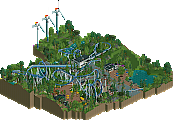
Ukiyo means "the floating world" or more specificly living in the moment and detached from the bothers of life. This map illustrates both of things in subtle ways. Hopefully you can spot them.
-
5 fans
 Fans of this park
-
 Full-Size Map
-
 Download Park
729
-
 Objects
34
-
 Tags
Tags
![Park_3809 [NEDC4 8/15] Ukiyo (The Floating World)](https://www.nedesigns.com/uploads/parks/3809/aerialm3438.png)

![park_3806 [NEDC4 2/15] - Interstellar](https://www.nedesigns.com/uploads/parks/3806/aerialt3455.png)
![park_3796 [NEDC4 4/15] - Wildfire](https://www.nedesigns.com/uploads/parks/3796/aerialt3454.png)
![park_3791 [NEDC4 5/15] - Arevik](https://www.nedesigns.com/uploads/parks/3791/aerialt3450.png)

![park_3324 [H2H7 R1] Circus Circus & Adventuredome Atlantic City](https://www.nedesigns.com/uploads/parks/3324/aerialt2970.png)
So happy this won Design. I had a feeling I would be the high vote; but I really enjoyed this!
Two drop tower vehicles? That seems a bit unsafe...
Wow, if this is n°8 I can't even imagine what's coming next. I admire this and your talent so much. The only thing I don't like that much are the trackitecture supports on the coaster (except on the loop) but it's just a detail. Congratulations for winning design! Well deserved.
Cutting it close.
Really was not expecting this from the teaser screen..great surprise! Overall an appealing composition and the different levels created some nice ‘vistas’. The landscaping of the floating rocks was well done for the most part but there was a bit of texture repetition with so many of the 1k rocks facing the same direction. It’s worth taking the time to rotate when placing them I think to get a more natural look. Good object use for the earth/roots, maybe a just a tad dark and contrasting too heavily with the clouds underneath but it’s a good solution nonetheless. Vines were very well done. Solid archy. Fun supports. Sexy pink tree. Good shit. 65%
Voted 70% (congrats on the design!)
+ First of all, I don’t think I saw any of this pre-release so it was a pleasant surprise.
+ You used those goofy root objects very well here, it really added to the floating island effect
+ Archy showed some of your skills, even just the creativity in general was great, like the protruding seating area
+ I like how you made the coaster explore various portions of the islands
+ Foliage and landscaping was both a strong and weak point, but I’ll include it in the + section, you obviously took a ton of time to create this floating island, so hats off to you. That is a TON of work building with those blocks (serious dedication!), and great use of the bamboo objects, Chinese cedars, weeping willows. The negative was that in some areas it felt too repetitive
- There are some brown rock objects that could have rounded off the underside of your islands so they don’t look so blocky
- Archy could have used more details, just bring it up to the next level, seemed just a touch plainer that I would have liked
Just bringing my comments over from voting:
Now this caught me by surprise Scoop. I was worried based on your screen that it was going to be a real cookie-cutter asian theme which has been done to death. However, the floating island approach really added something unique to your entry. Some minor points about the environment: why did it have to be so fucking high in the air , I didn't mind the foliage too much but it really got repetitive after a while [would have been interesting if you could somehow have combined different foliage environments for different islands, still retaining that overarching 'asian' theme but taking into account geological position (eg use of rockwork for cliff faces, some more kind of swampy foliage, wooden bridges)].
To be fair, I kind of thought the architecture was relatively uninteresting although the 'gate' over the loop was dope. Not too sure how I would have improved it, just seemed oddly square and any added towers appeared forced. Rather than building up from a wider base to a peak, you appeared to just build straight up. I was also a little confused by the steel + glass base used for the seating, seemed very strange given the more natural and quaint surroundings (especially considering the uprooted indication you gave the islands seemed to have formed from).
Not quite enough for design imo - you're getting there Scoop
Really didn't think I would be the low vote in this one. We've seen floating islands before, and done better no less. Not to say that this is bad, because it does show skill, but there was nothing exciting here for me.
Landscaping and foliage was okay, however, the edges of the islands themselves were blocky or jagged. The waterfalls were cool, however. Otherwise the architecture was just okay, it did the job, but wasn't great. The combination of various support structures also made things a bit messy for me.
The huge frame on the loop though was great. Absolutely a highlight and one of the best ideas of the contest.
Also, yeah, the fact that this thing was built so high off the ground made this TERRIBLE to view in game. Every rotation I made trying to look at something more closely just threw me to a different part on the map and was incredibly frustrating.
Regardless, Scoop, this shows some skill and I already know you've got some good stuff planned and have impressed in the past. This just wasn't for me. Keep going!
yeah definitely mixed feelings on this one. on the one hand, I enjoyed the lush bamboo and plants dripping over the islands, which were also pretty well done (but the rotating view issue killed me). I think the archy was really the downfall here- it just felt uninspired and like 'classic' asian rct themes that we've all been ripping off each other into a watered-down mess. the water and environment all worked well though and obviously the tori gate was fantastic. I think also the section with the log flume felt weird to me. like it was a section of a standard, realistic park that also just happens to be floating. I would have enjoyed a bit of departure from classic 'theme park' vibes and more magic and fantasy, seeing as thats already sort of the theme.
Like Steve mentioned. The theme isn't wholly original, but it's miles better than the so-manyth Cedar style design. The architecture was really nice in this entry. Didn't expect this submission to be yours initially, so I was surprised in a good way.
I didn't really like this to be honest. I'm not a sucker for floating island parks. The impressive aspect that made some floating island parks fantastic is kind of gone nowadays, especially when it's done in this semi-realism context. I didn't get why you chose to not blacktile the ground. The icey ground was really distracting. I liked the roots hanging below the islands.
Congratulations! This was a great entry.
The good: loop support/frame (10/10), the surprise of you doing something more adventurous, cascading waterfalls, good map composition, nice theme, good fun atmosphere
The bad: rotating the screen is so fucking annoying (why!?), architecture is copy pasted with just different random colours, the sides of the floating islands were blocky, you still felt the need to go all realistic on the log flume with layers and monorail beams
The ugly: roots object is awful, ICE BACKGROUND WTF
_______________
65%
Deserved win! Congratulations.
While the floating island thing isn't new, you created one of the better executed ones. I liked the sky blue background. The gate is definitively the highlight of your design. Congratulations on the win!
Great submission! Very hard to navigate though because of the ice background and the problem with turning the screen. I really had to work for this one to be able to see every aspect. The aspects that were there were enough for design though, congrats!