Park / [NEDC4 7/15] Panther @ La Ronde
-
 25-April 17
- Views 4,869
- Downloads 775
- Fans 2
- Comments 22
-
 70.00%(required: 65%)
 Design

Steve 85% CoasterCreator9 75% Cocoa 75% trav 75% alex 70% bigshootergill 70% chorkiel 65% Coasterbill 65% posix 65% Faas 60% 70.00% -
 Description
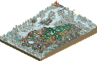
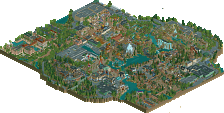
My NEDC entry, utilising Louis!'s floorless layout, attempts to incorporate it into La Ronde. Replacing the Boomerang, while still attempting to be true to the surrounding environment, rides, and park layout.
-
2 fans
 Fans of this park
-
 Full-Size Map
-
 Download Park
775
-
 Objects
1
-
 Tags
Tags
![Park_3808 [NEDC4 7/15] Panther @ La Ronde](https://www.nedesigns.com/uploads/parks/3808/aerialm3449.png)
![park_3800 [NEDC4 1/15] - The Junkyard](https://www.nedesigns.com/uploads/parks/3800/aerialt3456.png)

![park_3806 [NEDC4 2/15] - Interstellar](https://www.nedesigns.com/uploads/parks/3806/aerialt3455.png)

![park_3790 [NEDC4 2/15] - Ghoul](https://www.nedesigns.com/uploads/parks/3790/aerialt3443.png)

I think Shotguns said it best when he said that expanding three tiles to the edges would elevate this one. That would have pushed this to probably a top three entry for me. As it is the colors and the custom rides were absolutely amazing. I loved the rock work on the shore. I did find some of the texture choices and object uses a little odd for my likings though. I would be stuck in the middle of 70 - 75 on what to grade this.
I've already given you some of my thoughts on this, but it as definitely a really solid entry. The archy was quite solid and very much representative of La Ronde and you did a good job adding those little details that made this feel a bit unique. Especially the tree roots, a very good idea there. Even all the little signs and such around the rides were really well done and make the park feel lively.
However I think at times you went a bit overboard with this, especially when it came to the foliage. Just kind of was distracting and didn't really blend or feel natural to me. Kind of wish you left some of that out and cleaned the map up a bit in that aspect. Your foliage has kind of always been hit or miss for me, and this was definitely a miss.
Outside of that, and the awkward map shape this was really well done. Just didn't really feel like a design, which probably is why the scores are all a bit low. Perhaps a bit of this is due to the inclusion of the Vekoma, which, all things considered I think you did a petty good job on. Kind of awkward in placement and right up against the map, but all things considered I like it, just kind of felt like an on inclusion. Would be better suited in a full park.
Gets a 75% from me, hope you keep refining your style and keep producing work! Congrats on the design and thanks for entering!
Apparently I forgot to give this a proper review. Better late than never, so...
I have mixed feelings about this. One hand, it's a solid submission that looks fun and has some cool stuff in it. On the other hand, it feels a bit like a let down, under your skill.
The mini-splash was neat and a great idea. The tree on the slide was also neat and the theming on the mini-frisbee was very intense. Other cool stuff: the roots, diagonal McDo's sign, the sign/parkmap across the mini-frisbee.
The archy is solid, I like the station of the beemer. Queue of the beemer is a bit short imo. Long queues for these types of ride aren't unrealistic. I think the interaction with the coaster is good enough, a bit of a pity there isn't a path to the cobra roll because it looks like a dead place now.
The placement of the Vekoma is a bit awkward. It feels a bit too forced imo, however I can imagine SF doing this. I don't think it really adds something to the submission. Foliage wasn't very likeable, in overall it's not that bad but those green nets on the ground were a turn off for me. I feel like it's a bit too dense on some spots.
I think 70% is a good score for this.