Park / [NEDC4 7/15] Panther @ La Ronde
-
 25-April 17
- Views 4,337
- Downloads 674
- Fans 2
- Comments 22
-
 70.00%(required: 65%)
 Design

Steve 85% CoasterCreator9 75% Cocoa 75% trav 75% alex 70% bigshootergill 70% chorkiel 65% Coasterbill 65% posix 65% Faas 60% 70.00% -
 Description
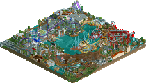
My NEDC entry, utilising Louis!'s floorless layout, attempts to incorporate it into La Ronde. Replacing the Boomerang, while still attempting to be true to the surrounding environment, rides, and park layout.
-
2 fans
 Fans of this park
-
 Full-Size Map
-
 Download Park
674
-
 Objects
1
-
 Tags
Tags
![Park_3808 [NEDC4 7/15] Panther @ La Ronde](https://www.nedesigns.com/uploads/parks/3808/aerialm3449.png)
![park_3806 [NEDC4 2/15] - Interstellar](https://www.nedesigns.com/uploads/parks/3806/aerialt3455.png)
![park_3790 [NEDC4 2/15] - Ghoul](https://www.nedesigns.com/uploads/parks/3790/aerialt3443.png)
![park_3800 [NEDC4 1/15] - The Junkyard](https://www.nedesigns.com/uploads/parks/3800/aerialt3456.png)


Voted 70%
+ You definitely captured the La Ronde feel in this park, mixing in some real-to-life rides
+ You have a knack for making a park immersive in the legitimate details, foliage is quite well executed
+ The archy you’ve included is fairly well done, but you focused most of your attention on the rides in this design, giving Panther many supporting rides. Manitou looks as best as could be re-created, as is Super Manege.
- Didn’t seem like your best effort, you’ve gone more potential than this (but obviously you weren’t trying to make it your best release ever)
I think the vekoma is a bit small and squished up against the map border. Like Liam said, the map being cut off the way it was was kinda awkward.
Overall, I enjoyed it pretty well. I think it should have scored higher than Xenoforce, to be honest. Congratulations on Design!
I would have voted 70% too, so I agree with the score. Although I would have liked to see this design finish at place 4 or 5. Some parts were great: the whole area of Louis' coaster, the foliage, the Mac, the tub ride and the slide. Definitely worth 80% or more. But this design had some really weak areas as well. The pedal trains looked unfinished with those square roadlines as track marking. The balloon ride was okay, but the balloons should have been bigger for sure. The worst part was the corkscrew coaster. The layout is dreadful and so is the ground beneath it. Roadlines on bare ground is never a good idea. And the mesh acting as mowed grass did not work here at all. I think you shot yourself in the foot by adding that coaster, although I can see why you tried to since it's a recreation of the area. All in all a pretty good design though with some fantastic hyper-realism.
What really brought this one down for me were the surroundings. Really wasn't a fan of the Vekoma or the area around the McDonalds. The coaster and (I'm assuming) Huss Frisbee next to it were very well done though.
The way you cut the map off ruined it a bit for me. Some areas had really generous surroundings whereas other parts seemed to have been cropped too closely. I would’ve preferred a proper path leading to the corkscrew and I also thought the section of splash boats was naff. Sorry. Onto the good shit though, of which there was plenty - excellent realistic archy for the station and marccy d’s great foliage, lovely rock work along the water. The kid’s rapids was cute as was ‘Tchou tchou’. Corkscrew layout was nice except for the stretched out corks.. I get why you did it but I think taking liberties with the layout and making them diagonal would’ve been better. Real nice support job on this. Maybe wish you hadn’t gone so patchworky on the ground underneath. Love the colour choice for Panther. Very glad you got this done, though I do think you could’ve lifted it with less severe cropping. 70%
Amazing work. I agree about the arrow/splash boats part that doesn't bring more to your entry but it's still stunning. Perfect colors, foliage looks wonderful. This is the kind of content that deserves a full park !
90% for me
It'll be a cold day in hell before La Ronde runs 2 trains on Super Manege. lol
Seriously though, this was really nice. The placement of the corkscrews was super awkward but otherwise I don't really have any complaints. Great work, definitely design worthy. Nothing here blew me away but I really enjoyed it.
Really well done realism. The execution and placement of Manitou is perfect. I missed a bit of interaction with the coaster, the support rides were a bit away from the action. Nevertheless, I had fun looking at your entry.
Overall the atmosphere and details were pretty great. Nothing incredible but definitely very good. I thought the composition was also fine. The cutoff of the map didn't really bother me or detract me from my viewing experience. Sure it would have been nice but I'm not voting on what isn't there, I'm voting on what is. If that's where the map ends, then okay. Sure.
I liked the colors on Panther a lot and I really didn't have any issues with the corkscrew coaster. I'm not familiar of the real life counterparts so forgive me if that's a bit naive. Regardless it looked good and it was done with skill. I didn't really see too much wrong with this entry. I also thought the abundance of foliage was kind of nice. Reminded me of a local part that's very forested. Nice work, dude!
yeah I'm also pretty surprised by the scores at the bottom (especially those below design??)
I thought this was a really solid realistic release. you clearly have an eye for finer realistic detailing and also recreating interesting and unique parts of parks. I loved the whole section it sat in, especially the corkscrew coaster. this would be a really solid area in a realistic park. I think maybe its not higher marks from me because I still want to see realistic releases that really innovate and do something new and exciting. I know thats a hard ask but while this park is all good, I feel like I've seen a lot of it before (from you, and from other people). not to start an argument about the value of realistic parks; I think there is always room for new atmospheres and aeshetics and detailing to innovate in, in minor ways, and I also think you did craft a nice wooded atmosphere here. but I want to see a bit more stoksy from gardens of babylon- you have a lot more technical skill now than I think you did then, and you could really smash some more theme-y themes I think.
gritty amazing imprfect realism. love how the foliage is so thick it makes the viewer actually turn the camera. great use of elevation and really interesting path choices. the vekoma is NUTS and the ground underneath???? omg. coaster-coaster integration a little forced though. but holistically i can actually imagine being here, like youve hit that perfect level that makes everything tangible. geewhzz analogy is totally right, but maybe a little more "forced imperfections" than what he'd likely go for.
like 1 more hour of work into this (expanding it like 2-3 tiles and finishing the splash boats) it's easily over 80% work. even in its current state how the fuck someone thinks this isn't design???? is beyond me
I would've voted 80% on this, but more 85% than 75%. It's just excellent work, and far above average realism in my eyes. Here's some cool shit than elevated this above most realism parks, spotlights included:
Things that held it back have already been mentioned for the most part, except this: why are the paths single wide? Looks silly that some parts of the map are super crowded and others abandoned. So the peepability is not great. But whatever. 80% man. Too bad the panel is composed of blind men. Blinded by the high quality of the contest maybe.
those tree roots tho
This is pretty good. I will post a video review later
Sorry for the low vote (again).
I got really excited by the waterfront path going under the first drop, how cool would it be for the peeps to walk there. Why is it a backstage area?! Why is 20% of this design backstage area? There were so many cool places for coaster-peep interaction, like the pathway mentioned before, but also the queue almost going under the loop, but then at the end sharply turning to the left.
The path layout was really confusing for me, you created so many cool opportunities for sightlines and interaction for the peeps, but it's like you almost intentionally didn't use them at the end.
The custom flat ride and tiny details were really cool, but man did I have a hard time understanding why you did and didn't choose to do certain things the way you did them.
Reminds me a lot of gee. I don't know if that's a good or a bad thing though, since this entry isn't really having something new or spectacular for me, it's still pretty great though, of course.
Path layout was a bit weird, and i would have loved to have it a bit clearer at some places. The ground textures under the orange coaster also really confused me...
Overall still a decent entry though, and of course, definitely a design.
70%
I thought La Ronde was a really fun park when I visited, so this was a neat project to see.
It's a shame that it sounds like you got docked some points because of the elements you were recreating like the service road along the riverside, but credit to you for doing a decent job trying to copy some of what La Ronde has. Your Vekoma was actually one of the better recreations of this type of coaster, though you kind of missed it with the footers vs. the mobile support frame. They don't really work together.
I think Six Flags would probably not put a new coaster over top of their old Vekoma like that, but you did what you could with a stock design and in RCT it makes for neat interaction. Everything else you have seems reasonably believable though your maintenance area for the coaster is inaccessible for vehicles.
I'd love to see you do some more of this type of realism work-- not necessarily recreations, but this style of build. It's really pleasant.