Park / [NEDC4 15/15] Table with Umbrella
-
 21-April 17
- Views 4,818
- Downloads 644
- Fans 6
- Comments 25
-
6 fans
 Fans of this park
-
 Full-Size Map
-
 Download Park
644
-
 Objects
1
-
 Tags
Tags
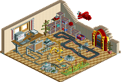
![Park_3807 [NEDC4 15/15] Table with Umbrella](https://www.nedesigns.com/uploads/parks/3807/aerialm3426.png)

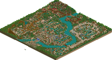
![park_3359 [H2H7 R4] #diamondheights](https://www.nedesigns.com/uploads/parks/3359/aerialt2984.png)


It took me a while to understand the meaning behind the umbrella placement and I think your entry is an interesting approach towards umbrellism. Also enjoyed the peep-umbrella color choice.
Also, please know that when I view submissions and vote on them, I look at them as objectively as possible and do not let the builder, or my relationship with them skew my views on what is presented competitively. Whether you believe it or not. I've been a part of this community for almost 15 years. I care about this website and the people in it far too much to be or do something I consider unfair.
I will touch upon on a number of things in this, mostly about Liam's contest entry and things I believe are related (maybe not directly) to it. However, they are things that I believe need to be said and this appears to be the vehicle for it. I would also like to note that if I do single anyone out, I am not picking on you or thinking less of you or more highly of you compared to others. I know it's hard to be objective in these circumstances, just know I am doing my best.
So, yes, I really enjoyed Liam's entry. First and foremost, the layout is good. I understand that we are not judging the layout specifically for this contest, but we are viewing these as designs. They are competitive design submissions at their very core. The layout itself is good to the point where I think it's worth about 5-10% of your total score. If you don't think that's fair, then why is the layout even there to begin with? We are judging the map, not just the theming. By that logic, to give this a 5-10% total score, you would be saying the rest of the map is essentially worthless.
It is not worthless. Whether you think it's well done or not, you cannot deny that this is a relevant and biting satire of today's NE community. Discord has sucked up the majority of NE's activity, and for good reason: we get real time discussion. We get coaster news, RCT screens, and hilarious antics that we'd never get on the site itself. nicman is a newer member and immediately his presence was made known with the goofball things he had to say and just in general having a great time in Discord with him. Whether you like it or not, I find it hard to believe any one of you will forget nicman and his recent activity. Liam noticed the significance, and cemented it in-game.
Despite that, we just have an all around creative and good-looking piece here. Probably the most creative of the contest. He managed to take one object and make buildings, trees, catwalks, waterfalls, fountains, and even awnings themselves. Whether the aesthetics are missing or not, it's impressive. Have you ever tried building something with one object? After seeing this, I tried. It's not easy. I think this alone deserves some credit. And even on top of that Liam has some decent landscaping and the composition is appealing. A nice wooden path, waterfalls in the hills as the coaster's backdrop, rolling grass hills. What is not to like here?
If your answer to that is "umbrellas" or "it's a joke" then I'm not sure how much I can help you. This is not typical park making, yes, but that has never stopped anyone before. Just as an example, the first thing that comes to mind for me is #diamondheights. This park is by no means a joke, but it is satire. We are making fun of an old scenario. Just because it looks prettier means it's better? Maybe, again, that's for you to decide. But to call it a joke or to say it's a waste is ignorant. There are plenty of parks that are funny or satirical or a joke. It doesn't mean they are any less of a park, despite the content.
Before writing this, I spoke with Liam a bit on his thoughts amidst all the controversy. It was a quick conversation but it's poignancy resonated with me. Yeah, he the said the park is a joke. However, that does not mean it holds no value. This is a parkmaker's creation, and that holds weight unto itself. None of us would make something they didn't value. Liam also went on to say he obviously did not put his heart and soul into it. However, all of his work falls under the same field: having fun with the game, which I think is what we should all strive for. Despite it being a joke, it still holds a sense of meaning or purpose and it was fun in the process. Don't devalue something based on you not taking something seriously when the builder themselves actually did.
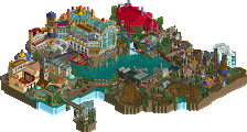
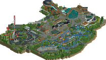
Liam created something new and interesting here. More interesting than say, Scoop, or Iron Rattler made. We've seen floating islands before and we've seen scary or dark themes. To be honest, I looked at these and got bored quickly. I looked at this entry and couldn't stop looking at it. It's inherently fascinating and fresh and a clever spin on today's NE member culture. I ranked it higher than some because I felt it broke the mold and did it with style, and it was fun. Again, I don't mean to pick on anyone, these are just examples. I love you all! I simply feel like people wrote this off too quickly when it probably deserves a bit more.
On that note, I wanted to touch on some things concerning the accolade panel. It's no secret how I feel about some of the panel's views, clearly, but that's the benefit inherent with such a method of voting. You get both sides of the spectrum and a democratic result because of it. I think it's the best method and never disagreed with that. However, people's mind sets on how the vote strike me as utterly ridiculous and detrimental to what the whole point of it is. If you or anyone else truly voted to simply try and knock something down or because you think it SHOULD be lower than others, you're rigging the system. You're skewing votes. Regardless of its objective or subjective or black or white or whatever you should always maintain the integrity of this panel by voting fairly and be true to yourself. Vote for how you feel, don't even the playing field. I am not 100% directing this at you or anyone, I just hope that people are not in this panel with that mind set. You should look at things as objectively as possible but still, follow your heart. I always said to trust your gut when voting for a map. If it feels right then it feels right. If that was your method, then hey, I guess I don't have much to say to you. It's your opinion and even if I don't agree with it, I can respect it. I just want everyone to give things a true vote and look past the surface. That doesn't mean you shouldn't have some fun with it either! On the bigger parks maybe look at how much research went into something. Put yourself in the builders shoes. Remember all the advertising, go back and reflect. Things are all things you should look upon and goes back to following your heart. I've never only looked at parks for how clean something is made or how rushed it is. Go deeper and analyze a little if you want, it's only going to make things better for you as a builder and benefit the score and keeping things on an even keel within the site.
With that said, I understand this is a game. Obviously if you don't want to read that much into it then hey, that's fine. Again, if you think you're doing good by you and the site then press on. At the same time though we are also a tight knit community with mutual respect. I hope that for a lot of people this extends to being more than just a game, but a fun hobby amongst a great family we can share it with.
I hope I did my best to explain myself and my feelings on things. I tried not to jump around too much and I tried to keep it objective and to the point. If you need me to elaborate further, I'd love to talk to you about it. This site means a lot to me and I care about it and only want the best for it. These kinds of discussions are what keep us motivated and encourage us to strive for greatness within RCT2 and beyond.
Liam, great job on this. I want to take the opportunity again to thank you and the admin team (especially Russ!) for putting this contest on. Here's to more entries, and a bright future at New Element!
Deep
Good read Steve, but I have to fully disagree with you about the greatness of this entry. I'm with trav here. I can always appreciate satiric or arty work, but I don't see more in this entry than a joke and some rushed work. That why I can't give it more than 15%. If this design was turned in outside of this contest, do you really think it should have just missed the design mark (60%)? And like trav said, it is kind of demotivating and insulting for other participants if a joke receives a higher score than serious entries.
But like you said, different opinions on judging RCT work is what makes the accolade panel so strong. And good discussions on RCT is what makes this site alive.
tl;dr