Park / [NEDC4 9/15] Caelipotens
-
 23-April 17
- Views 3,271
- Downloads 572
- Fans 1
- Comments 25
-
 62.50%(required: 65%)
 Design Submission

bigshootergill 75% chorkiel 75% CoasterCreator9 70% posix 65% trav 65% alex 60% Coasterbill 55% Faas 55% Stoksy 55% Steve 45% 62.50% -
 Description
Welcome to my entry for the fourth New Element Design Contest!
This entry takes you to a realm of fantasy above your imagination, which waits to get explored by you! -
1 fan
 Fans of this park
-
 Full-Size Map
-
 Download Park
572
-
 Objects
22
-
 Tags
Tags
![Park_3805 [NEDC4 9/15] Caelipotens](https://www.nedesigns.com/uploads/parks/3805/aerialm3439.png)

![park_4087 [H2H8 R1] All Coasters Go To Heaven](https://www.nedesigns.com/uploads/parks/4087/aerialt3818.png)
![park_4074 [H2H8 R1] Wit's End](https://www.nedesigns.com/uploads/parks/4074/aerialt3814.png)


Interesting fantasy theme. Rocks actually look cloudy and soft. Otherwise there is not much to see, your buildings are quite repetetive.
We've seen some promising stuff from you RWE so i was curious for your submission. You chose to go all out fantasy, and I have to be honest: that's not kinda the style of RCT I like/enjoy. So maybe my post sounds too harsh but don't let it get you down. I know you are a good talented builder, it's just not my cup of thea. That can happen.
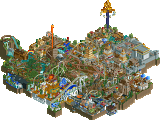
Interesting use of the LOTR rock as clouds. It works really well on those smaller islands, the big island with the lift on is a bit too much for me. The tower next to the lifthill is dull. It's too thick, too wide and too repetitive. The front of the station proves you can do better archy!
I can feel the score given by the panel lists is justified. It didn't do much for me I'm afraid. Doesn't mean I'm looking forward to see more work from you!
I think this entry suffered the most from the layout being prebuilt. Because the layout is so familiar at this point the lack of other attractions or focal points is more noticeable. I really liked the use of the rocks for clouds and I think the architecture created the atmosphere you were trying to create.
Thank you for all the nice replies, really enjoyed reading through those. Good to see there are a lot of people overhere that are caring a lot about giving proper feedback.
Now for my answer i want to explain what the building process for this was, and how this became the submission, you're all seeing now, because that is important to understand, why it is like some levels below the quality my stuff is usually having:
At first i must say, i hadn't really ideas what to do with the layout at the beginning of the contest. I had started 2 or 3 maps, but neither of them worked with the layout and the expectation i and other people had for my entry.
So, after i still hadn't any ideas for some days, i decided to go for the style and theme you find here at the moment. Basically more as a submission just to participate and be a part of the contest, rather than as something, where i think about everything and make sure everything works well and fits. So iwanted to make something where i can fun-build completely blind and without much thinking, so that i can finish it, without thinking it could have been better.
After that decision was made i basically had no ideas for a fitting style left, than creating something full crazy fantasy-ish like "The Genesis" from Magnus, which was my first and only inspiration for this. So i have just directly built what came in my mind and i must say, it was a nice variation to what i'm normally doing and i had really much fun building it.
Of course, i will change this again for future submissions, and as you can read in Park Updates, my next submission will probably be pretty soon and in my best quality possible!
the idea behind the submission seems half-baked which has led to the entry not being as good as it couldve been it seems. the clouds felt lazily executed which in this case considering your entire entry is based around those really put a dent into your ap score.
Hmm, this submission is somewhat upsetting to me. While its nice, and has some clever ideas, like the usage of 1k ruins as clouds, it just misses the mark mostly because of its lack of content. Though I guess with a deadline I cant fault people for not putting a lot of time in their entry, so I guess you'll get a pass from me on this.
Everything you have is just okay, nothing really that interesting or lasting in impact. The archy was hit or miss, the columns were nice but the textures and colors were certainly not. The ride fit in well so I'll give you credit for that, and it was easy to look at and view which is sometimes underestimated in importance for something like this.
Glad you submitted something, though I dont think I agree with its placement, still a 50% from me and for a 9-10 hour build that's quite good.