Park / [NEDC4 1/15] - The Junkyard
-
 30-April 17
- Views 5,362
- Downloads 945
- Fans 5
- Comments 17
-
 80.63%(required: 65%)
 Design

Steve 90% bigshootergill 85% CoasterCreator9 85% Cocoa 85% trav 85% chorkiel 80% Faas 75% posix 75% Stoksy 75% Coasterbill 70% 80.63% -
 Description
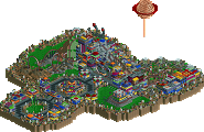
A Junkyard themed area with architecture and decoration built from the parks old, disused attractions and theming. In classic NEDesigns tradition, rollercoaster track becomes roofing.. however this time it’s not in disguise ;-). Enjoy the park.
-
5 fans
 Fans of this park
-
 Full-Size Map
-
 Download Park
945
-
 Objects
1
-
 Tags
Tags
![Park_3800 [NEDC4 1/15] - The Junkyard](https://www.nedesigns.com/uploads/parks/3800/aerialm3456.png)
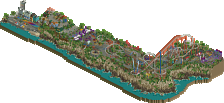
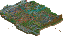
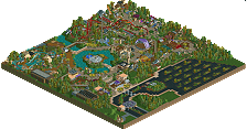
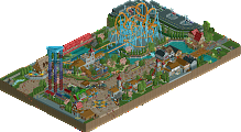
Voted 85%
+ Obviously the setting is genius, this junkyard is a beautiful mess. You’ve shown your imagination time and again, and this design showcases your talents.
+ I enjoyed how you mixed in some of the weird ncso objects with ncso & trackitecture to create this park
+ Supporting rides are great. Of course I’m a sucker for a killer go-kart track, and you pulled this off so well! Great interaction with the coaster too
+ The seating areas are actually really cool, the funky design you pulled off with some of those roofs was really nifty
+ The color combinations you mix together shouldn’t work, but as usually it does, and this looks great!
- I can’t exactly pinpoint why I feel this way, but the design almost feels like it’s slightly unfinished, but maybe that’s just the ruggedness of it
- I want more!!!
Congrats on the win Alex!!!
Pure artistry. The fact that this park makes you take trackitecture literally as track repurposed as architecture is enough to make this groundbreaking. But then you went and made it very well composed too.
Just bringing over comments from voting:
My score on this might be a little controversial at first viewing, but hear me out. The junkyard itself was fucking nuts Alex, I mean holy shit the use of monster trucks, monorail trains, and texture was unbelievable!! It was refreshing in the same way as ]['s yet seemed slightly cleaner in object selection and usage.
The question I had to ask myself when giving this a score though was: how did this entry create an environment for the main coaster, and I keep coming to the answer 'not much'. The only interaction anyone has with the entire layout is the cobra roll and maybe some visibility of the corkscrews. The rest of the layout is in the middle of nowhere without any interaction with anything. Not even those queuing for the ride can see anything of interest. In the context you set this park in I much would have preferred you to have really embedded the coaster into the actual junkyard, that would have seen you really hit the heights of 85+ scoring which everyone seemed to peg you for.
I want to reiterate how phenomenal the junkyard area was, but the surroundings and the fact that the coaster was primarily in those surroundings really detracted from the overall 'design' aspect. I do want to add particular note to: the crane, corkscrew coaster, and trackitecture/trainitecture(?) used for the rotating cafe which were all next-level brilliance.
definitely a fantastic entry. really unique and the atmosphere was outstanding. my favorite bit is probably the monorail that winds past the colliseum object. just so hot. I also appreciate the low-key, minimal architecture vibe you were going for. it definitely sells the theme, although it does in some senses make it feel like it has a little less content than some of the other entries. nah i take that back actually, there's a whole lot of amazing sculptures and eye candy, and the architecture just feels really natural and well-built, and well-textured too. it pretty much excels at everything it does. so enjoy your continued domination of everything at NE
Congrats Alex. Wonderful originality which obviously still strikes most with people. Good to see. Still prefer you in LL waters.
Congratulations on the win, dude! One day someone will beat you at something here
This was fabulous. Definitely my favorite entry in the contest.
What I liked is the believably. This could fit into a decently themed park and be believable and realistic. Nothing is overdone or hard to engineer-- it all 'works' in real life. To me, the coaster off on its own makes more realistic sense than a coaster where every last aspect is fully integrated into the theming. Consider a highly themed ride like Hulk at IOA where the majority of the ride takes place in an unthemed back area not readily visible to guests. From a park perspective this makes a ton of sense.
And I love the originality. This isn't a realistic design that doesn't rip off a real world theme (my method of choice!) and I can't recall seeing this convincing of a junkyard theme in RCT below. At least not from a realistic sense. The junkyard theme also allowed the use of a really wide array of objects you wouldn't normally use-- sphinx, pagoda, pirate ship, etc-- and it all feels pretty natural.
An amazing design with fantastic details that I'm still finding. This is somewhere between 85 and 90 for me. Well played and I hope to see plenty more RCT2 from you soon. Congratulations!
The moment you shared you screen I knew the winner... and as predicted This is just amazing, wow!
You clearly have no problem re-inventing the game over and over again. The chosen theme is so unique, never saw it before and if I would, not on such a high level, full of details and atmosphere. It takes a genius to create a junkyard theme zone that actually looks good and appealing!
I don't want to know how much you've spent putting all those cars and other non-functional rides in their place?! The use of new textures, the use of that pagoda,... shows so much rct-intelligence. I love the crane, the go carts and the placement of the cobra roll, the enterprise roof, the helter skelter... Just all of it!
Congratulations! You're obviously the justified winner in my eyes. Genius, just genius!
I really don't get why most of the NEDC4 parks are scoring so low, the top 3 or even top 5 designs are almost all worthy of 80%+ IMO.
Congratulations on the win, so much creativity shown here. This is definitely the best one in terms of concept. One thing that bothered me was that you really took your concept/theme to the next level, but didn't really to that with the most important part, the coaster.
It's an elaborately themed junkyard which also has a roller coaster plopped to the side. I meand it's plopped with great care and skill, but still, I would have voted 85-90% if you incorporated the coaster more into the theme.
Because competition.
I'm a fan 95%
Amazingly creative and original.
Your work is a breath of fresh air in the sea of realism that has dominated NE the past couple of years.
Your commitment to the unique theme is above and beyond what others have done in this competition, and there is such innovative use of scenery and trackitecture. I'm also glad that the architecture was pared down and not overdetailed. It goes to show that creativity, concept, originality, atmosphere and simplicity are still respected here over micro detailing and ornate architecture, which is something I thought was lost here at NE in the recent years.
I agree with the other comments about the placement of the coaster, however. I think the park could have been more effective if the road was going from top left to the bottom along the bottom left edge of the map, and the rest of the park wrapped around the loop as the centerpiece of the park in order to integrate the ride more with its surroundings. I can imagine the entrance coming in from the top right of the map instead of the bottom right.
That aside, this is definitely an inspirational effort and definitely my favorite of the designs from this competition. This is the type of atmospheric and immersive content that I try to produce in my own work. Bravo!
Probably most memorable, inspiring release in recent years.
95%. Absolute amazing. what else to say.
This is purely amazing! Definitely a deserved winner!
The theme choice is perfect and i've looked a lot on this entry, but i just can't find something negative about it except for the foliage that might have been done smoother or more interesting in some places.
But yeah, overall a great winner and big congrats alex for winning this contest!
90%
I just came by to say that this made me smile. Thanks!
"MFG"
Congratulations Alex
https://www.youtube.com/watch?v=2GXe88qgbBM
https://www.youtube....h?v=2GXe88qgbBM