Park / Islands of Adventure Hollywood
-
 15-September 02
- Views 14,389
- Downloads 4,220
- Fans 3
- Comments 65
-
-
 84.38%(required: none)
 Spotlight

posix 100% no chorkiel 90% no robbie92 90% no Cocoa 85% no G Force 85% no Liampie 85% no RWE 85% no Scoop 80% no csw 75% no Poke 75% no 84.38% 0.00% -
3 fans
 Fans of this park
-
 Download Park
4,220
-
 Tags
Tags

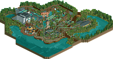
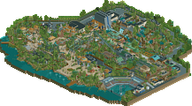
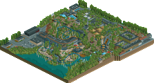
Dragon Flight is probably my favourite floorless coaster - the diagonal lift, the first drop and the interlocking vertical loops divided by the corkscrew make it different and exciting. I don't really need to say anything about the theming (I think all of JS's theming is great).
I liked the JP area quite a lot (nice to see a bare patch instead of damn cactuses everywhere), and the supports on the water ride were fine.
First of all, the entry area is good parkmaking indeed but it's boring as hell. That's how I felt about Moonlight Magic as well. A lot of it looks good but too much of it looks forgotten and except for the Quake coaster nothing jumps out as especially original or interesting. A good park but forgettable. I won't even mention Canterbury Falls. I looked at it once, that was enough.
But anyway now that you know what I think of what came before, I'll tell you why this is so much more impressive. Let's start with...
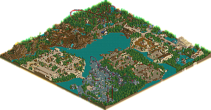
The Jurassic Park section. You all are crazy. This is the best section in the park. The flying coaster is excellent, it has interesting elements but more importantly a great flow from beginning to end. The two bare mountains look great. A bunch of bushes would have spoiled the look I think. Who made the rule that Jurassic Park sections have to be filled with jungle trees and dinosaurs? In fact, this section really reminded me of Evolutia in a way no other park has. So I congratulate Schuessler for this one. This is what Jurassic Park looks like to me. This is sorta hypocritical of me to say, but I think sometimes all those little details just get distracting. Elegant simplicity should be praised I say.
As for Merlinwood, it wasn't much of a section really. The medieval buildings are still boring. If I took pictures of medieval buildings in 80% of the parks on this site and shuffled them together who could tell the difference? Dragon Flight however is one exceptional coaster and probably the highlight of the park. The layout didn't strike me as particularly good but this is another ride that flows naturally. This is great coaster design. The medieval walls add a lot to the look of the coaster. Oh yeah, and bonus points for a great queue as well. So lame section, awesome coaster.
Marvel Super Hero Island was pretty daring. First of all he only used the new Marvel movies X-Men, Spider-Man, Hulk, and Daredevil which I thought was a nice touch. This section is just so different than anything I've seen before that I can't help but like it. It isn't beautiful and it does look too grey but it has a nice city feel to it. And the Spider-Man coaster is as well designed as Dragon Flight just a lot shorter and with a powered launch that feels like a cop out for a real coaster design. However, it does fit the section and it's also something new. Do we really need a lift hill? Are they really that exciting anyway? Another impressive section.
Hamunaptra is pretty neat looking. There is a good counterpoint between the trees and the tan surfaces. However, this isn't really something we haven't seen before. I'm glad the flowers aren't all over the place like in other Schuessler parks. This is a good amount of flowers for a section. The architecture in this section is pretty good stuff and I like that big old ride building. Flat planes work well in RCT if you use them right and this works for me. The actual Mummy ride is kinda boring as are most indoor coasters. And I must say I don't understand the logic of throwing all those pine trees in there. In any case this is a pretty ordinary section for a park like this but still nice looking and very IOA nonetheless.
The arabian section is also too small for it's own good. It does fit the park though and it doesn't need a major ride or anything. There's some nice detail in the theater building and I love that little fort section with Chimera Glass and the Coin Mint.
Lastly, the Lost Continent section has some neat touches like the Mythos building but is also fairly routine. The river ride has a nice design and some great building design. It does feel like it needs more so this is probably my least favorite section.
So some stuff I really like, some stuff I don't like as much but all of it is good. More than worthy of the NE spot I think and none of your uncultured ramblings will alter my opinion any. Schuessler has redeemed himself in my eyes.
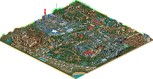
Enterance: Overall the enterance was nice, but a few of the buildings looked plain and in the end it came out as notihng special.
Marvel: Looking at the mini map pic tells the whole story, the whoel tihng is grey... and thats bad. While it may be a harder theme to do, it came out quite boring. I really think the use of a bunch more glass and color would have boosted this area's interest up.
Hamanaptra: Great landscaping and rides, boring buildings. Once again... even if Egyptian buildings werent the most interestign things to look at they looked better than this, and you do have some creative room to work with it. I would expect more than several giant square buildings, the one housing the coaster being the biggest problem.
JP: As stated earlier, it doesnt matter if real mountains are bare... in RCT bare mountians are jsut ugly and boring. The flyer isnt much to look at and the architecture is rather non existant except for a few very small scattered structures.
Merlinwood: A truly awesome area. For the most part a great variety of intricate architecture, but not without a few buildings lacking behind. Dragon FLight is an amazing beemer and probably my favorite. Great theming and atmosphere overall for this area.
Lost Continent: Wow that building housing Poseidon's Fury is ugly... way too bulky and absolutly notihng going on with it. The rest of the area is fine, but bears a strong resemblance of the egyptian section.
In the end I was rather disappointed as there was little that was likable to be found.
My favorite parks from Danimation and the early years of RCT were all recreations. The fantasy parks all contained huge coasters with two dozen helixes and 12 inversions etc. which I always found ridiculous. The recreations however had shorter rides with more interesting layouts. Recreations were also the first to implement double wide paths and buildings out of terrain because you can't go far in recreations without those. Later some builders started building fantasy parks with the same principles as a recreation. mrIce in particular was a big proponent of this but there were also others. CPRulz and Segaman75 made some great stuff and Aero21 made a lot of realistic parks with some elements of fantasy. I'm forgetting some others of course but you get the idea. So I've always loved realism in RCT parks which unfortunately wasn't the mainstream until NE really.
Strictly realistic parks limit themselves only to coaster layouts which are found in real coasters and coaster types that are actually built. They also tend to favor modest architecture which is much more typical in real amusement parks than the fantastic designs you see in some RCT fantasy stuff. Others take some of the realistic ideas but spice them up with huge rides, elaborate themes, and larger than life architecture. Both styles work well but some tend to prefer more or less of each.
So when I say I love this park understand that this is coming from someone with a stronger leaning toward realism in RCT. All manner of opinions are equally justified by situating people along this scale of pure fantasy to pure reality. Leaving hills blank doesn't make sense when thinking in terms of RCT and creating impressive fantasy but it does make sense if you want to capture the look and feel of a real life location.
And now with his view heard, the Persnickety Platypus goes off to dwindle in his mysterious ways...
A solid 8 out 10 rating!
BTW, all of the Spotlight parks on this site are wonderful!
Welcome to NE, Testudo, maybe you could share you FDS with the people who havent seen it.
*Stargazer*
Anywayz welcome to NE...wat is this FDS i hear about besides the spotlight one
Anyways, thats just one platypusses' opinion...