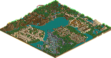
Park / Islands of Adventure Hollywood
-
 15-September 02
- Views 14,377
- Downloads 4,220
- Fans 3
- Comments 65
-
-
 84.38%(required: none)
 Spotlight

posix 100% no chorkiel 90% no robbie92 90% no Cocoa 85% no G Force 85% no Liampie 85% no RWE 85% no Scoop 80% no csw 75% no Poke 75% no 84.38% 0.00% -
3 fans
 Fans of this park
-
 Download Park
4,220
-
 Tags
Tags
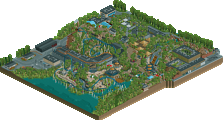
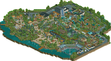

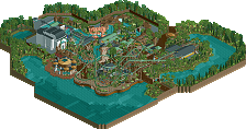
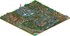
The Marvel Superhero Island section was very well done, yes it's a little TOO grey but that's just fine. I'm not a big fan of those brightly colored walls in RCT anyways!
Anyways, I give this park a thumbs up. Nice job.
Segaman
iris said, and I quote, "iris2486 (12:10:42 AM): You will LOVE this park in about 2 weeks".
No. NEVER! I don't necessarily hate it, but it just seems so... bare.
The Port of Entry: Yes, it has its moments, but the lighthouse is just plain sad. It is decent, but a bit too spread out and not enough stuff. If he would have pulled everything in a bit, and added some more shops, it would be more leeter.
Marvel Island: First off, the bastard stole some of my ideas for USP. I hate him. However, they were not executed nearly as well as mine were planned to be. The last half of Spider-Man is good, but the first part is poorly designed. And what the hell is that shit theming?!
Hammanaptra: It's not a bad area, per say, but it looks like it's missing something. I can't determine what, but some of the theming just seems lacking. Why are there so many trees in the desert...?
Isla Sorna: Not. Enough. Green. When you watch the movies, there is jungle stuff everywhere! This is just a brown hill. What about the bird cage (or do I have my islands mixed up...)? And all the Ingen buildings? If it wasn't supposed to be from Jurassic Park, I'd think it was better... but it doesn't scream JP at all.
Merlinwood Forest: This is the highlight of the park, although the area is small. Dragon Flight is good. Nice, fast, and exciting B&M (note: does not actually represent B&M coasters). The theming is excellent (especially the station). But, it only has two attractions. TWO! WHY?!
Lost Continent: I like this area, but it is not that high on my list of "Best Themed Areas". It has its moments, but it could have been much better. The stadium is nice.
I will never accept this park fully. It will not grow on me.
It's unfair.
+'s
Dragon flight was amazing
Entrance was nice (didnt like the lighthouse)
-'s
Marvel too grey - take the paths off the roofs and it'd be nicer
lack of foilage in jurassic area
i expected a little more but overall still nice
~Prince Ashitaka~
It's "per se," Ty. And Grinch. And anyone else that should learn how to actually SPELL words before using them.
"per say"... What a bunch of dumbasses..
GO SCHUESSLER!
THANK YOU HARAKIRI!@!@!
(please note that Ty has the power to edit your posts and/or kick you from the thread)
I LUV U@##%@#@!@
I can compleatly understand this, however it doesn't excuse the fact of it being so bad. There is absolutely no excuse for crap.
Iris, in case you haven't noticed, this is not real-life, this is a game. Within this game, a bare mountain is hopelessly ugly, and it compleatly ruins the look and feel of the entire area.
No, he stole it from Snowbound. However, the rest I agree with compleatly.
I agree, not all areas must have coasters. In fact, a park jammed with coasters is becoming so cliche it's, um, bad. However, the coasters in this park are truly terrible, and hopelessly unoriginal. There is not one thing remotely enjoyable about watching these coasters, except what one could gain from watching any coaster.
This is a problem.
The difficulties with the architecture are not over glitz, but boredom. We've seen the same thing over, and over, and over, and over, and over, and over, and over, and over, and over, and over, and over, and over, and over, and over, and over, and over, and over, and over, and over, and over again. Why would we want to see it anymore?
I think that a few of the coasters are nice. Dragon Flight was done very well imo, and Spider-Man was fun to watch. The flyer wasn't my favorite ever, but it was still a good ride, and it fit the area right.
About this being a game, I understand that, but lots of people in this game try and make things as real as possible, so they take more qualities of a real life park then a fantasy one.
Hive, grow up man, and stop blowing Chauncey.
Damn! How did I forget that one? Yes, Dragon Flight is an amazing ride, the rest aren't.
Anyways, maybe I'll actually get a reveiw done of this park, especially because I have opinions on this park, and I need a wider form in which to state them. But you must factor in my inherent laziness, and the fact I'm actually trying to regain my life after breaking into tear due to self pity, while listening to "Nowhere Man."
The Beatles can change your life dudes.
Fatha' Offline
Well, here goes.
This park was amazing when it first started out, but as he progressed and worked, i became dissapointed. Iris and I have had many talks about IOAH, and since its finally done, i cant give it a rating. Its quite low, not in the 9 range, but still, the park gets what it gets from me. I give the park a 8/10.
Why?
Many reasons.
Let me start out with the cardinal sin known as Jurassic park in IOAH.
I could care less whether a mountain is bare in real life, whether Spiderman's building isn't flashy, in RCT, you should always make mountains have at least shrubs on it. The flyer is good, but the station? Horrific. JP was probably the most dissapointing area ever from a top notch parkmaker ive seen.
Next, on to the Arabian/Poseidon area. Why combine two area, that really should never be combined. The river ride was good, but another sin in my rct book was commited. I think u should NEVER leave the river rides supports veiwable. it looks bare and undone in my mind.
Next we have the Marvel area, which isnt great, but i known how hard it is to theme a city. So i give props here.
The entrance is marvelous, one of the better I have seen.
Dragonflight is good, and the area around it is to. A+ here.
The Egyptian area is nice, except for two things. That horrendous temple that that flat sitdown coaster lays in, and the kiddie. I dunno why people make lifts, bank them at the top, and then drop. The exit of the lift is slow and boring, and it hurts the rest of the coaster. Other than that, nice area.
So, final rating sits between a 7.8 and 8/10.
w00h00 off to vy00
Props on using diagonal track. Not many usually do that, but it is making a comeback.
Great job on the B&M
That mummy ride was boring to me.
Great architecture.
The island wasn't an island, so what was it exactly?
Lots of path on that island, but still, you pulled it off.
I'm glad someone noticed the typical 'RCT-Sins'. I've done a '7deadlyRCTsins.sv4'
Maybe you could do something like that yourself and put it into 'Fatha's Rant' ...
what u think?
Jurassic Park was awful. It takes 5 minutes to put some shrubs on.
The Marvel zone was good, but a little, well, weird. Can't put my finger on it.
The Inverted was good, well paced, well themed.
Didn't like both the Egyption coasters. Not my cup of tea really.
About 7.5/10 in my book.
Port Of Entry: Very nice. I liked this one a lot, except the part near the lake, it looks rather plain there. I also thought the tower didn't really fit with the rest.
Spiderman: My favorite area. I didn't liked it at first, but I do now because of it's simple style with a very fresh atmosphere.
Egyptian: I liked this area a lot, especially near the scorpion king. The only thing I disliked was the building of the mummy and the caroussel. Again, too plain. Harakiri's is ofcourse right to say that the real Egypt wasn't that detailed, but to quote CG: This is rct.
Predator: This area sucks. Final. Very unthemed and plain. The flyer was too short and the plain rocks were a pain in the eye.
Medieval area: This is very nice. A good combinaition of medieval and woodsy theming, with a very nice, unique, floorless. And, fascinating, bushes at some of the rocks.
Lost Continent: The roman theming is nice. So is the Arabian, but together; it just won't do. And there's also two big buildings, rather unthemed (that word again) that ruined the area. The lift of Poseidon and the theathre, that is.
Overall a okay park. Too bad it was rushed. It had some potential to be a great park. Still, I think another park should have won. I, btw, have a nice little theorie about this spotlight. I just don't feel like getting flamed here.
7,4/10