Park / Islands of Adventure Hollywood
-
 15-September 02
- Views 13,700
- Downloads 4,102
- Fans 3
- Comments 65
-
-
 84.38%(required: none)
 Spotlight

posix 100% no chorkiel 90% no robbie92 90% no Cocoa 85% no G Force 85% no Liampie 85% no RWE 85% no Scoop 80% no csw 75% no Poke 75% no 84.38% 0.00% -
3 fans
 Fans of this park
-
 Download Park
4,102
-
 Tags
Tags
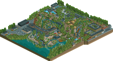
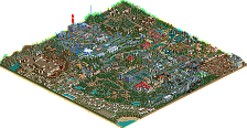

Post Comments and Congrats to Schuessler.
(Maybe he'll even post now!
Nice Park!
especially Goblin and Spidey
great job, not the best park but great job.
Lost Continent- Excellent. Not too bare, but not overthemed either(I should know the difference).
Merlinwood- Fucking great. Dragon Flight is my favorite RCT beemer ever made. Almost perfect. in fact, I can't see anything that I don't like about it. Very ambient. I hate JS for making this one.
Jurassic Park- Not what I'd expect. Then I remember that it's Isla Sorna and I am a dumbass, so I just have one one quarrel with this section- not enough foilage. Yes. Look at that lack of foilage in Jurassic Park.
Hammunaptra- The ONLY thing I thought was bad about this secton was the lack of detail in the Chamber of Doom building. Then I remember that most Egyptian architecture didn't have THAT much detail. THEN I think, "Well, that is why their sun god got Romans to destroyed them all... They didn't work hard enough." and then I get pissed again. Go figure.
Marvel Superhero Island- I didn't like this one. Too "grey" think. Or maybe it's something else, I'm not sure. Whatever the case, the coaster was nice, and theming was rather innovate, but I'm just detached from this particular section.
Rating- I don't do ratings, so I'd just say that the park as a whole is awsome. When I saw that JS were making an IOA, I said "Fuck. Now I'll be going after Schuessler" with my IOA park. X-Sector's will be fairly easy to try and outshine, but I know that I won't outdo this one. The way JS tied everything together was great, and I sure hope HIOA doesn't shame IOAH in the battle of pseudo-Universal vs. the prolific pseudo-Disney.
Overall I would give the park a 8.5/10.
Great job Schuessler.
[Mr. Glass]
My favorite part of the park has defiantely got to be Dragon Flight. To me, this is the pinnacle of what a Floorless Beemer should look like in RCT. This is my new favorite coaster.
I also liked all the other sections of the park. Keep up the good work Schuessler and don't quit like a lot of the RCT Legends are doing at the moment.
One would have to be the lack of anything in the Jurassic Park section...It just seems so boring and empty...
Second, the lack of substance in some of the sections...If some would've been extended more, they're would've looked more full and nicer...
Third, the shortness of some of the coaster...It's really not too big of a thing, but itz noticable.
I did like your take on Marvel Island, was very nice and executed perfectly...Hope to see something more come from you...
thanks
~Prince Ashitaka~
I guess I'll have to wait until after work now.
Oh well. It's by Schuessler, so it should be one of the better ones.
Kai
Overall, it was a nice park. I just think it will be overrated because of JS's status in the RCT world.
this park puts me to the most outerst zoom.. to realize it still doesnt pack detail nor punch.
spiderman is a bad coaster, although a nice end that should be after a nice beginning and one inversion just isnt enough. terrible... and the worst area in the park.
the mountains in jurrasic park scared me.. with harakiri, NeViS, myself, Iris, rrp, xsector, grinch, ETC theming every scrap of land to the best of our ability.. this scared me.. the coaster... Y ANOTHER LAUNCH is spiderman and the mummy ride not enough? the two half loops in the same direction didnt look at all attractive either.. tho i liked the half cork..
Dragon Flight.. now thats a beemer.. tho two things.. what the heck is "no entre" and y is the station that small.. surely a great big park like universals would make sure theres atleast two trains...
the arabian area with poseidon really lacked a coaster, thrilling ride, innovative ride, nice good looking water ride.. heck it was just boring theming..
entrance.. this i actually liked.. tho a bit more detail wouldve done well.. and the blue building
i did not like the mummy ride either..
sorry to have to bash this park so much.. maybe it still has to grow on me.. for now i think it sucks..
on a side note... MY PARKZZZZ are comin in for next spotlight and/or hiddens!!! get MaT, DToE, and UTML in two weeks!
To me it seems as if Schuessler had a time limit to finish this park!
- all brakes are very brutal
- banners say 'Happyland'
- some edges aren't any themed
me loving MM so much I was really mad about Schuessler's next park... but... hmm...
MM is better imo.
The entrance blew me away but as I took my way through the park it got worse and worse...
Dragon Flight is a very nice Coaster but MM's medieval section looks exactly the same ...not to say better!
Marvel looked crap honestly! The urban theme in general is crap and Spiderman was =/
The thing that shocked me really bad was the kiddie coaster & that indoor ride! Gosh, this is terrible!!
well, surely it's a nice park but it didn't do that much for me....
Entrance - Now this was awesome it wasn't like the really port of entry which is a mix of styles but that doesn't matter this is minor criticism.
Marvel Super Hero Island - I liked this area it had a great layout with nice coasters the only problem it does seem a little bit grey all over this is minor criticism.
Hammanaptra - Now I loved this area my second fav area of the park it has a great layout and constructed well i like the colours of it.
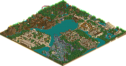
Isla Sorna - the flyer was nice looked odd at first but I have got use to it and I like it. I really like how you have done the area but I think it does look a bit bare on the mountian and The area seems to be all brown but that isn't really bothering me I think this area will grow on me more and more each time I look at the park.
Merlinwood Forest - Now this is my fav area the beemer is fantastic and the area is be constructed great my only problem is I wished it was bigger (minor criticism again) as its awesome.
Lost continent was amazing as well just like harakiri said its not bare and its not overthemed its just right.
Great park some bits were disapointing but that doesn't matter iam sure this park will grow on me more and more.
EDIT: well I been looking at this park for about 2hrs now and as iris said this park will grow on you and its taken 2hrs and iam loving this park now. I said the jurassic park area will grow on me and it has I first off said i didn't like the moutian bare but i was thinking not all mountians are covered with bushes and trees and the area does make you think you in the movie. Hammanaptra is now gotta be my fav area of the park it is just constructed so well and it just looks so superb. One thing i forgot to comment on was the architecture I thought this was the great architecture that JS always does. Marval area has also grown on me more I really don't care if its grey that much.
Good but not awsome
Entrance - VERY NICE...the entrance was this parks best quality along with coasters
Coasters - The coasters were very good and themed well (not pteradon flyers.) I really liked Dragons Flight and Spiderman tho.
Architecture - The architecture that this park had was very nice but i hink the park needed more architecture. there were some places where there was too much path and not enough architecture
Theming - The themeing in this park was very nice...with some exceptions. The moutain next to Pterdaon Flyers was BARE. Completely BARE. also, some more themeing wouldve been apresiated in the Spiderman and Mummy sections
Overall Look - This park had a very cool overall look...but when you zoom in, you can start to see its defects. Good job...but not the greatest.
Rating - I used to do rating but then i stopped...so i guess ill only do them now for Spotlights...8.1...Nice park...but not the best
1.Schuessler was on a time limit to finish this park, as he's heading/headed off to college, and was rushing to finish this park before college.
2.Not every park in RCT has to have every single tile of path fully themed. Some one isn't allowed to have a bare mountain? It's a mountain for god's sake, mountains ARE bare in real life.
3.This park took a different style then the current "NE style" of parkmaking, which it seems like everyone is trying to imitate. People, get you're own style! Schuessler has his.
4.And why do some people think that every themed area in IOA has to have a coaster? In the real IoA, only two themed areas have coasters (not including Pteradon Flyers, since 99% of patrons cant ride it). This park has all but one area with coasters, and some great coasters to.
5.I'm wondering why people think that the architecture isn't "flashy". Seriously though, if I'm making a realistic park, I'm not making my buildings flashy. I'd like someone to take a helicopter view over IOA, and look down at Spiderman, and see if that building its in is "flashy".
Anyways, just my thoughts.