Park / [NEDC4 13/15] Glow-Worm
-
 21-April 17
- Views 3,669
- Downloads 694
- Fans 1
- Comments 20
-
 58.75%(required: 65%)
 Design Submission

CoasterCreator9 70% alex 65% Steve 65% trav 65% posix 60% bigshootergill 55% Coasterbill 55% Faas 55% chorkiel 50% Stoksy 35% 58.75% -
 Description
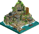
My entry for the New Element Design Challenge 4, enjoy!
-
1 fan
 Fans of this park
-
 Full-Size Map
-
 Download Park
694
-
 Objects
1
-
 Tags
Tags
![Park_3798 [NEDC4 13/15] Glow-Worm](https://www.nedesigns.com/uploads/parks/3798/aerialm3428.png)


![park_4178 [H2H8 Grand Finals] Heaven's End](https://www.nedesigns.com/uploads/parks/4178/aerialt3929.png)

this park was a bit hard to judge because its quite nice but very sparse and there's really not much there. at the end of the day, I probably wouldn't give it design in real life, and the fact that the layout (which is the main piece of interest here) wasn't yours really makes me skeptical about the content of work. that said, the rides were nice and the foliage was wonderful. the atmosphere was generally good although the dead-end of the path is a bit awkward. I just want to see more fairy-tale/fantasy stuff if that's the direction you take it!
Just bringing my comments over from voting:
The functioning magic mushroom swinger was really cool. Unfortunately, there's nothing else to really comment on. There was no architecture, foliage served a purpose but didn't really accomplish much more, and the use of bobsled was rather pleasant and quite clean.
This made me smile. Super charming little rides, nice pleasant atmosphere; shame there was so little of it and that the coaster felt wildly oversized for the area.
I really liked this. The mushroom swinger and the Sunflower wheel were adorable. I also liked the simplicity of the station and your color choices. I feel if there was more you would have hit design.
Voted 55%
+ Honestly, the premise behind this idea was really good, it just needed more time and effort to earn my design vote
+ Magic Mushroom ride was very well executed, great job! I’m going to have to steal your idea for the mushroom top for one of my projects!
+ Other ideas were great too, like the sunflower wheel, even the awnings for the coaster were fun
- It seemed too rushed to me, the supports in some places were great, others were poorly built, the station was barely a station. Keep pushing ideas like this though!
If I wouldn't have seen screens from Faas' submission, I'd think it would be a Faas submission. This screams cuteness all over it!
Supporting is topnotch and I really like the colors you've chosen for the coaster. The mushroom ride is pure genius and the sunflower wheel is also a great idea. The landscaping and foliage are great too.
I feel the borderline design score is a justified and good score. It just lacks stuff! Overall there's a great atmosphere but there's hardly any archy and almost no interaction with the coaster. With a bit more content and better park planning, this could have scored higher. Great job nonetheless Che!
This was very cute! I really enjoyed the foliage and the mushroom swinger.
Could have done with more content, I'm thinking buildings similar to the Arthur stuff at Europa Park. That would have taken it to the next level.
Not bad. Great idea, good execution. But there is not enough content (especially since the layout isn't yours) to justify design. Keep pushing themes like this though!
I agree with everything above. That what is there is executed well, but there is just not enough of it. The design misses architecture and some cool coaster interactions.
Simple but clean and very charming. Maybe a tad content-light but still had fun ideas throughout like the sunflower wheel and the mushroom swing. I also really liked the overall composition and your path layout - I think choosing to bridge the coaster where you did rather than where most of us did (over the cobra roll) payed off well by giving peeps a good view of the drop. Simple, bright and well executed foliage. Great colours. The more I look at this entry the more I like it. 65%
This was just pleasing and everything that was there just needed to be there. And what is there, was executed well. Hit all the marks for a design right on the head. No more and no less.
Very beautiful entry. Colours and foliage are superb. Hope to see more from you. Good job!
This theme was really cool. That mushroom looked really cool. Like most people have stated already, it was simply just too sparse. There wasn't enough content to hold my attention for long enough and aesthetically it wasn't enough of its own thing to warrant a long look.
The most underrated entry in my opinion. First of all, color choice is amazing. So much taste and creativity, but also a clear desire for minimalism that works really well here. I understand people saying that it's sparse, but it still looks totally credible for me. Great foliage. Great "drugs" tag.
minimal but the theme is legibile. lacks ambition, but to be fair this is the most underrated entry of the non-designs.
More CHE work please!
This one was pretty cool. You're definitely having a lot of talent, CHE! There isn't much to see, but what you're having overthere is pretty cool. The mushroom swinger is definitely awesome.
I would have loved if you would have expanded the theme a lot more though, since as it is, a view on it sadly doesn't take long.
Great entry though, and i hope to see more from you soon! Maybe some german collabing could also be cool haha
60%