Park / [NEDC4 12/15] Shimmeria Subway
-
 21-April 17
- Views 3,919
- Downloads 568
- Fans 0
- Comments 25
-
 59.38%(required: 65%)
 Design Submission

CoasterCreator9 70% bigshootergill 65% posix 65% alex 60% Faas 60% trav 60% Coasterbill 55% Steve 55% Stoksy 55% chorkiel 50% 59.38% -
 Description
Join Walibi and his friends on the craziest, wackiest, most mysterious subway ride in the musical country of Shimmeria! All aboard!
-
 No fans of this park
-
 Full-Size Map
-
 Download Park
568
-
 Objects
1
-
 Tags
Tags
![Park_3797 [NEDC4 12/15] Shimmeria Subway](https://www.nedesigns.com/uploads/parks/3797/aerialm3430.png)
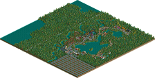
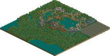
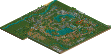
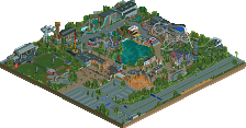
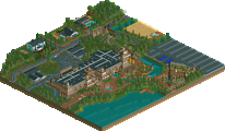
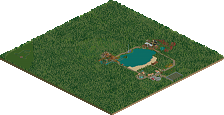
definitely not bad at all, just a little bit plain. I would have loved a little more than a mostly generic theme tbh, but I think the surroundings are generally quite pleasant and some of the archy is well done. its a little bit inconsistent, and a little bit nothing-new, which is probably why its down so low on the list. but that's not to say the work is particularly bad, just I would like to push you to really challenge yourself to new themes and original atmospheres
Just bringing my comments over from voting:
Ah yes, the return of the classic textureless brown Jappy roofs. I will never understand why you do this haha. The dodgems facade and sugar sweet truck were both brilliant. Unfortunately, a lot of your other architecture fell back towards some rather odd form, colour, and texture choices. I'm not sure you're quite understanding how best to incorporate different path types and the crazy paving + tarmac used here is quite awkward.
I'll decline to comment on the foliage, I think it's just reached the point where I can't articulate why I don't like it anymore lol. Anyways, park surroundings weren't bad, but should have really been fleshed out more with some subtleties in path colour/texture and possibly some movement would have helped here as well.
I think Animal Kingdom is where you should be going, this seemed a bit of a step back towards some of your older releases which are borderline rather than pushing higher accolades. More dodgems and sweet trucks. Less gazebos, pizza solos, and textureless roofs plz.
Default color scheme
0%
I thought this has some excellent path interaction. Probably one of the strongest in the contest from the standpoint of what the peeps see and what's hidden from view.
It seemed to be aiming for mediocrity, with a sort of generic and mostly un-themed park environment, which made it far less memorable than just about everything else.
It might be because I can't see the other entries to compare it to, but looking at it on it's own I probably would have voted 65% on this. I thought the facades on the mainstreet were all very charming and liked the details like the signs. Some of the backstage areas seemed kind of out of place compared to everything else but I still really enjoyed this entry.
Voted 65%
+ Classic Jappy style park, love it as usual (that means you’ve got a reputation on this site now, but it’s a good one)
+ I appreciate how you built the context of this park, the surroundings make it much more real. Maybe the guests can pick up a beamer after they leave the park J
- Perhaps one of my downfalls too, but you seemed to use color for the sake of using color and it came off a little bit too bright in my opinion
- I wish you had more time to bring more depth and details to this design, for example the station façade seemed too flat
I rather enjoyed your submission Jappy. Of course I've been to Walibi many times and I think you translated the Walibi feel very well into RCT, kudos for that. The song is horrible though
For me, this is easily the best pathing we have seen from you. Archy is typical Jappy and also typical Walibi, you should do more Walibi-esque parks! I do understand the complaint about the brown flat roofs, I think black works a lot better but for me it's not that of a problem.
I like the Wab shop and the bumper cars facade, that last one is a bit too blocky in its shape. Playing with shapes and height differences would have worked there, and it's something that you still need to do more in your archy in general.
I like the coaster, would've like to see more interaction with the cobra roll but ok, it's not that unrealistic. Love that you included some flashback And you've spent a lot of time to the outskirts. Again, very recognizable.
For me, this is design worthy. I can understand that others don't feel the same way, for me seeing the Walibi touch in RCT does a lot of course.
Yeey! It's out! And it scored not bad for the amount of effort I put into it.
The archy: this part of Walibi was a bit strange. it had a French and Italian theme years ago, but in 2011-2012 they threw a whole bunch of paint on it to match the colourful music theme they got going. I like the brightness personally, but it was tricky to translate it into RCT without making it look...TOO bright. I believe I sort of succeeded. About the brown textureless rooves, I mosty use them out of ease and object-saving measure. Something I realise was actually kinda pointless on a project this size. I think you can hear me coming, yes, those flat rooves have been used in my current zoo project, but they're not that big of a flat mass as seen here. And I actually have to save object space in that one so I hope you can excuse me for using them. I promise to look for a new flat roof in my future projects.
Just to post some pictures of the real-life area...
The path: Walibi Belgium is known to have the worst path ever. Especially in this area of the park, it's pretty bad. Mixtures of tarmac, tiles, concrete... And not even in any order, just...mixed. I wanted this to have the same feel but again, not trying to go overboard with it so I limited myself to crazy path and tarmac.
For the general feel and style, I first wasn't planning on participating in NEDC because I had no general idea about any sort of theme. When I got inspiration, the deadline was already quite near but I hadn't got much time left because real life. So I kinda went on auto-pilot for quite a few parts, falling back into my old clichés because I wanted something finished. Could it have been better with more time? I believe so, yes. But that wasn't an option.
Stoksy: foliage is better in my big zoo project, I'm sure you'll like it there. If not, I'm goign to shoot myself.
bsg: flat station? You should see the real Psyké Underground station, mine is an upgrade of that in comparison.
Oh yeah, FredD? More Walibi-esque parks? Very maaaaaaybe, but don't hold your breath... Not until I feel perfectly comfortable in the boring, one story realism style.
@IonZer0: What default colour scheme? I painted it this way myself! Nothing default about it!
I thought this was good overall, but not quite design standards.
I loved that you took a slightly different approach to pathing to everyone else, with the path going under the loop rather than over the hill after it, or just not crossing the track at all.
I also enjoyed the little details like the truck and the park map. But the archy really let you down here. It was too basic and textureless for the amount of colours you used. I know the idea was Pskye Underground, but I feel like that has a lot more texture to add to the colours.
Perfect Walibi recreation. Unfortunately, that is what makes this design mediocore.
Needs more love, but still very good. Love the little truck. I think you're improving with each realease. Keep working hard!
Interesting to see you try a more ‘realistic’ style, and i think it works well for you! Your archy is stronger because it’s lost the texture-layer-cake look. Take the ‘Wab shop’ building for instance - it’s simple, clean and well coloured. Same goes for the games and the cafe. I love the crazy mural on the coaster station too. Composition and path layout is good but could’ve been improved if you crossed the coaster the same way Che did in Glow-worm. Looks a bit too tight/awkward with the path going under the loop. I’m not sure if the highway adds that much but the dealerships are kinda cool, as is the sign. LOVE the yellow ‘sugar sweet’ truck and the park map. Generally it’s nice but feels very safe and lacks impact. 60%
Most of my thoughts have been put to words already above.
Not really much of a problem to me - and you can blame this on Walibi - but what did this thing have to do with a subway?
Rushed and primarily uninspired both in structure and composition. Definitely a weird path layout, idk if i like it or not. like it's good interaction but it also doesn't flow. high marks on the dodgems, though.
The supports on the path are awkward. I don't know walibi, so I can't say much about that, but I really liked the whole station complex. Nice realism entry.