Park / [NEDC4 2/15] - Ghoul
-
 30-April 17
- Views 5,373
- Downloads 716
- Fans 3
- Comments 23
-
![Park_3790_[NEDC4 2/15] - Ghoul](https://www.nedesigns.com/uploads/parks/3790/logot.png)
-
 78.75%(required: 65%)
 Design

trav 90% CoasterCreator9 85% Cocoa 85% Stoksy 85% alex 80% bigshootergill 80% posix 80% Faas 75% chorkiel 60% Coasterbill 60% 78.75% -
 Description
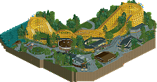
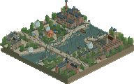
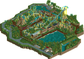
Our premiere attraction, Ghoul, comes to life in a vibrant fall setting in one of the top amusement parks in New England! Come take part in our annual Autumn Festival where pumpkins run rampant, and Rosie's famous apple pie makes it's limited release!
Do you have what it takes to enter our haunted estate and take on the Ghoul itself? -
3 fans
 Fans of this park
-
 Full-Size Map
-
 Download Park
716
-
 Objects
1
-
 Tags
Tags
![Park_3790 [NEDC4 2/15] - Ghoul](https://www.nedesigns.com/uploads/parks/3790/aerialm3443.png)
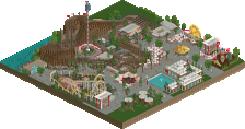
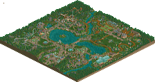


Voted 80%
+ Your experience shines through in this park, from top to bottom you did such a nice job in executing this design
+ Archy was so solid, what a great coaster station!
+ The foliage and setting of this coaster was spot on, you have a gift in pulling all the elements of a park together, you didn’t do too much or to little
+ The coaster really felt like it fit properly in this setting
- We don’t have enough Steve releases on NE
Full review later on phone now
I think I could have given this 80% easily.
In the end, I really enjoyed the foliage and architecture, though I thought some of the paths that run through the forest were a little narrow and hard to see.
Overall, excellent submission, and a very worthy Design win!
I love your brand of realism steve. You integrate backstages and the (usually) unappealing stuff into your themed architecture in a way that is never jarring. Interesting new theme which played to your strengths in terms of how you make buildings I think. You absolutely nailed the autumnal foliage, loved that. Path layout worked well, felt very organic and was quite different to most. I like the viewpoint over the water of the first drop from where one of the path exits the map. I could imagine myself being there. At first I thought the coaster colours were too bright/saturated but the more time I spend with this the more I like how much it stands out and think the pink/magenta complements the autumnal foliage really well. If I had to nitpick (and I do) I think the park is lacking some storytelling details - I understand the setting is New England from the architecture and it’s got something to do with american Witches and Ghoul’s from the naming but I would’ve liked to see some specific cool ideas/details (like the ones #diamondheights was full of). Amazingly beautiful park though. 80%
PS I had absolutely no idea you built this on your smart phone. WTF. I can barely manage using a simple web browser on my phone without miss-clicking.
Just bringing over my comments from voting:
Fuck yes Steve!! Loved this from the moment I opened it actually. It retained your capacity to create an inviting atmosphere, but was also architecturally superior to some of your previous work (eg Fenrir). Other than the fact the foliage often hid some of the things I really wanted to see, this was easily my favourite entry.
The layout was given a really beautiful framing by foliage, pathing, and architecture with wonderful viewing opportunities by the bridge and I can so easily imagining being able to get a complete picture of the coaster upon immediate entry to the area nearby the motion simulator.
I must admit that I think I've rather underestimated just how good you are at architecture Steve, until this release I've never had you in my mind as someone who's architecture I'd aspire to but I think this entry is true evidence that you should be in that bracket. Although at times (again) obscured by foliage, the form, texture, colours, and detailing on every building in the park was absolutely on point. The facade for Witch Hunt is unbelievably good and a prime example of this.
Comfortably best entry for me (although not quite at the heights of 90+), brilliant work Steve. I'm loving the productivity and this makes me even more excited for your nostalgia project!
this was my favorite of the whole lot. I have one gripe only- and thats some misplaced trees. you've covered amazing architecture and cramped paths in a few areas by some massive, unecessary trees! ugh so frustrating
that said, everything else is perfect. easily the best new england theme i've ever seen done here. the station is hot af, the foliage is so atmospheric, and it feels like an awesome section out of an american themed busch gardens. the setting is breathtaking, colors are spot on, etc etc. great work, and incredible that you did it on mobile. if I had less readings to do on the bus, I reckon I'd have a crack...
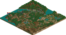
Firstly, the trees were intentional and not exactly "misplaced" or anything. Every piece of foliage in this was done with great detail. Both in the placement and what they are colored as. I had all of these huge trees amongst the paths because I was referencing local parks up in NH that I attended as a kid, which are basically built in the woods. I know it's not the best for viewing parks in RCT but that's what I wanted. It was risky and I knew that going in. I like the look of it, myself. I do see how it could be frustrating or distracting but if I wanted the viewer to see something then you'd see it. The trees are there on purpose.
Second, yeah this park was mostly (nearly entirely) done on my iPhone 7. However, it's not as wild as it seems. I don't know how many times I need to stand on my soapbox and preach to you all the benefits of this new tool we were given (without even asking, no less), but this is proof of its capabilities. I'm always happy to discuss more on getting people started using it or answering any questions. Send me a PM or find me on Discord. It's so easy to build with whether you're on a brand new iPhone or an old beat up Android (I'm guessing). Everyone should utilize this great new tool.
Thank you everyone for the kind words. I had a blast building this and honestly it's probably my work in the most proud of. Huge thanks to the entire admin team for putting this on, and to the accolade panel for your voting. Can't wait to see what's next for New Element.
Great entry, Steve.
You really put a great map together. The architecture really steals the show here as I think is typical in your work. I love the dark ride facade most. It upstages your coaster a bit, but that's not a problem really. Being a more recent addition according to the dates, that makes total sense.
I really didn't have a problem with the foliage. A lot of us under-tree in order to make things more visible, but that's a trade-off of in-game viewing vs. perhaps a little more realism. I enjoyed pulling out a few to properly view the buildings, but I don't think I'd have liked to see you leave them out. And the fall colors were just great. I do love a good colored tree and these worked out really well for you.
There's some realistic things I'd have maybe liked to have seen. A maintenance bay for one-- a park with this quality of theming could definitely afford that! Vehicle access to the area you have cleared out underneath the coaster would be useful (necessary) for annual maintenance.
But honestly when it comes to stuff like that it's splitting hairs. This was a wonderful design and I hope (expect!) to see more out of you very soon. I will never get tired of your work.
I know I voted on the lower end of a lot of these so I feel like I should sort of explain my position on that. I really like this layout but I feel that it lends itself better to a Spotlight submission than a Design submission.
Everything here was really nice and tastefully done but I feel like the coaster feels really disconnected from everything else aside from the cobra roll (which everyone tried to play with and in most cases did it the same exact way, just like you did here).
I really liked this, but it didn't feel cohesive in the sense that a typical Design submission does. The ride is hidden from most of the path with the exception of the cobra roll and it would have been nice to see some visible supporting rides.
On the plus side, the architecture is really nice, the entire thing is very clean and despite the critiques I still really enjoyed this. Good stuff and congrats on Design.
Steve, on 01 May 2017 - 2:26 PM, said:
This... what... how...? iphone...? explain...?
AvanineCommuter, on 01 May 2017 - 7:21 PM, said:
http://www.rollercoa...tycoon-classic/
Lovely stuff. Love the colors of the coasters! This is clearly the best realism submission. The archy is great and the kind of American archy I like to see. You created a great environment to place the coaster in. The foliage is great and fits the theme very well.
The bridge over the cobra roll is a clever way to interact. Found it a bit weird that you placed a big green box next to it?! Doesn't add anything in my opinion. I love the orange pumpkins every where! Overall this is very atmospheric, would like to see more work from you man!
Wait, wut? THIS.... this is built on a phone? Via an app? Can NOT believe that!
Not much to say, it's awesome. The foliage is great, yet sometimes a bit too dense limiting visibility. But like CP6 said, that's a choice you make as a player. The archy was very American IMO, so well done. I love all the different halloween decorations around the park.
This was my favourite entry, looking back I maybe should have voted 80%.
The architecture was spot on, and the surroundings complimented the coaster really well. I actually loved the foliage.
Incredibly glorius as always. Subtle and interesting theme, the coaster's colours are just spot on, foliage is unique and the different colours just work so well.
Textures are wonderful too and you've integrated the backstage areas so well they don't deduce the atmosphere at all.
Love it, love it, love it.
This is great! I really love the colors in the foliage and the arechitecture, worked so well together, and the way you integrated the coaster is perfect!
Would have maybe loved some more details here and there and something more done with the water, but overall this is definitely one of my favourite entries of the contest!
Great work and congrats on the design, dude!
80%
https://www.youtube.com/watch?v=pJHzrhC9k3Q
https://www.youtube....h?v=pJHzrhC9k3Q