Park / [NEDC4 10/15] - Apollo
-
 23-April 17
- Views 2,682
- Downloads 574
- Fans 0
- Comments 15
-
 61.25%(required: 65%)
 Design Submission

bigshootergill 70% chorkiel 70% CoasterCreator9 65% posix 65% alex 60% Coasterbill 60% Cocoa 60% Steve 60% Stoksy 50% trav 50% 61.25% -
 Description
Made for the NEDC4.
-
 No fans of this park
-
 Full-Size Map
-
 Download Park
574
-
 Objects
1
-
 Tags
Tags
![Park_3787 [NEDC4 10/15] - Apollo](https://www.nedesigns.com/uploads/parks/3787/aerialm3441.png)
![park_4712 [NEDC5 - 05/10] Fireball](https://www.nedesigns.com/uploads/parks/4712/aerialt4594.png)
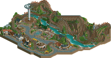
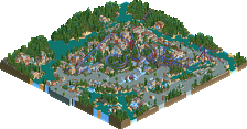
Voted 70% (surprised by the two 50% votes)
+ Always love the unique Faas style of building
+ It’s almost refreshing to have an old school feel to this NEDC, it’s probably been quite awhile since something like this was released.
+ You did a really cool job in pulling off the crumbling structures, while maintaining some semblance of order
+ You always show creativity in little areas, like the funky pillars in front of Neptune, even the way the queue for Apollo is situated along with water is a nice touch
+ The varied landscape and foliage works well here, provides a good mix for the setting
- I felt like this design needed something more to compete with the other submissions, but I assume you weren’t gunning for top spot, but you did a great job and I feel this is design worthy!
Worth prefacing here, the main reasoning behind all my votes is broadly explained for this entry.
Just bringing my comments over from voting:
The use of a protour bench was an unexpected approach to this context, but I think served you relatively well. There was a lot of nostalgic appeal in using an old bench and was a nice almost callback to the pre-realism NE 'style'. I unfortunately don't think this really did enough to warrant a design though, maybe I'm not nostalgic enough haha but even minor improvements like not having the water 20m deep wouldn't have really brought this up appeal-wise for me.
This seemed to be a real reflection of the nature of the NEDC contest, because the layout is definitely design quality so much more critique is given to surroundings. If this weren't NEDC then this entry would be pushing 60, maybe even edging a design for me. But because the layout is 'known' I find myself giving much more scrutiny to all the other park elements.
It's still pretty classic Faas, and I appreciate that you really have your own style of building. I wish that style was to my tastes.
I did like this. It was maybe a little short on content but it had a good classic vibe and I think you used the environment/ layout in a different sort of composure than a lot of people did, which is nice to see. so yeah in general pretty solid- maybe not quite interesting or memorable enough to really push it into a design, but I enjoyed that you experimented with the bench and object choice.
Had two goals with this one, I wanted to send in something cool for the contest, and I wanted to experiment with a classic bench. I succeeded at both I think.
This submission had some of the best interactions of the contest.
The placement of this coaster was perfect. but there wasn't quite enough content for me. What's there is lovely though.
Nice and simple. You have a knack for making simple look really appealing though. Loved the colours and composition, though maybe it was a tad cramped around the cobra roll/splash boat station, compared to how open the rest is. I like how the station was ruins rather than an intact temple structure, and you executed this well. Boat ride was a nice choice for a 2nd ride. I can imagine it being cool for peeps to flow along that aqueduct watching the coaster going by. Generally a pleasant entry but not really stand out in any way. 60%
I don't think the size is an argument for this not winning, not at all... This is exactly what a design should be and anything more would be a bonus. Plenty of iconic designs are just this. A coaster with direct surroundings and everything else cut away.
I think it should've won but I can see why it didn't. The theming was hit or miss. Station area didn't do much for me, but the row of temple structures on the hill in the background, the asymmetrical bridge over the splash, the aquaduct and the cross-shaped building are all hot. Overall style is appealing, with lovely colours. (Some of the) best ride interaction in the contest no doubt.
It's a good piece of work. 65%!
Chosing an older bench really made your submission stand-out between the other submissions. And that's important in a contest. I nagged about those supports before and I do it again: with B&M supports this would have look way more clean, better and more beautiful. I don't like those thick supports. And I don't think adding in these B&M supports wouldn't harm the concept of an older bench at all.
The archy is neat, not the super detailed stuff we see often but more little and charming. Charming is the perfect way to describe your park, every aspect of rct building you do makes everything so atmospheric. The park feels alive. Your color choice is great and I do the like the foliage a lot. One point I don't like that much: the cross shaped building. Others here have said to like it but I don't feel it.
The interaction with the coaster is great. A water ride beneath the cobra roll is something I wanted to do as well (but didn't have the time for it). Glad to finally see a submission where the turnaround for the corks are more interacted!
Overall nothing to say more than this was another very enjoyable, charming and cute park. Or just another typical Faas park The score is a bit low in my opinion, this deserved design accolade to me, to win the contest it wouldn't be enough but surely a memorable piece of work from you!
I really enjoyed this entry. Almost everything about this entry worked for me and the boat ride is probably my favorite secondary ride of the contest so far. I do think the open aired station could have benefited from being a little more disorderly and some of the supports seemed a little clunky, but I definitely would have voted this design and it might be my favorite of the first eight entries.
its a fun little thingy. love the aquaduct and how the ride goes under it. the plaza is underwheming and the foliage totally let this down tbh. it needed that thicc tree placement yaknow
The aquaduct and the theming overall is pretty great, i enjoyed this entry really much. Some spaces, like the place beyond the aquaduct felt pretty rushed though, and i'm missing a lot of cute-ness factor overthere, since it's your work.
Overall a decent entry, but i do agree that it is not quite design-worthy...
60%
Solid submission Faas, I think this accomplished exactly what you intended and was nice representation of the style. The landscaping and foliage backdrop was done really well and made the map feel very complete despite it small size.
Guess I just would have like to see something a bit more ambitious and grander in scale. This was nice and fun but didn't really do enough to impress me and push it to that design level.
In the end it gets a 60% from me, thanks for the entry!