Park / Steppenwolf
-
 11-April 17
-
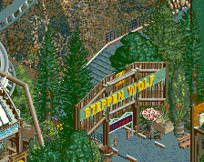
 Steppenwolf
- Views 5,420
- Downloads 672
- Fans 7
- Comments 27
-
 79.38%(required: 65%)
 Design

Kumba 90% Austin55 85% G Force 85% bigshootergill 80% CoasterCreator9 80% Cocoa 80% Faas 75% Steve 75% trav 75% ][ntamin22 70% 79.38% -
 Description
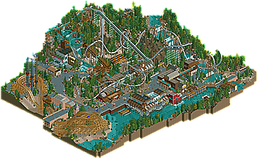
Experience the beast of Greyback Mountain.
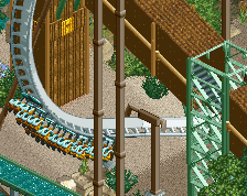
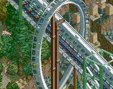
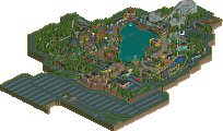
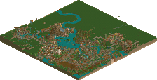
Inspired by coasters like Banshee, Alpengeist, and Raptor, Steppenwolf is a refreshing blend of modern and classic B&M inverts. Set in an unnamed northwest American park, the coaster is perched along a mountainside and heavily interacts with the surrounding landscape.
Steppenwolf took me 2.5 years to finish, but I'm extremely proud of it. This is a design that continues to push the limits of NCSO, thanks in large part to the new features of OpenRCT2. Spend some time looking at the little details all around the park. -
7 fans
 Fans of this park
-
 Full-Size Map
-
 Download Park
672
-
 Objects
1
-
 Tags
Tags
![park_2434 [H2H6] R5 - The Replacements - New Fantasyland](https://www.nedesigns.com/uploads/parks/2434/aerialt2181.png)
![park_3367 [H2H7 R4] The Wild West](https://www.nedesigns.com/uploads/parks/3367/aerialt3772.png)
This showcases an absolutely insane amount of creativity with the NCSO format.
Wonderful job Randy, you really knocked it out of the park with this. Definitely my favorite map of your's and definitely an early candidate for Best Steel Coaster of the year.
I'll try to get a more full review out soon.
Rock climbing is definitely one of the 2017 best idea contender.
This is absolutely amazing for NCSO and I agree with Pierrot, that rock climbing thing is awesome. It's very clean, wonderful job!
This isn't really my cup of tea, it feels just a bit too gritty, but I can see how much skill this takes to make. Really great stuff.
Redwood Cafe is a standout for me, very cleanly executed.
wow this park is awesome. its also massive. the layout is huge and awesome, and stuck so well onto the landscape, which is also really detailed and well designed. the architecture was awesome, and refreshing, and had great atmosphere as well as feeling really unique. there were lots of new and cool ideas throughout, not just in obvious things like rock walls but just in the way you sort of put pieces together and designed buildings. really, really like this.
The coaster, well, yeah this is a year-end best contender I think. A great spin on Alpengeist, and the sheer scale and pacing of it is just great. Definitely has the design quality of actually having the coaster be the focal point.
One thing that does miss the mark for me is the atmosphere. Much like your screens, it still feels a bit cold and sterile. Perhaps that's what you were going for? Some of the buildings like the pink brick one add some warmth but otherwise, I didn't find myself sucked in. Maybe a different path could've helped. This is still solid work. Maybe even the best NCSO work we've seen.
other than the mcbr the layout is solid.
tdub96 Offline
Never been a fan of the "snippet of the rest of the park on the edge of the map" approach to the design but it works better than usual here.
With Scoop on the MCBR, and the scale of this whole thing felt a little big too (namely the coaster and a couple of the buildings) I guess in comparison to the peeps but hey that's not a big deal. Especially when its this detailed.
In Kidron, you did some shit and reached some heights I never thought I'd see with NCSO, and this thing is very much in the same vein, except much more concentrated and thus, probably at an even higher level. This is exceptional work in my eyes, NCSO or not.
Its early, but like Steve said, this ought to be a best steel coaster contender and a darkhorse for best design at the year's end in my eyes. Excellent stuff dude.
Thanks mate! You raised the bar so high, I can stop building now.
But seriously, this is soo good. So many great theming ideas, great layout. Well done!
This was a great effort! I absolutely love the layout of the coaster. I like how it is this huge but still fits in its surroundings, great job!
Another highlight was the redwood cafe, great job.
However, I almost felt the architecture was too complicated, especially around the waterfront. I would have prefered the architecture to be a bit more simple. The top of the log flume also seemed a bit weird.
But overall, great design! The coaster rocks, which is the most important part!
75%
I loved what you accomplished with this design, just beautiful. The atmosphere was very immersive! Awesome coaster layout, the attention to detail and creativity in the architecture was great, you kept everything very clean too. I felt like the landscape and foliage was spot on, you spent the time to make it high quality! There's just a ton of little details you've included, like the supporting rides (rafts, log flume, chairlifts & tower drops). Excellent work!
80% from me!
Though there were some parts that I felt could use some tweaking, it wasn't enough to detract from the submission as a whole; well done.
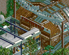
Some of the best NCSO ever plus you used the TI to get really crazy making that one building look like something done with Codex in LL. Outstanding work!
Time to do replies. Thanks everyone for the positive feedback. This was a difficult design to finish due to time constraints and lack of inspiration at times. In total, this took 2.5 years to finish, challenging me in new ways along the way. I think it's safe to say this design pushes the limitations of NCSO further.
Honestly, I'm a bit disappointed this did not get over the 80% hump to get me the Parkmaker status. Any chance one of you low votes could give me that extra 5%?
To address some concerns, the atmosphere was definitely more muted than other fun, colorful parks. I totally understand where peeps were coming from here, but this was very much intentional after looking at photos of the northwest and realistic coasters which inspired this.
Thanks again, everyone. Hopefully, this isn't my last NCSO submission...
Looks awesome, the waterfront + station area is perfect. Great layout too.
I'm dissapointed that this didn't get 80%, definitely felt it deserved it after those last few buildings you added.
Honestly, I almost wish I voted higher looking back, the area around the maze is just perfection.
Yeah I honestly thought I was going to be the low vote for this design. Very surprised there was any votes below 80%. Fantastic job here, lovely design!
You're a Parkmaker in my books!