Park / Quetzalcoatl
-
 20-March 17
- Views 3,359
- Downloads 649
- Fans 0
- Comments 18
-
 66.25%(required: 65%)
 Design

posix 75% Steve 75% chorkiel 70% Louis! 70% bigshootergill 65% CoasterCreator9 65% ][ntamin22 65% Coasterbill 60% Stoksy 60% Cocoa 55% 66.25% -
 Description
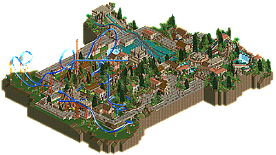
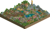
Started out as an experiment to see what I could build in a limited time using the disaster bench. Overall, I spent around 12 hours on this and I'm pretty happy with the result.
Using the disaster bench allowed me to focus on the macro a little bit more than I usually would, hopefully that comes across with the less-detailed-than-usual buildings that work pretty nicely together. -
 No fans of this park
-
 Full-Size Map
-
 Download Park
649
-
 Objects
35
-
 Tags
Tags
![park_3607 [NEOlympics] Abu Al Sheikh Amusement Park](https://www.nedesigns.com/uploads/parks/3607/aerialt3220.png)
![park_3833 [Disaster Micro] Sharkfin Cove](https://www.nedesigns.com/uploads/parks/3833/aerialt3494.png)
Wow this is amazing! For me the best things in this park are clearly the log flume and the buildings around it. I love its disposition.
The coaster is nice but I feel like there is something weird with the colors (probably just a question of taste) and in my opinion the foliage is lacking in some parts near the border of the map. 80% !
Where were you in the Olympics
Awesome use of the disastrous objects! I don't mind the overuse of brown, since the coaster and flume provide some nice contrast. Coaster station looks great with those pyramid-looking things, and that revolving(?) flume station was a nice idea as well. Foliage is probably the best that you could've done with the disaster bench, so no complaints from me. The only issues here IMO are the emptyness around the coaster itself, and the raised walkway, which looked a bit strange. Definitely Design-worthy!
I'm a little on the fence with this one. It's a remarkable display of improvisation using the disaster bench, and it looks very nice for a disaster bench design.
Which is where I'm running into trouble.
The coaster layout is fun; I love the interactions with the landscape and foliage. The colors give it some pop in the sea of green and brown, which is also a plus.
The architecture is a bit mixed; you have some really ancient looking structures like the coaster station and some elements of the log ride, and you have some more theme park-esque structures around the plaza and paths. I think I like it.
Log flume is a nice addition, but I can't help but think that it obscures the sight lines across the lake a bit too much. I'm also withing for a bit more color on the log flume station's side of the map to balance out the blue coaster dominating the other half of the park. That's more personal opinion, though.
Foliage is, well, it's the improv bench, so you did what you could. To that extent, I think that there's a very interesting combination of trees that nicely emulates a jungle as long as one doesn't look at the individual trees too closely. It works. What doesn't quite work for me is the stark change from jungle to grassland across the path. Those areas could maybe have used a couple trees.
In the end, I think this is going to be 65% from me. It's design worthy in my eyes. I like everything you've done, and I think you've accomplished something respectable. However, some of the limitations of the disaster bench held this back a bit for me, but what a remarkable experiment it was - you were certainly successful in creating something appealing in a short amount of time with some difficult objects.
This coaster is lovely. Good layout, great interaction, nice pacing... solid all around!
The Flume was nice too though I wish you kept the level of detail you had over near the station with the covered lifts and drops throughout. Great stuff, there's not a ton of content but what's there is really nice.
Path layout really screwed you over I think. The path framing killed a lot of the fantastic atmosphere you had everywhere else, eg coaster queue + entrance plaza + flume. I think you had enough space to develop the area opposite the drop tower queue which I think would have really brought this together into real high-quality design territory (or at least offset how sharp the integration between path and theming was).
60%
This vote is impossible for me, I just cannot decide. This never really happens to me either.
The coaster was just okay, the supporting was a bit lazy it seemed but passable. I missed the presence of a catwalk on the lift, especially because you have one on the MCBR.
I'd almost say that the coaster was the weakest part of the map, which shouldn't be the case for designs. However, the surroundings and flume where fantastic, really used the objects well and make it look really atmospheric and theme park like.
Probably going to pass on this vote for now, just not able to come to a decision. Its between a 60-65 for me, just can't really decide which.
yeah I agree that there were some weird design choices here. the actual archy and atmosphere could have been great, but was compromised by way too much path which surrounded everything and sucked the atmosphere away. it needed a lush, lost in the rainforest sort of feel to it, but there just wasn't enough foliage and landscaping. I also found it really strange that you cut everything off really close to the path and coaster- give it room to breathe! it needs space to live in and give it context. I thought the layout was fine, and I liked the interaction and dense feeling right in the center- but that feeling was definitely lost on the rest of the map because of the big, blocky path and bare grass edging on blacktile.
Great submission, i really like it. It's amazing how you've managed to create such a clean and well detailed architecture with that bench, without throwing ugly objects everywhere like everyone else is doing. Your feeling for texture and stuff like that is one of the best around on this site, and you're showing this a lot overhere!
The coaster and the flume were okay, they're working, but nothing special i think.
For the foliage you did what you could, i must agree here with arctic, probably couldn't be done better with that bench, but maybe it should have been a bit denser.
What really ruins it for me is the path. It's just akward to have it framing the whole thingie like that. I think you could've done that much better.
Overall still a design for me though, and it's great to see another submission from you! Hope to see them more frequently in the future!
65%-70% for me.
That flume could've gotten design by itself, imo. The coaster kind of brought the whole thing down relatively. It was cut off to abrupt, but other than that it was quite good. Congrats on design.
can someone tell me what the disaster bench is?
It's the bench made for the improvisation round of the NE olympics. you can download it from the database
I really enjoyed this, trav.
Congrats trav on your first serious solo project.
No idea why this is just barely a design win. It's clearly better in my eyes to other releases in this score region. Anyhow, congrats trav. Hope to see more!
Congrats, trav! Great to see this got design!
Congrats! I really enjoyed this. Hope to see more from you!
Wahey! Only 15 years into my Rct career. Breakthrough of the year 2k17.
So this park was very much a bit of fun. I started it an hour and a half before a contest deadline for a 20x20 park using the Disaster Bench. I wasn't able to finish that 20x20 section in that time so decided to expand it and put a time limit of 10 hours on.
I ended up spending 10 hours 30 mins in roughly this way:
2 Hours building log flume and surroundings
30 Mins building coaster layout
1 Hour building coaster station and bit in front of it
1 Hour building Dodgems/Roto Drop
2 Hours doing coaster queueline
1 Hour doing path
1 Hour doing the plaza area
1 Hour doing custom supports
Final hour touching things up and making sure everything worked
To respond more individually:
@Julow; thanks for the kind words! I think 80% is a little too high but I appreciate the sentiment. I agree that the foliage could be a lot better.
@Gamma; thanks! The reason for the emptiness was to offset how busy the middle felt with the heavy textures as a result of using the disaster bench, I probably went too far with this though which is why it seems quite a few people weren't a fan of the empty space.
@CC9; overall I was trying to make this look like it's something that could be found in a theme park of my dreams, hence why you mentioned a couple of times that it seemed to be stuck in the boundary between realism and semi-realism. The empty space was something I tried, and it didn't work out exactly for everyone, so is something I can look to do differently in future.
@Bill; thanks! I wish I would have continued with that level of detail more so as well, but it would have just taken too long and would have taken me too far over 10 hours.
@Stoksy; I agree, the path wasn't a great idea and was more of just a means to add some elements of interaction rather than actually fulfilling it's primary purpose. If I was to spend longer on this, this is the number 1 thing I'd change.
@Posix; I thought you'd be one of the ones to appreciate this more so I'm glad that that's the case! While I'd agree that I think it is a little better than 66%, I can totally understand why others disagree. Composition is definitely something I can improve on, and was the primary focus of doing a map like this. The less detailed bench meant I had to find other ways to keep my work interesting, and I think that if nothing else, I've learned a couple of things to take forward. I'll definitely look into how Natelox does his filler trees and take that on board.
@GForce; I'm not a coaster designer haha, never have been and never will be. The lack of catwalk on the lift hill is just because I completely forgot and I'm pretty certain that no matter how long I could have looked at the park, I would not have remembered. I'm glad you liked the surroundings though!
@Cocoa; the path is definitely an issue. I used it more as a means to provide interaction opportunities rather than for it's primary purpose. If I were to spend longer on the park, I'd definitely change that and make it much more cohesive.
@RWE; thanks! I like to think I'm pretty good with textures too haha. The foliage is definitely something I struggled with, maybe I could have done it denser and that would have looked better, but with the heavy textures on the trees, I didn't want to go too far.
@Chorkiel; I'd agree that the flume is the best bit of the map. That's what it originally started with, and then I extended the map to include the coaster so I could submit it for design lol.
@Sammy; it's a bench with intentionally 'bad' objects. Was used during the Olympics.
@Everyone; thanks for taking a look. I really appreciate people taking a bit of time to leave some feedback. Everything helps and is something that I can take on board for future projects.