Park / Wraith - A Park Snippet
-
 09-March 17
- Views 3,357
- Downloads 599
- Fans 0
- Comments 16
-
 67.50%(required: 65%)
 Design

SSSammy 75% Coasterbill 70% Louis! 70% trav 70% ][ntamin22 70% CoasterCreator9 65% Cocoa 65% G Force 65% Stoksy 65% chorkiel 60% 67.50% -
 Description
This is the first of many Design submissions that will eventually unfold into a full sized Park. Each piece will fit together to make the whole thing and hopefully be congruent when it's all said and done.
-
 No fans of this park
-
 Full-Size Map
-
 Download Park
599
-
 Objects
39
-
 Tags
Tags
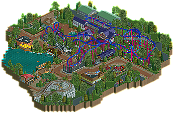

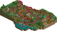
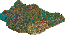
Thanks to Scoop for supplying the maps for this, really does speed up the process!
I think this shows clear improvement from your past work, archy, foliage, color choice are all much better than before. Not to mention the path layout, spacing, and overall park "feel". Probably will be right on the border for me as far as design goes, still think there is some room for improvement regarding archy and foliage, but like I said this is a big improvement.
I agree with G Force about the foliage and architecture, but overall really nice work. I like how the portions of other rides were functional, and I particularly enjoyed the super loop custom flat ride.
65% from me. Definitely worth a design in my eyes.
No real critique from me on this, just feels like a certain score and I don't really know what can be done to make it better other than maybe a heavier theme.
Same critique regarding architecture applies as I often comment of Russell's work (single-level structures, while realistic, don't really lend themselves to higher quality work), and with respect to foliage while not inherently 'bad' per se I think that people are abusing Liam's underbrush a little too much without quite understanding how to use it well. Also worth a mention that a change in land texture can make a world of difference sometimes, and not just making an area the same texture but using a splash here and there in combination with another (eg instead of the entire lift area of the coaster being entirely grass you could have utilised the dirt and dirt/grass or sand textures so it didn't just read as one huge grass plane with trees and weirdly sparse/rough underbrush).
Good, solid realism 65-70%. I did love the functional cutaway rides though, excellent touch there.
That layout is just amazing. Everything does its job perfectly, I love the looping flat ride and the different path next to it and the curved fences in the water, it's a nice attention. The big black fences of the inverted coaster are finally really good looking. Foliage is very nicely done. As said above, this is solid realism -which is not really my style- but it really like it.
90% from me, could have been more if the parts where there's the woodie, the restaurant and the tracked car ride would have been more detailed, it gives me the impression that it was a bit rushed.
I liked this.
The layout had some nice flow to it, everything worked well aesthetically and the supporting rides were very nice.
I guess if I had to critique anything layout-wise it would be the section between the barrel roll and batwing but the rest of the layout more than makes up for it.
Great work. 70% from me.
loved the layout and colors. the whole map felt quite alive too, which is refreshing from some realistic releases. I wish there was a bit more interesting/new content, as it does tread on a long history of somewhat forgettable realistic design releases. maybe a solid secondary ride would help. that said, everything was quite nice. why don't you just make one big park? haha
I really enjoyed this. This is a style that normally doesn't suit my tastes but you really brought it to life. I thought the layout and color choice worked very well. The surrounding architecture worked well also. Easily a design for me, and I'd love to see you do a full park like this.
Really surprised im the highest voter. to me this was an unambiguous design. it wasn't mindblowing, but it was a compact display of competent parkmaking. colours worked really well. felt believable and i enjoyed what rides were there. wasnt really any wasted space. the interaction wraith has with the park seems kinda superficial, i would have sunk the immelman and the batwing down 2 or so units so that the peeps could look down on it. the layout was nice, though. can't say i was a big fan of the ride trains appearing out of thin air on the edge stuff, seems like a lot of effort for not really that much benefit. great effort and congrats on the result, looking forward to seeing more from you.
Congrats on design!
Great job on this, Scoop. The ride layout is very good here and the colors are striking and fitting of the theme. Architecture is well done, too.
I agree with Cocoa though: why not just make one large park?
Great coaster you've got there Scoop! Proof that bigger inverts aren't (always) the best ones. Interesting lay-out, would be a so much fun coaster to ride irl.
You're progressing very much. Technical is really good, but like been said before, in order to make it even better it needs a heavier theme. More than one story high buildings etc, listen to Stoksy
The landscape lacks different textures, you should have played with it more. It's a little task to do but it can make a lot of difference! I'm also not a fan of the aba-path style you used. The safety nets are bit over the top and ruin the views from the peeps.
Quite nice you added (some) parts of other rides riding. The color use is excellent and the vibe all round the park is also great. For me, absolutely a design!
Congrats on the design, scoop! Really liking this! I'm a little bit late, but still want to write my thoughts done:
First of all, the layout really impressed me! As a fan of smaller inverts ( since big inverts are really overdone ) i really appreciate the style you've gone for overhere.
The archy felt a little bit uninspired though. Try to give it more depth for your next project. You need more small details and stuff like that, to make your stuff more interesting for the viewers and make the realism style work.
Agree with FredD about the landscape. Foliage could also be improved a little bit. I feel like it looks a little bit random and should have more structure for a park like that.
Overall great to see you're imrpoving and definitely a design for me, would rate this around 65%.
Looking forward to your next stuff!
I really like how tight this layout is. Small inversions done very well. The surrounding area is as others are describing it - nothing wildly unexpected or out-of-the-box, very much a vanilla American park. I think we've gotten so good at creating this kind of environment at NE that we just aren't engaged by it anymore, but the truth is a lot of the little things are very well executed here whether we find them engaging or not.
I'm really excited to see where this goes with other designs you plan on making. The layout was excellent, and it has a great realistic environment without sacrificing too much atmosphere. Looking forward to more.
I love the W sign at the queue entrance. Also the color scheme, blue/purple always looks good in my opinion