Park / Park Nehalennia
-
 22-February 17
- Views 3,398
- Downloads 706
- Fans 1
- Comments 16
-
-
 56.25%(required: 50%)
 Bronze

Coasterbill 65% Kumba 65% bigshootergill 60% posix 60% CoasterCreator9 55% csw 55% G Force 55% Cocoa 50% Liampie 50% Louis! 50% 56.25% -
 Description
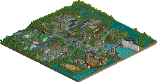
It’s finished! Park Nehalennia is my second RCT2 park, after the abomination that was Golden Hinoki. I’ve spent a couple of years on it, deleting and rebuilding lots and lots of stuff.
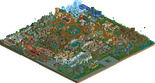
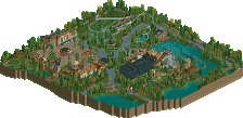
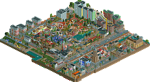
My primary goal was to have fun and I succeeded. Park Nehalennia is a mix between realistic and weird, and I like it that way. The buildings are strange and too small, there’s way too many benches, the colors are odd, and the parking lot is a bit too small.
At least the park is super eco-friendly. It has lots of greenery, water, and the coffee cups are like 30% recyclable. The park has multiple brilliantly named areas:
- Main street. Weird houses, some shops, and a tiger named Neha. Don’t forget Calamari Mansion. Legendary calamari. Tremendous calamari. They’re the best, it’s true! The best calamari in the whole world. Incredible.
- Poplar Woods. A dark forest with high trees, ghosts, and a guests’ favorite coaster: Elpenor. Named after a guy who fought the Trojan War but only got mentioned in the Odyssey after he fell to death after waking up on a roof pissed as hell. He’s my role model in life.
- Cittarossa. Narrow streets, the smell of floppy pizzas, screaming grandmas hanging out the windows. Also known as the area you have to pass in order to get to the killer coaster Oliva.
- Frankville. Named after and designed by a sea otter named Frank who likes this shade of red. He does three shows a day: they’re a mix of drama, sci-fi and Michelle Obama impressions.
- Cripple Creek. With over 400 different animal species, 200 of which are wasps, this area is loved by all nature freaks. Peaceful, quiet… This piece of heaven on earth will cure every hangover.
- Hellas. A Greek area. Santorini meets other Greek architecture meets columns for some reason. Try out Charybdis. And the coaster with the weird lay out, Rhadamanthys. And the toilets.
- Fun Forest Fun. I’m sorry for the pun. And for this area.
I know it’s not gold material, but I’m still quite content with it all. Had fun while making it, and hope you have fun checking it out. Thanks for downloading!
Odour -
1 fan
 Fans of this park
-
 Full-Size Map
-
 Download Park
706
-
 Objects
1
-
 Tags
Tags
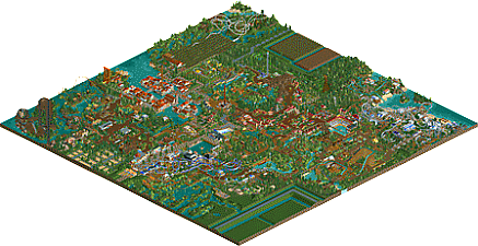
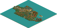
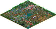
Haven't had the time to download any parks lately but I did check out the overview of this at work....
From a viewers standpoint, you also achieved your goal. You have some neat ideas here from what I can tell, and your "odd" colors actually work really well in most areas. Architecture is not amazing, but its certainly not ever bad.
What holds this back for me is the coaster layouts. I know you said you're going for a mix of "realistic and weird," but a turn around in the middle of the lift hill just interrupts an image of what otherwise is your best coaster here. I wasn't too keen on the woodie, launched coaster or invert layouts.
But altogether I can tell you had fun making this, and that's what the games all about. If you maintain your knack for color and atmosphere and improve those coasters moving forward, I think you could put together some really good stuff.
A lot of questionable design choices but it's clear that you have some skill
yeah I think it could use a lot of refinement and planning more for your next park but I think there was a lot of good stuff here. I especially liked the venice area. In general the archy felt a bit inconsistent maybe, and the layouts could use a lot more work integrating them into the park and making them more aesthetically pleasing. landscaping was patchy- good in some bits, like near the launched coaster, but bare and unfinished feeling in others. experiment with more than just grass and brown dirt everywhere. I think some areas needed more clarification (in-game, not in an accompanying guide, using visual cues and details) in what the theme actually was, notably the sort-of italian area, the entrance, and the yellow-accented-lush area in the bottom right. also whatever the sort of mish-mash of an area is in the leftmost part of the map near the woodie. but all said, not bad stuff. shows a lot of promise for sure.
This is really nice and it deserves more comments and more attention. This actually reminds me of BSG's earlier work where the coaster layouts need work (especially the larger they get), but the atmosphere is warm and inviting and while there's room for refinement for sure, it's really nice on a macro scale.
Some of my favorite areas were the areas around Graziano (which is left closed by the way), and the area near Rhadamanthys. That Greek shore style is tough to translate into RCT but it looks very nice.
Another thing I enjoyed was seeing all of the ride types that are never used for their intended purpose by the NE community. The Monster trucks for example were super cool, the Submarines were nice to see and you even made that shitty inverted hairpin coaster look good.
As I mentioned, some of my biggest complaints were with the coaster layouts. Rhadamanthys has an odd layout all around, including the broken up lift hill (though I'm somehow a fan of those weird corkscrews that send the train back the way it came. That element works surprisingly well) . The invert is also very strange.
Dryad and Oliva are a bit better though and Elpenor is actually pretty cool except for that one weird twisting drop. The splashdown was a nice touch. Things like that are so against the NE norms that they're actually refreshing to see.
Overall I really liked this. If you work on your layouts and refine your architecture a little you'll be an awesome builder. you've already nailed the art of atmosphere which is something even the best builders often struggle with. 65% from me. Well done!
Thanks for your comments and ratings, appreciate it! I actually agree the coasters are a bit strange, I too hate the broken lifthill of Rhadamanthys. In hindsight I should've redesigned it, just like the inverted which I'm not a fan of either.
And Coasterbill, Graziano is closed because it'd crash all the time. There's another bug in the park: I can't get more guests than 350. Before submission I've sent in a couple of trams but for some weird reason all guests except for about 350 leave.
Some nice work here. The park planning remained me a lot of Zippo's and some J K work. The usage of diagonal path really helped break the grid and added a bit of uniqueness to it.
The layouts really held this park back for me however, a lot felt a bit amateurish and rushed. Spending more time on them would really up your end product in my opinion. Your architecture is pretty solid, although a bit inconsistent at time in scale.
Hope to see more from you in the future, there is definitely room for you to improve!
Some very beautiful scenes here, but as shotguns said, also some questionable design decisions. Overall I liked it. The front half and middle of the park were great.
Sorry for the delayed vote. Trying to keep up with the sea of parks hitting the panel's inbox the last little while.
I enjoyed looking around this park, which is massive by the way. It always shows serious determination to complete a park of this magnitude, so well done!
First of all, it's clear you had fun building this park, no doubt! You added a lot of variety throughout the park, different sizes & shapes of buildings, sitting areas, pathways, planters, food stands, statues etc. The variety and creativity you've shown here, if refined could really up your game. I found some of your stronger architecture was closer to the entrance of the park, perhaps areas you built first, or possibly as your game improved it was some of the last stuff you built.
Very fun to look around, thanks for putting so much time and effort into this. For your next build, perhaps work on something smaller, maybe design or a smaller park and focus on coaster layouts and improving your structures, learning from what others have built on NE.
EDIT: I provided the last Panelist's Vote, congrats on the mid-Bronze, well-deserved honor!
For some reason I kinda love the invert's layout. It's so weird... that it's good? It somehow has the same kind of awkward weirdness that made Drachen Fire so beloved. All it really needs is an in-line roll after the first loop and a couple of tweaks here and there... or am I just crazy?
This really screamed "Low Silver" to me, but congrats anyway. I think if you focus on improving your layouts that should really help you improve dramatically.
For me personally, this is a silver, for sure. Very quaint and sweet. While I usually don't like overly flat parks, this one creates a lot of drama with the little islets, and the use of water. I love how the woodie is nested on its little island. I like the car ride with the intertwining paths. I LOVE the u-turn on the white steelcoaster. I like how the launched giga coaster is launched through the orchard. You say you had fun making it, and it shows. Great work!
Me too. I'm stealing that element.
Didn't even notice that crazy turn. Pretty sweet! I assume that's not on a real life coaster?
In parts this is a very beautiful park built with quite some heart and clever design choices. I love the originality in the the layouts, which you sometimes have in the overall park composition too. I hope to see what happens when you develop your game further.
^ I just think it's great that he had the balls to actually use that stupid inverted hairpin coaster and he actually made it look good. Next up we need a non-ugly wood reverser.