Park / Imaginaerum
-
 10-March 17
- Views 5,493
- Downloads 774
- Fans 2
- Comments 25
-
 76.88%(required: 70%)
 Gold
Gold

bigshootergill 85% posix 85% CoasterCreator9 80% Coasterbill 75% Cocoa 75% Dr_Dude 75% G Force 75% Liampie 75% pierrot 75% Steve 75% 76.88% -
2 fans
 Fans of this park
-
 Full-Size Map
-
 Download Park
774
-
 Objects
99
-
 Tags
Tags
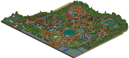
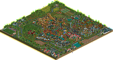
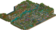
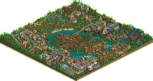
![park_4117 [H2H8 R4] Grand Central](https://www.nedesigns.com/uploads/parks/4117/aerialt3899.png)


A reply to all people finding the bovious mistakes I also see in this park like the planning and some areas being a bit less cohesive and such.
this mainly comes from the fact in the way that I build, I have no plan when I start, I simply open up the game and start building very organically... I just plop down what comes to mind and what I think fits the theme of the park and so on. The obvious flaws don't always happen but it's hard to prevent these in the way that I build, it's something I constantly try to improve on but building for me is a thing of the moment and I can't really build on something planned as I lose interest in it fairly quickly.
I have to say it took me about 3years to get this park done and I knew it was going to be a high gold and nothing more. that being said I still believe that this park holds everything it should for my own personal taste, that are just immersive themes and awesome coasters, believable or not.
I'm glad this park got out instead of becoming one of those projects that never truly got finished.
Greets BG
Just wow, you got me with the launched flying coaster and then I saw the Gold Rush coaster, outstanding work.
Great work BG, there are some really outstanding bits thrown in here. I agree with a lot of the critiques given already, but I have to give you praise for the creativity and originality of how you executed some of these themes. There are some really beautiful details and ideas in each area. Some highlights for me:
The launched flyer is fantastic. Really enjoyed the layout, especially the beginning corkscrew flip into the launch! Unique and creative.
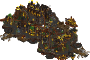
All the metalwork in the steampunk area is really beautifully executed.
Frontier City's atmosphere was really something new. I enjoyed the barrenness of the landscape and the layout of the giga was impressive.
The entry area had some great architecture and some really beautiful composition.
Some really nice flats throughout the park. Standout is the windseeker in Frontier City.
I'm in love with the red gazebo seating area by the lake... that and the tan building with 5 small staggered teal domes... I'm going to steal these ideas.
Congrats on finishing the park and you should really be proud of what you've made here!
It's true what you say that more planning leads to quicker loss of interest. I've felt this way too. I applaud your spontaneity and instinctive building style. It's certainly where people's talent becomes most visible, and people usually have most fun building. We need more or that.
Do you have any future RCT project ambitions?
I think you've been undersold here a little by not even achieving 80%, but I can understand why at the same time.
As others have mentioned, a chunk of the park looks like it's just been filled in without the same thought put into the earlier areas. As I saw a few saves of this in development, I think I may notice this even more.
I would have loved to see you go more in depth with theming across the park. The Western area is really the only area that I feel fully immersed in that heavily atmospheric style you do best, where as the rest of the areas just don't quite cut it.
The steampunk area comes close, but I feel like there's so much more you could have done here. More machines, more methods of transport...more movement! It feels just a little too empty.
The Medieval area is definitely the area where you were least inspired, which I think is a shame as if you'd have gone down a more fantasy-esque route, I think this would have been really strong in your style. What's there is good, there's just not a lot there past the coasters.
The entrance area is probably my least favourite. The Eurofighter is very well done, but I'm just not a fan of parks that open out like this, it creates a confusing layout in my opinion, but that's nothing that could be changed here. What is here is great, the colours work well and the architecture is immersive and detailed.
Overall I'd be putting this in the 80% - 85% bracket. I think with a bit of a bigger map, with some more details here and there and a bit more inspiration, this would be a definite spotlight contender. The quality is definitely there in areas that were built earlier, but the later stuff lets the park down a little.
Congrats on Gold, dude! I think the score fits really good overhere. While there were some parts in this which were pretty amazing like the steampunk area and the western area, other parts just felt uninspired like the medival area or felt weird like the entrance where there was way too much path for my taste in the end.
The coasters are all feeling not bad, i like how you've tried to create really special stuff overhere, i especially like the coaster in the steampunk area and the eurofighter. The dive machine felt as unspired as the whole medival area compared to the other coasters though.
Overall i think that what's the main issue about that park, and what's making the difference between that park and spotlight parks for me, is that it doesn't feels that cohesive and that well planned as it should have be. Some areas just feel really rushed and filled in as already mentioned.
In the end, i still love this park though, and it's really nice to see you've finally finished this. I remember you were showing me a file of this 3 years ago...
All in all 80% for me! Looking forward to see with what you'll come up next!