Park / Imaginaerum
-
 10-March 17
- Views 5,493
- Downloads 782
- Fans 2
- Comments 25
-
 76.88%(required: 70%)
 Gold
Gold

bigshootergill 85% posix 85% CoasterCreator9 80% Coasterbill 75% Cocoa 75% Dr_Dude 75% G Force 75% Liampie 75% pierrot 75% Steve 75% 76.88% -
2 fans
 Fans of this park
-
 Full-Size Map
-
 Download Park
782
-
 Objects
99
-
 Tags
Tags
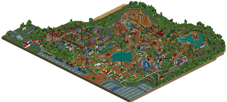



Launched Flying Coaster? Triggered
Version1, on 11 Mar 2017 - 12:21 AM, said:
Good Idea, similar to thunderbird. 80% from me, il explain when I have time.
Nice Machina Clone (jk)... real post later...
hmm. I'm pretty torn on this park. I'll go through area by area
outskirts:
not bad. there's not a whole lot to really hold my attention, and some of it seems out of scale or weirdly layed out. but its not a bad little bit of context.
entrance: definitely my least favorite area/ most confusing area. the layout is strange- its mostly open space with buildings plopped in the center of path, which is a pet peeve of mine. the architecture seemed a bit lost, and buildings were often a bit awkward or strangely layed out. there were also some really good, atmospheric bits and some nice landscaping, but it didn't really come together so well I think. the best bit is definitely everything relating to the coaster, with the wall, station, foliage, etc. thats a standout piece of work here.
steampunk: some really solid archy in here, and a little bit of awkward stuff. but mostly just good things. the flyer layout was so-so but there was some good atmosphere here and some really nice details. once again I think the actual layout of the area is not so well thought-out and I get a bit confused here. I think maybe I've only very recently come to realize the importance of smart design and park layouts in taking good, well-detailed archy and atmosphere into something that really stands out and is excellent. So I'm still working on these issues myself
Frontier: easily my favorite area. Some awesome buildings, awesome landscaping, and sick rides and interaction. I have very little criticism of this area, other than I wish the care and attention here was consistent throughout all the other areas!
castle: not bad. I liked the ride interactions but nothing particularly stood out here as interesting or different than other castle areas I've seen. some of the archy is quite nice but there is also the same sort of inconsistency in design here that I found in other areas.
so I guess I'm having trouble articulating my thoughts on this park. on the one hand, there's a lot of technically really good stuff, but some element in the designing area just falls short for me, especially in buildings that sort of don't make much sense to me structurally or from thematic perspectives. That said, I'm working through these issues myself so we'll see how we go with that.
anyway, its still a great park that I'm excited to see finally released from you. congrats on the release! I'm sure it will do well
Beautiful (!!!)
Rigth, so I'm gonna try to write a review of this! God help us...
A BG solo is something we've all been waiting for for a very long time, so it's great it's finally here. Congratulations on finishing this, it's a magnificent park. And that's gonna be the main theme of this review, it looks great.
Entrance area: the archy is here is very nice. You've chosen to make life difficult for yourself for choosing a fictional country but it works here most of the time. I can imagine walking towards the entrance would seem pretty imressive with those towers and the eurofighter in sight over those walls. But I do tend to agree with Cocoa here sort of. Some buildings seem a bit scattered around the path, making it look a bit cluttered. The boardwalk atmosphere around that little lake is pretty nice, I especially love the food stalls and the covered picnic area. I don't get the biplane though.
I like the medieval area because you've chosen to make it colourful. Most medieval areas in RCT are a sea of brown, but you've managed to not step into this trap and it pays off. But here I find also one of the main problems I can find throughout most (not all) of the park: unclear path layout. Sometimes the path can be very narrow here and when it's hidden behind trees, buildings and coaster track it's quite difficult sometimes to make out where it's going. Also, little tip: not all mayor rides need music... But of course there's good stuff here. The shooting game is a nice touch, the guillotine above the queue I noticed only after a second viewing.... The archy itself is very well done.
The western area is the biggest in the park and has some of the best stuff in it. I did notice the path is disconnected to the backside of it though, making it impossible for peeps to reach Buzzsaw and Lumberjack. Not sure if intentional or not? Maybe they get lost if otherwise? Maybe you've forgotten? No big deal though, I connected it myself . This area is also filled to the brim with detail: the saw blades everywhere, windmills, the archy... I especially love the building in the water where GoldRush races through! Great touch! The coaster itself is awesome, the rockwork it goes through is sobre, but it works. The station and the surrounding archy is also pretty cool. I especially love the old rusty mine shaft.
City of Steam: a steampunk area, my kinda area! Great fan of all things steam, and I wasn't disappointed. That restaurant near Y'jan is fantastic, maybe because it's the sort of archy I personally also love to build the most? No matter, it's great. AquaVentura is quite sobre but serves it's purpose. Don't know why you've chosen splash boats though, surely the water coaster boats would've been better? Aeronaut: a lanched flying isn't something I've seen very often on this site, so it's a nice change from the usual. That station is instantly recognisable though for a Belgian: Antwerpen-Centraal... Good job on the big structure, it works perfectly here and you'e modified it in such a way it fits the theme well. You've succeeded with this whole area to make it look industrial an steampunky but, like you said, not clutter it with unnecessary shit. There's just enough detail and hints of machinery. Only complaint about this area is the same as the one for the Old Kingdom: confusing path. This isn't really helped with a completely unnecessary (but till good looking) building next to the queue... You could've made the queue go through it, it just sits there idle now.
You may have noticed how I didn't comment on any coaster layouts. That's because I'm not an expert ont hose and I don't think it would really mean anything to get feedback on those from a guy that still has trouble making coasters himself.
Great release, some minor criticism but hey, what park is 100% perfect? Hope to see more of you in the future!
I have to agree with Cocoa here, basically entirely. The park overall is good, but the western-style area is fantastic and easily Spotlight quality. I don't think I have seen such a great log flume based around an actual logging company. Not to mention the giga coaster was excellent and used it's surroundings and theming wonderfully.
Again, overall a solid effort. Definitely a mid-level/high gold for me. Great job!
This park is very frustrating to me, you have some awesome ideas an great skill in the game. The flyer and Intamin, as well as the western area really show that. Probably some of the best content we've seen this year.
However, its almost like half of this park was built in a rush to just release it, the surroundings, area around dive coaster, area around the water coaster....
These are things that I would expect to be a bit more cohesive and finished from an experienced player like you, a few more hours of work could really pay off and maybe push this park to the next level.
I also want to mention some of the architecture and structures in this park feel super out of place. The tan and black building near the flyer, the castle structures around the dive coaster, blue roof building near the Eurofighter, the small plane? This has been a trend in your work for ages, stuff that just feels like its from a different park. Its incredibly frustrating to see you consistently do this, its almost like you put a bunch of ideas in a hat and randomly pick ones whenever you have an open space to fill. Just mind boggling stuff really, not that its bad, just weird and non-optimal really.
Anyways, the park is still really good, a 75% from me. Like I said the Intamin and Flyer are really well done, and everything generally has a solid aesthetic to it.
Just wish that you'd look a bit more at the big picture and how the different elements fit together, some times it give me the impression you build in like a 200x200 window and don't look at anything outside of the small area you're working on. I really think you have the potential to release a top tier park, but these consistent problems have really held your work back and allow for some real improvement in the future.
Echo everything what G was said.
I think this is quite a step-back to compare your previous works, perhaps I was being too anticipated for this project.
75%
Congrats on finishing this! You did a great job
The medieval area lacks breathing space, it feels crammed. Making this area a bit bigger would make it come more alive. For me, it's not up to par with the rest of the park. The lay-out of the dive coaster was fine but the powered seemed slammed in.
I do like the entrance area, I could really see myself wandering around there. It's also a nice alternative for the classic main street entrances we see. The topspin could have used some more work, right now it looks like a cheap version of Talocan. The Eurofighter is intense, I really love that one! It's really implemented well in the environment and the wall is a great background to it. The lay-out is compact like a Eurofighter should be and has a great flow in it. It looks great! It's really one of the rct coasters I'd wish they build it in real life.
The steampunk and wild west area were intense! For sure, these areas are on spotlight level. Goldrush is great, while it's a huge coaster you've managed to make it go up in the environment well. That house on the lake with the turn, gave a me a BTM feeling. The archy is topnotch, as well as in the steampunk area. The flying sure has one of the best station buildings I've seen in-game.
A launched flying is really unique and makes it a memorable coaster. The pretzel loop is placed so great here. Aquaventure was a bit off, a bit too bare.
A park to be proud of. I'd rate it 80%. You have 2 areas on spotlight level, the entrance area is great too but is not on that level, the medieval part wasn't up to par. I hope we can see another solo from you soon! #makeBelgiumGreatAgain
@posix
the ride ratings comes from some of the hacks needed to have everything functioning as smoothly as possible
I'll try to reply as soon as I can to the rest of the replies
What a beautiful piece of artwork. I loved looking around this park! Much like Jappy, I can't really chime in on a few areas, such as a coaster layouts and park composition. To me those areas seemed fine... anyway, here's my take on things.
I loved the interaction of the coasters with the landscape, scenery and pathways. To me it felt like each coaster took you on a little adventure. The Curse of Y'Jan has a fun quirkyness to it, Gold Rush was phenomenal, just so much to explore in those 60 seconds (passing through the mining cave, behind the waterfall, through the island buildings, really exploring the park... though it could have use a few chunks of gold here and there to see), Lumberjack Falls was a beautiful little log ride, Wyvern & Black Knights interwoven track was tons of fun to watch too!
I felt the park was chalked full of details, very immersive, both in the magnificent attention to detail in the archy, and the little things, like signage, tables, island planters and scenery. I mean you took some themes that have been done in the past and made them your own, bringing the BG flair to the park. The variety of self-hacked rides was great too, sometimes those take a lot patience to pull off, but they ran quite smooth. Kudos.
And just a quick thought about the foliage, which seems to be more and more important in NE releases these days. Honestly I barely even noticed the shrubs, trees and grasses my first time through, which personally I think speaks volumes. I always notice if this is done bad, but you did such an immaculate job in assembling these components that they seem very, very natural. Fantastic work in this area!
My only real beef with the park is all the rides that don't have peeps on them, and there's a lot of them. 10 minutes with the SoB trainer to hack the stats and these rides could have been slammed full.
I'm having a hard time saying this is completely spotlight, but I'm going to give it a bit more thought. I'd rate this 80-85%, this is definitely a skilled park and worth of the NE Parkmaker status (which you already have of course, but still...)
Fantastic park, hopefully you've got some more rct in you!
Great park!
I absolutely agree with some of the points about cohesiveness. Things like the giga / western area and the area around the eurofighter and flyer are amazing but then things like the dive coaster area seem to be on a much lower level.
Starting with the good, I absolutely love the giga. The support work was great on this, it really captures that Skyrush / I305 feel and the layout itself is a ton of fun to watch.
As I said earlier, the flyer and the area around it was awesome, as was that wall near the EuroFighter. All of this was probably Spotlight quality.
On the other side of the park, I found myself questioning if the park would have been better without the mine train coaster, and the dive machine (while nice) didn't blow me away. I found the placement of the drop to be odd, it's facing a quiet path along the back of the park where generally parks would put these dive coaster drops facing high traffic areas to make them a real focal point.
Overall I feel like the left side of the park is amazing and the right side of the park is sort of rushed. If you had spent a little more time on the right side you'd be looking at Spotlight for sure, but as it stands this is still a great park. Gold quality work for sure. 75% from me.
I'd really want to say this is a definite spotlight for me, but something is holding me back. It's all a+ work, but it just doesn't scream spotlight to me. Not sure what it is atm.
Score is pretty much spot on in my eyes, nice job everyone. Congratulations to you as well BG.
I rarely visit this site anymore, but I had to login just to tell you that this is awesome.
Great work guys!
I think this is a good score, could've easily topped 80 with a few fixes here and there. But what was there significantly outnumbered what wasn't.