Park / Club Roy
-
 15-March 17
- Views 2,272
- Downloads 649
- Fans 1
- Comments 7
-
-
 Description
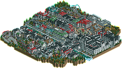
Old Project of me, first time using custom scenery. Very repetitive, but back then i had this idea and i wanted to realise it^^
-
1 fan
 Fans of this park
-
 Full-Size Map
-
 Download Park
649
-
 Objects
57
-
 Tags
Tags
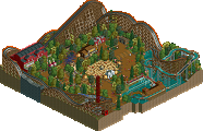
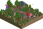
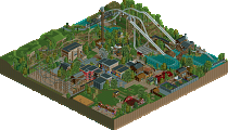
This is a very interesting park. Feels like a bit of a throwback! How long ago was this project?
This has that Korean RCT feel, pretty nice.
I like this, I can't quite put my tounge on it, but it looks clean, the buildings are very pleasing to look at, and there is some nice interaction between them and the rides.
@CoasterCreator9, i started ~7 Months ago, and it took me with lots of pauses 3 months to finish it^^
Definitely repetitive and a little too busy for my taste, but this is definitely accolade worthy IMO.
weird park! I think you maybe overused the white wall with brick framing, and it made a lot of the archy feel monotonous and blocky. but there were some good industrial looking bits, although I was confused by the purpose and design philosophy of the park as a whole. not bad! could easily be bronze I think.
I'm not loving the colors and the architecture is a bit repetitive, but at the same time there's still a lot of great content and detail here.
The coasters (while maybe a little awkward) were a ton of fun to watch (especially the woodie and launched B&M's) and the park had enough detail and cool elements to have a fun vibe to it even with the dark color palate and repetitive architecture.
Very nice, and it's obvious you have a lot of skill.