Park / NE's Mirage Islands
-
 30-January 17
-
 NE's Mirage Islands
- Views 13,724
- Downloads 1,326
- Fans 12
- Comments 44
-

-
 81.25%(required: 70%)
 Gold
Gold

csw 85% no Jaguar 85% yes Kumba 85% yes bigshootergill 80% no chorkiel 80% no Louis! 80% yes Steve 80% no trav 80% no ][ntamin22 80% no G Force 75% no 81.25% 30.00% -
 Description
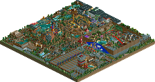
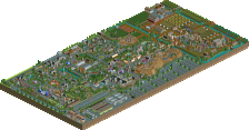
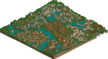
Welcome! Miraculously created in little over a month by two dozen different builders, Mirage Islands is an excellent start to a new era of group parks. This is history, right here!
To find out who did what, take a look at the patrol areas of the entertainers - each entertainer represents one builder. This gives a good rough indication of who did what. Invisible like this, but very important to mention: Louis made the layout for the B&M flyer, and Maverix is responsible for the GCI duelers as well as the Vekoma kiddie coaster.
We couldn't have made this park without the awesome OpenRCT2 Multiplayer feature and TycoonParadise hosting the very first NE multiplayer server - our thanks to the OpenRCT2 dev team and SweetT/CC9 for helping us get the server up and running. -
12 fans
 Fans of this park
-
 Full-Size Map
-
 Download Park
1,326
-
 Objects
1
-
 Tags
Tags
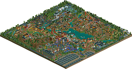
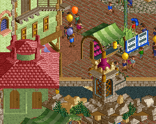
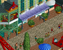
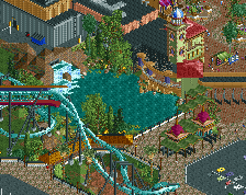
<3<3!!
Why is the logo taken from Space Jam?
Yay <3
Love this.
I will try and post my review as soon as I can.
Compliments:
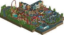
1. The flyer is brilliantly placed. It interacts beautifully with the parking lot/entrance path, and the covered walkway beneath it stops it from feeling like it's intruding too much on the parking lot.
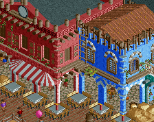
2. The Mainstreet is beautifully composed. It has a nice blend of cultures in it, and the detailed towers help break up the monotony of flat rooftops.
3. The river rapids are simply stunning. The rockwork along it is some of the best I've seen, and it's integrated nicely with the path.
4. Ethiopia is my favorite part of this park. I'm a huge fan of the fallen pillar on the path.
5. The entertainer village is a nice touch.
Complaints:
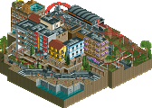
1. The Monte Carlo area should have died the first time it was removed. It only has 2 or 3 facades that actually look Monte Carlo themed, and the rest could be townhouses in pretty much any first world country.
2. The space-themed area feels out-of-place and cramped. This park is basically a "world showcase" of many different cultures (Ethiopia, Himalayan, Scandinavian, Mexican, etc.), and the space theme just doesn't fit in.It feels very limited by the Monte Carlo area.
3. The flyer is absolutely dwarfed by the hotel.
4. The observation tower should be more centered within the park, and not confined to a themed area.
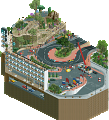
5. The invert has way too many tunnels. The mountain under the lift is a bit bare in some spots.
6. The water coaster's supports only look good from 1 angle.
7. The roller skater's station is way too massive for that kind of coaster. It's brake run is forced into being absolutely huge, and the long straight section before it doesn't help, either. The transfer track is also quite unrealistic; there's no way for the train to get onto the alternative track, and there's no room for train maintenance on it, either. The coaster would have been better without the transfer in it.
8. The jet skis are an interesting addition, but the ramps sitting in the water take away from the beauty of the lake.
9. The lake should have more detail. As it is, it's just a flat-bottomed lake only 1 unit deep. There should be some elevation changes underwater.
10. The Moped Tour Co. ride is quite awkwardly placed underneath the invert, and it doesn't fit the Himalayan theme.
11. The pathwork uses too many brown/tan colors. The brick and cobble paths are overused.
12. The hotel-park entrance is quite awkward. There's hardly any room for it, and it creates a bottleneck between the 2 towers flanking it.
That flyer is the sex, best layout in the park, whoever designed that is a genius, give that man a job!
Have you *seen* where Cedar Point's observation tower was?
Notice to Acolade Panelists that have built on the park:
If you have been deemed to not have contributed much, you have been temporarily removed from the park in order to vote. Once the park has been voted on, you will get your share back.
The reason for this is that there are simply too many panelists that have built on the park, and thus, the park will never get voted on. For that reason, we decided to allow certain members who have built on the park to vote, as explained above.
The following panelists have had their shares removed:
][ntamin22 - 4%
Louis - 4%
Dimi - 1%
Faas - 1%
G Force - 1%
Posix - 1%
trav - 1%
This post is also in Leon's first post.
Even though I only contributed to this a small bit (some walls and stuff), it was still amazing to see this park progress so much in so little time, and live right in front of my eyes! Love this a lot.
Panelists: take your time with your votes.
I wish I had the time to write a proper review, but I don't right now, but I'll drop in a few words.
I absolutely love this park, to me it's a fantastic example of what rct is all about. I know that some hoped to have more planning involved, but I think overall this came together extremely well. And the variety of themes is so much fun, in every corner there is something fun and exciting tucked in there!
Well done to all involved! I know there was extra work on the part of certain builders near the end of the project to get everything completed, so an extra thanks to them!
Can't wait for Park II. I hope this new trend continues!
Except for the name which I think is downright lame, this park turned out really quite nice.
The entrance is stunning and the woodie, controversial at first, turned out really nice and fits pretty comfortably in its spot. I also really love Ethiopia, very nicely done and architecturally well researched! Definitely my favorite area of the park. The Tibet area and its coaster, on the other hand, while well done feels kind of derivative of BGA (even though the invert there was in another "country") and all the tunneling looks very much like an after thought (I assume it is?). Monte Carlo could probably have been skipped or integrated with the entrance, but the coaster is nice and the roulette table is lovely! I like the space area even though it's a little cramped. Scandinavia turned out nice although beside the woodie it does look a bit uninspired. The midsummer's pole is a nice detail, though! Germany is good, in particular the coaster, but I would've liked to see some of it used for Badlands instead, that area I think turned out really nice but tragically tiny. Shutter Island, like some said, doesn't really fit that well but it looks great, kind of nostalgic, and it's great to see such good work from a new member! Mexico is very well done but didn't do much for me on an emotional level; a pretty done-to-death theme (although I guess you could say the same about Badlands). High hopes for the next park!
I'm going to take credit for coloring a few awnings the entrance area, shouldn't that be at least a 20% share?
wow, this park is amazing. so excited for the multiplayer future of NE. just so much fun to work on, and just to watch and chat to people in. love this place!
"islands"