Park / Dragon of Bastard Mountain
-
 31-January 17
- Views 3,716
- Downloads 622
- Fans 5
- Comments 23
-
 63.75%(required: 65%)
 Design Submission

Louis! 80% Kumba 75% alex 65% Liampie 65% trav 65% Coasterbill 60% Cocoa 60% csw 60% G Force 60% ][ntamin22 60% 63.75% -
 Description
Another No-Hack extravaganza. LLLL
-
5 fans
 Fans of this park
-
 Full-Size Map
-
 Download Park
622
-
 Tags
Tags


![park_4806 [NEFC] We Overcome](https://www.nedesigns.com/uploads/parks/4806/aerialt4750.png)

![park_4796 [NEFC] Pineapple Road](https://www.nedesigns.com/uploads/parks/4796/aerialt4695.png)
![park_3119 [MM2014 R1] El Paso Springs](https://www.nedesigns.com/uploads/parks/3119/aerialt2737.png)
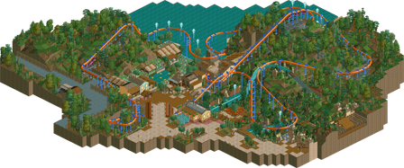
Ah, love this! Always great to see new LL work of this caliber, and nice to see a less-used coaster type (seems to me most persons would go for a B&M invert with a theme/name and landscape like this...) The layout is so smooth, and follows the terrain perfectly. Nice scale. Great colour and texture choices throughout, including details like the little shifts in the colour of the coaster rails! The way it suggests wear to the paint job is a nice way to add a level of micro-realism that's otherwise tricky to achieve in LL, at least without hacks! The lack of hacks is also very inspirational I feel. Splash boats are also nice, I would've loved to see this expanded into a complete park, it really leaves me wanting more. My only complaint would be the bare cliff faces at the back of the station, with the lushness of everything else it simply looks unfinished.
This is your best work by far.
Great to see some great LL on this site, Nice stuff, dude!
Landscape on the hills could be a bit stronger I think. Although I get the impression this was something you breezed through and were doing solely for the fun rather than the glory. Definitely not bad by any means, still.
Looks good, I cant way to try it out.
This is a nice little release, though I far prefer Hunter Wizard to this map.
Kind of wish there was a bit more context around the path, however I understand what you're going for. The coaster was really nice and the colors gave it a nice feel, overall a really solid release.
Hope to see more of these.
I really enjoyed this. The coaster and pacing were great, I love the colors and the interaction with the boat ride was great.
I guess my only complaints are that i wish there were a few more details in the surroundings and the foliage probably could have been better, but overall I'm a fan!
nice work. pleasant layout on a nice landscape, with some good buildings and vibes, although I'm not really sure what the theme was. i think the foliage was a bit off, maybe too much focus on the dark jungle bushes or something. it almost nails that classy LL aesthetic though. suck me balls
It's nothing special, but it's mostly solid. The coaster is a little bit above solid, I thought it was great! Very nice stuff Sam. 65% from me, and I'm rooting for this to get design!
Based on the overview, and what I’ve seen on your streams, I like this a whole lot. First of all, I’m a sucker for this kind of coaster, especially the ones that goes through the terrain.
I think you nailed the layout. It looks beautiful and it interacts so well with the mountain. I also love how it interacts with the splash boats, water, and pathways. For example, the turnaround next to the queue, down to the right, is magical. Also the part where it goes under the path is so good. What I also love is the bright colours. Also the choice of paths is a plus. There are many good things to say about this design. My only complaint is the lack of peeps.
Anyhow, I really like this, and to me it is design-worthy. Good luck on the AP vote.
And by the way, I hope to see you stream again.
Aw, another close call.. Too bad man. But considering the effort you put into this (it seems you built this in like three sessions), not heartbreaking. It's a fun map anyway.
Ouch. I was sure this would win.
you have a ridiculous amount of almost-LL-designs
HOW THE FUCK DID THIS NOT WIN AN ACCOLADE.
ALL PANELISTS REPORT TO MY OFFICE IMMEDIATELY.
Oh man, I really liked this...
I think this was borderline, but below 65 for me.
Considering I thought Hunter/Wizard was the far superior map, and that didn't get design, I didn't think that this was deserving.
Not really sure what else you could have done to push this over the line for me, other than perhaps expand it a bit more. Everything was well done, but just not quite enough to reach design level for me.
Sam happens to be the king of the category because his style lands squarely on that archetype, but here:
http://www.nedesigns...1601/hurricane/
http://www.nedesigns.../1588/kukulkan/
http://www.nedesigns...er-gap-rumbler/
http://www.nedesigns...440/tourmaline/
http://www.nedesigns...1/the-guardian/
http://www.nedesigns...rk/2862/knight/
I'd copy/paste my "Sam didn't win design" comment again but I feel like we all saw this coming.
To me, getting a LL design on something that is even arguably borderline, is kind of a shot in the dark. Just the luck of the draw on who votes and who doesn't really.
Perhaps its a bit less so now with the small size of the panel, but its possible that this is the only 10 vote combination that the panel could have produced that wouldn't have resulted in a design. Replace any of the low votes with a 75 or 80 and boom, design.
Its kind of the way anything that is borderline works, but perhaps more so with design and spotlight yes/no decisions, which is a shame, but something that really can't be fixed.
Indeed. No voting system is perfect. I'd say the system we have is great, and couldn't get much better, but there will always be borderline cases. And to be honest that's kinda a good thing too. Keeps things interesting and offers incentive.