Park / Sognare
-
 02-February 08
- Views 20,107
- Downloads 745
- Fans 0
- Comments 68
-
 No fans of this park
-
 Full-Size Map
-
 Download Park
745
-
 Objects
159
-
 Tags
Tags

go get some imagination and then come talk to me...
seriously, what you say is along the same lines as someone bolding "rollercoaster" in the game title, either way there are not set guidelines as to what has to be made in this game so stop acting like there are... if you don't like it that's fine but don't go acting like you are one of the the ones who "plays the game right" and Kumba or Levis or whoever "play the game wrong" or some other nonsense
oh and if you think building parks is the way to beat scenarios you are sorely mistaken... think back to the time you played them, you don't play to make things beautiful you play to win... it's a totally different game from that now... it's not even a game any more as there is no goal or even a real purpose, it's more like a creative outlet where you can do what you want. And honestly, I do not see the problem with that.
And sorry if this is not a park based contest, but look how thats gone recently with the end of H2H4 and next to no one getting a PT3 finals entry done in like 3 months. Deadlines and "Parks" does not work these days.
And yeah my entry is Lord of the Rings based and Ent is the correct spelling
So, Steve, maybe you should just shut up. Leave the site if you don't like it.
OLE, please stop. "Get some imagination?" Seriously? You're talking to someone who's an art major in school and writes in his spare time, so don't tell me to "get an imagination". I really don't know why you said that. Also, I'm not really sure what you meant about that bolding "rollercoaster" thing. I assume you mean that some people think the game is about rollercoasters and nothing else, and I somewhat agree with that at times. That might be a very good reason for me to dismiss zodiac's entry for lack of coasters, actually.
I never said about making parks beautiful to win, neither. I said you had to make parks. You've ALWAYS had to make parks. You had to get a certain amount of guests to enter your park, you needed a certain amount of coasters, or money... it was ALWAYS about parks. I wasn't around at the beginning of this site (but fairly close I suppose), but even then, it was about building parks. Not space stations in space, not coasters flying through clouds, and not about Ents. I don't know where you're coming from OLE, though I guess I vaguely understand some of what you're saying.
RaPiPo, RCT is a creative outlet, yes. I GET IT. What don't get is the first thing you said? So you draw and try to put your ideas to paper. OK, thanks for sharing.
RCT has always been a creative outlet, by the way. I don't know why people are just now saying this recently like it never was to begin with. I guess the whole reason I'm bitching and moaning about this is that I just miss when people built parks while STILL being creative. geewhzz's design is a perfect example of that; he made a legitimate park, while doing new and exciting things. So, whatever. I'll leave this site when something like cBass' Outpost wins Spotlight.
A mirror is made to look at your self so I'm not allowed to bounce of rays of light with it?
etc etc etc
this is just another case, Rct2 is ment to make parks, but why can't some people use it to express other things?
you can build a real park in the pro tour contest or the head 2 head contest ... so why cant we have a contest once which is about searching the limits of rct2 by trying more radical things.
ohh and steve ... doesn't DRC give you enough reason to leave ?
and for someone claims to be so creative you certainly aren't showing it very well with comments like the above
as I said before, we all have different ideas, opinions, feelings, thoughts, beliefs, whatever you want to call it on this and you don't seem to be able to accept that. My question is why. I'm not speaking a different language here nor am I being vague. Open your mind to it a bit dude, stop giving the impression that you're just right about this and that's all there is to it.
so don't tell me to stop because I'm not going to
whatever... there's no point in saying things to people like you anyway, I'd have a better chance of convincing a wall of what I'm trying to say
PS- I find it really interesting that the people who act like they know a little bit about everything rct are the ones who don't play any more.
Edit- well this little bitchfest was fun while it lasted... guess I'd better go get to work on some parks now
Corkscrewed Offline
Just spouting a South Park quote in just to demonstrate how this whole argument is pointless. There will always be people who believe in the more traditionalist view of RCT and advocate PARKmaking, and there are others who view RCT simply as a pallette for ARTmaking. Both are right. Is that so hard to believe? If making smaller things will produce actual work, that's good. But everyone will still know that to be truly great at this game, you'll have to actually make a great PARK, not just a great mini.
--
Just took a look at this MM, and I've got to say: I feel like somewhere in the course of whatever he was last working on and this contest, Kumba finally nailed the concept of color management. Nice job here!
Corkscrewed Offline
Obviously, pretty colors are always nice, but if you put thought into the color scheme, that's the more important part. And Kumba seems to have finally realized that you don't need to give people seizures with your color choices.
That doesn't mean it is 'wrong' to use this game as a form of art or outlet of creativity.
It's also nice to once look at a MM entry or the like, but that's it. ONCE.
These kind of creations bore me pretty quick but are nice occasionally.. And it's nice to see people use their imagination and create something that other people can see..
But again, I can see where Steve is coming from, and if you really hate these creations as much as you seem to simply ignore them or don't look at them. People who created them put time and effort in it and don't ask anything in return. So take it or leave it..
Kumba, I'm starting to like your style more and more, with all those 'little Kumba things', as I like to call them.. And nice architecture Zodiac, too bad about the forfeit.
Pity you had 2 forfeits in 2 important rounds Kumba and you knew about it in advance.. But yeah, congrats, and I hope matchups from now on won't be disappointing anymore..
SF
Edited by zodiac, 02 February 2008 - 05:54 PM.
ATTENTION EVERYONE IN THIS THREAD
JUST BECAUSE YOU HAVE AN OPINION DOES NOT MEAN THAT IT IS CORRECT
JUST BECAUSE YOU HAVE AN OPINION DOES NOT MEAN THAT OTHER'S OPINIONS ARE WRONG
JUST BECAUSE YOU HAVE AN OPINION DOES NOT MEAN YOU MUST MAKE EVERYONE ELSE HAVE THE SAME OPINION.
I'm going to make that into a motiposter and bring it out the next time someone starts a realism vs. fantasy thread.
now then, on to park commentary.
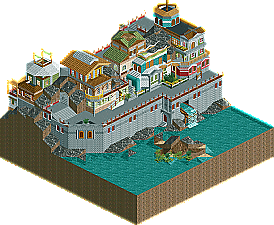
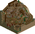
Zodiac- very pleasant. You've got something very close to an amazing atmosphere here, but you've slightly missed the boat. The details are amazing- the spillway made out of splash boats is fantastic, and the little islet there looks great. The facades all have intricate details that would make them fantastic if pulled off... well, not so much 'better', just differently. I think the underlying problem is that the colors and textures don't line up properly. There are simply too many textures on a few of the buildings, and the color choice aggravates the problem. Personally I think you overused white- the white roof looks particularly out of place - when you should have used brown, I think. It's really hard to place my finger on what exactly is awry here, but something is just.. out of place, keeping this from being really special.
Kumba- oh dear god. If there was ever a park to have Levis's approval, one would think this would be it, but apparently it is not so.
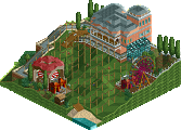
Um, yeah. amazing, for the most part. The cranes on the 'surface' are outrageously awesome, as is treebeard with merry and pippin riding.. the 'fetal', 'weapon making' and 'axeman' orcs are about the best 'little things' I've ever seen.
The coaster was creative, and the layout was alright, but personally I get the feeling that had anyone else done a wooden with 1-tile turns it would have been dismissed as ridiculous. nevertheless, It's pretty sweet. Some of the visual effect is ruined by all the black and the empty space between the two levels. The elevator is used to very good effect here, but a little less distance between the levels would have been better. While the tower and saruman were cool touches as well, I think the scale there is off, and the quarter-tower seems kind of ill-conceived. I can tell that the thought process here was "Oh, it'd be cool to have the tower with saruman panicking on the balcony.. but it doesn't all fit.. let's just squish a quarter tower into the corner." Not sure that was the best solution. The orcs swarming about were pretty cool, and the dam looks rather convincing even though it isn't supposed to be that close to the tower.
Edited by ][ntamin22, 02 February 2008 - 07:13 PM.
That's how hitler got started, too.
Steve, there are better ways to prove your point. Which, although i agree with it to some extent, is hard to prove. I'd much rather you show your take on parkmaking through parks and inspire the rest to agree with it. Opposed to some illogical debate.
How do you know 'the way the game was meant to be played'. The game was set-up to beat scenarios. One of them was creating a big mega-park, probably what inspired people to outdo themselves in terms of coasters and theming for the viewer instead of the peeps. From one thing led another, and ages ago the majority of 'parkmakers' forgot about peeps all together. They were still creating parks, but in a very different fashion then you would when playing a scenario. This whole realism aspect is somewhere in the game, but if i would construct 'a way the game was meant to be played' i'd leave that out of the picture. It's possible to create realistic parks though. It is also possible to create a scene from the lord of the rings.
And i too, especially with these microparks, would rather see it differently.
Kumba's park really would have done a lot better for me, if there were paths of people. Maybe they could be the orcs. But that was never his intention. For what it's worth, i think the theming lacked in some places. There was a lot to see though, and that's really what microparks are about. If it were about creating one lousy building it would get boring, really, really quickly. Zodiac's building was impressive but it remains just that. A building. Kumba's entry had an interesting coaster, which was incredibly hard to follow which would have made me like it a lot more. It looked like every three track pieces you couldn't see the coastertrain anymore for a while. The small turns worked somewhat, they looked really intense.
Congrats on another win though, Kumba.
Corkscrewed Offline