Park / Piano Park
-
 02-December 16
-
 Piano Park
- Views 7,987
- Downloads 1,014
- Fans 3
- Comments 26
-
-
 73.13%(required: 70%)
 Gold
Gold

bigshootergill 80% Dimi 75% G Force 75% Jaguar 75% trav 75% ][ntamin22 75% Cocoa 70% Faas 70% Louis! 70% Stoksy 70% 73.13% -
 Description
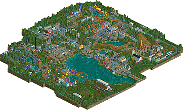
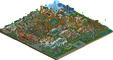
Dum dum dum duuuuuuumm!! The most musical of theme parks has arrived! Enjoy great rides like Fortissimo, Highway to Hell and Cry me a River!
With thanks to Lagom and FredD! -
3 fans
 Fans of this park
-
 Full-Size Map
-
 Download Park
1,014
-
 Objects
1
-
 Tags
Tags
![park_3123 [MM2014 R1] Wildalpenbahn](https://www.nedesigns.com/uploads/parks/3123/aerialt2745.png)
Glad this is one is released I tested it, but there I focused on the points you could improve. I promised a proper review, so here it is.
A music park, a theme many of us thought of doing but never got to. Or almost never, I never did because it is hard to translate it in the fitting archy and vibe. I think you succeeded well in that, the pop zone looks the most generic but it's just a pain in the ass music style to do in rct.
It is definitely a step-up compared to your previous work. You improved a lot, and just learning how to make the entrance huts invisible did a lot Archy is good, superb on some places (hiphopplaza, hardrock USA, entrance/classical zone) but a bit bare and the old-Jappy style on other (pop zone, jazz zone).
I'm not a foliage expert. Of course there are other parks who displayed more stunning foliage but it's all clean and very green and that's what I like. I like the coasters too, especially the spinning coaster
 Seriously, the GCI and the Intamin are also great!
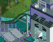
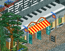
You've built some really neat details: the piano building, all kinds of instruments properly built, the KrissKross jump , the broken windows and graffiti at the hiphopplaza (and finally a game stand that would never disturb me irl in a park, the basket court), cry me a river statue/waterfall, headphones, flashmob...
You can be very proud Jappy! Glad that I could help I rated it 75%, so a gold for me.
This was lots of fun! great work, references, puns and sculptures man
For some reason this park reminds me of WoF, perhaps its the coaster types and the sprawling nature of the park, or maybe the way you handled the themed areas.
One small thing that bothers me is the lack of a true kiddie coaster, you have Symphony of the Classics, but I'm not sure if that counts.
I sill need to spend a bit more time to take this in, but I give off a better impression to me than earlier. A full review will come soon enough!
This was pretty cool. It oozes ideas and creativity. You have a lot in common with Lagom, I'd say - admittedly more from his Liseberg time. You have the ideas, the creativity but skillwise you're not on the highest level. That isn't to say I'd rate you poorly for it. Technicality is rarely of huge importance to me. This park was interesting and fun and I can only think of one thing to be your 'next step';
Go bigger. Your layouts are underwhelming tbh. Your parks need that extra 'thing' to get you from silver through to gold to spotlight. They, generally, seem to miss a sense of grandeur.
Most poorly written/worded review of mine in a while. I'll rewrite some of it asap.
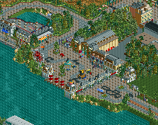
Hip Hop Plaza and the block of buildings around the Trippin' Sixties are borderline spotlight quality imo. Loved them.
Congrats on finishing this, Jappy. It was a treat to watch in game. I won’t be able to write a full review, but I still want you to know what I think.
Pros:
+ The park is so alive. There are peeps, stalls, and signs of life everywhere and I love it.
+ The atmosphere is just wonderful. I love that with your parks.
+ Colours are great. Some bold choices here and there but I think they work.
+ The instruments. The trumpets, the drum set, the guitars, all made me wow.
+ Coaster layouts were better than in your last park. Highway to Hell was really fun to watch, for example.
+ Architecture was really nice and interesting in my opinion. So much to look at! For example I love the radio building and the green brick building in Rock Town USA.
+ Clarinet Catapult. It is probably my favourite attraction in the whole park. Great idea.
Cons:
- Foliage. This is what brought the overall impression down in my opinion. I’m far from an expert on foliage, but I would’ve loved to see a brighter mix. The ones you use are a bit dark and depressing in my opinion.
- The yellow submarine. I can understand the idea, but it looks weird with the submarine on land. Shouldn’t it at least be in water? Compared to many other things in the park, this is of quite low quality. I’m 100% sure you could have made it better.
- Even though I love the massive drop on Cry me a River, the immediate and intense turn right after is a big no no, for me. Looks dangerous, man!
Overall, it is a solid park, Jappy. I had a blast watching it in game. I think it is a step up from your last park. I voted 75%. I love that you take peepabilty serious and I love that your parks are so lively and atmospheric. Keep doing what you do and good luck on the AP vote.
Thanks everyone for the nice replies! I've had a blast building this, and it's great to hear people like it too.
@FredD: Thanks! Great to hear all your compliments. I agree some parts of the Top of Pop-zone are a bit old-fashioned Jappy but I actually based the archy there of Walibi Holland. And like you said, it's extremely difficult to visualise the theme. Nonetheless, I think I made a valiant effort, and indeed, I am proud.
@Goliath123: Thanks for the compliments! Those puns and references took a lot of research so I'm happy you appreciated them.
@G Force: Well, as I said with one of your screens a while ago, your parks do form an inspiration for me when I'm looking at how other people tackled stuff like supports or path detail. Maybe that why it has some WoF vibe? I know about the lack of a kiddie coaster, but I imagined Fortissimo would count as a family coaster.
@chorkiel: Thanks! Lagom actually monitored the building of this together with FredD, so he advised me through the entire building of the park.
I'm far from a coaster expert, that's why I tend to "hold back" when building them a bit. But my next park will be another zoo-park. I'm thinking of not necessarily bigger coasters, but more heavier themed ones with more interaction. I already am planning my own versions of Expedition Everest and Black Mamba for that new project.
@Stoky: Spotlight quality?! Don't give me too much hope!
@Lagom: thanks for all the compliments! Atmosphere and peepability really are important for me. A park that's just dead scenery means little to me. I want the guests to interact with it and I try to push that to the max. About your cons, yeah, I agree with most of them apart from foliage. Strange you find it lacking, it's the same mix I've been using in pretty much all my stuff and it's weird only now you find it lacking. But like I said in the comments of my screenshot, I'm experimenting with complete new mixes of foliage for my new zoo-project!
@Jappy – Maybe it is strange, maybe it isn’t. The way I see it, is that you’ve developed your skills A LOT in areas like architecture, details, coaster layouts, etc, but the foliage looks pretty much the same. It just doesn’t keep up with the rest. Is it bad? No, of course not. Just wish you took the time to experiment a bit more. Anyway, it’s just my opinion. I could be wrong. By the way, I’m really excited to see that zoo park come to life!
Themeing was fantastic for the most part:
- Loved the piano shaped building in the entrance!
- Great classical music area, working in the instruments into the architecture was very well done (in the whole park).
- The building details and variety show a lot of creativity and skill, so much depth to your archy!
- I love the jukebox, the radio, the amplifier/dj mixer, the Guitar Hero ride buildings, etc, etc. etc
- The atmostphere you created with all the little touches were great, the musical notes, the headphones, the sheet music stand... it combines together with the rest of your park in a symphony!
I can't make any more suggestions to improve than what others have already noted: coasters, foliage, yellow submarine ride. To be honest, nothing in this park was poor quality, you're showing elite skills, more focus on these areas will only make you better!
Bring on the zoo!
80% from me!
That could already resolve my 'issue'. As I meant size wasn't the issue, but it's more about feeling. Missing a sense of grandeur - grootsheid - which I'm certain you can create.
@bsg: So to improve I have to focus on foliage, coasters and...yellow submarines?! Alright, I'll remember it the next time I build one!
Yup, I'd like to see a properly executed yellow submarine design for once!
This park is so unique, I really enjoyed looking through this. The only thing that I wasn't really impressed with was the woodie layout, but that's just one small thing so it's no big deal.
Very minor point, but I think it's worth suggesting that you make the underwater landscaping actually flat rather than what clearly just looks like you've used the mountain tool. Another minor point is suggesting that you use a combination of the cena path and the default crazy paving. It breaks up large expanses of the same path and works really well in doing so (see De Vliegende and BGA).
Foliage is the obvious critique, but I'll leave that aside for the moment.
Entrance
This is quite pleasant, something is missing from the path leading up to the entrance (idk, maybe the realism in me is holding out for a parking lot or something) but the entrance mainstreet itself is really quite good. The piano restaurant is brilliant, and I actually missed it on first viewing. The grey crazy paving was actually quite effective in guiding people through the park and I think if you had continued the use of music notes as a bit of a 'treasure hunt' kind of feature it would have been even better.
Four Seasons
Music is a great theme for a park because you can incorporate 1) a tonne of motifs and 2) you get to utilise architecture from gorgeous places. Unfortunately, the four seasons area I don't think you quite utilised this fact as much as you could. The dark ride station and 'season themed' foliage out front was what I wanted throughout the area. Instead, I got an awkwardly overgrown roof, a nicely built power shot, and a great facade but overall little oddly built station. Why are you so against black roofs lol?
Coaster layout didn't do much for me (unfortunately, this is a bit of a norm throughout the park), I appreciate the attempt but I mean uncoloured trains and 90degree turns are usually a no-no.
60s
I've already commented on how much I loved the block of buildings in this area. Not really much to add, I wanted more of that archy haha
Yellow Sub + AC/DC
Another kinda weak coaster, unfortunately I can't really put my finger on why I'm not taken by them. For some reason I want to compare them to what bsg builds, I guess it's just some kind of odd transitions, and you're using turns to get to another element rather than using them as part of the layout (that's kind of the only way I can describe it I think).
The Borough Markets was another decent building. I'm not sure I quite understand the level of critique everyone is giving to the yellow submarine ride. I mean, the double drop is a bit nuts, but the actual form of the building makes a lot of sense imo, it just did not fit at all with the surroundings. Also, worth noting the turnaround on land by the path is very ugly, keep it all on water and use the wooden boardwalk + benches combo. Had you made a kiddie area in the park, and shrunk the layout down a tonne or made a junior coaster the yellow submarine would have fitted perfectly!
Hip Hop Plaza
What made Hip Hop Plaza so good in comparison to the rest of the park might actually be the positioning of the architecture. Carnaby Street should have been swapped with the launched coaster I think, the problem becomes architecture having to be hidden by trees on one side because the path continues (unless you go with backlots but they still have to be hidden), and this looks weird because of that backdrop pathing.
Here you've got facades (well done btw), all the action centred, and backlots behind. Aiming focus without distractions. Re: Breakdance (see previous coaster critique).
New Orleans
Unfortunately, new orleans architecture has to compete a bit with Pac, Rob, and Shogo. It's good, but it doesn't quite compete with that haha. Unfortunately, you don't have the brick path texture I actually like on this bench and I think that would have been better than the one you chose here. I know I suggested ditching the tarmac in a previous screen but in actuality I think it was a problem with the cena path and not the tarmac.
Tomorrowland Stuff
Would have loved to see this area fleshed out a bit more, the facades by the drop tower were actually really interesting despite not having any peaks. Less foliage more pathing and architecture, seems like a more 'modern' area and the surroundings needed to better reflect that imo. Soundwave station was really cool.
King of Pop
Unfortunately, I didn't really understand this area too much. I mean it's bright and colourful but why does this reflect pop music? Surely all of this stuff would have fitted perfectly well in the previous area? Idk, I guess this area didn't really come together as something unique and different, unlike most if not all of the other areas.
Torn between 65 and 70, I think the fact there are spotlight-quality areas in this warrant a gold. Work on your layouts and foliage (understand foliage can also be used to reflect different areas), hopefully you understand why the spotlight-quality areas are of that quality and keep doing more of that!
Thanks for the review Stoksy. With the help of criticism I can improve, but some of them made me think or need some attention.
-Yes, I am against black roofs, you won't see them in my parks. Makes things way to dark IMO. Just a matter of opinion, nothing more really.
-I suck at coasters, but I do my best to improve. I agree I'm not really there yet though. Colourless trains? So green and red aren't colours anymore?
My next main point of improvement I will seriously work on is foliage. That's where my new zoo-project will help me with. It's a step back to a concept I've done earlier, but the vast nature of a zoo and lesser focus on architecture (doesn't mean there won't be any!) will force me to take greater care with it. Also, the coasters I have in mind will force me to put a bigger emphasis on interaction and design. Your own Expedition Everest will serve as an inspiration! Inspiration that is, not rip-off.
More that the colours you chose are often the default colours for those trains, I thought you could have gone with something bolder/more original. Idk, just personal opinion haha
Sorry don't have the time for a really long review like I've been doing recently but I'll post some quick thoughts.
I have mixed feelings about the park. I think its because it has a sort of identity crisis about what it wants to be. some areas seem like regular old themed areas with a music theme just slapped on in the ride names, and other areas seem really involved and intricately tied into the theme. There are a lot of impressive structures- big guitars, big jukeboxes etc around the park. but they sort of just sit as stations to otherwise generically themed rides or plopped in the middle of some standard european architecture. other than the hip hop area, which was my favorite, everything seems like it just missed something to make it special- more details, atmosphere, I'm not sure. For example, in the rock area, you have a big yellow submarine (cool!) on an otherwise not-so-themed log flume. And nowhere did you put in an abbey road crossing! that would be such a simple, necessary detail- something which I think was lacking throughout. You nailed the big set-pieces, even if they're sort of randomly placed, but lacked a lot of the finer details that make a park make sense to the visitors. and the new orleans area is ripe for dense atmosphere and vibes, but it seems to be just a square of buildings with the same path around it as everywhere in the park (another flaw- everything seemed too "samey" across the different areas)
layouts were probably not your strong suit also, and I wasn't a huge fan of the many dark rides squeezed inside buildings we couldn't see.
anyway I've bagged on a bit about it just saying the problems but overall it was pretty good. just nice, pleasant, classic european parkmaking with some nice architecture and fun vibes throughout. I think all the things I mentioned above you have the skills to tackle properly and fix in your next parks- I definitely see a massive potential there.
This is one of those parks that I clearly just don't "get". Don't get me wrong, I enjoyed it... but it struck me as a low silver. Some of the architecture is really nice, but I found a lot of it to be blocky and uninspired also. It was a bit bipolar in that regard.
I felt the same way about the layouts. The floorless layout was awful but the Intamin and spinner were very nice and the GCI was gorgeous.
Honestly there were some things I liked quite a bit, like the area near the spinner with the basketball courts (the inner-city park look isn't something many people would attempt due to the sparse foliage but you pulled it of). I was also a big fan of the building between the Scrambler and Enterprise and the one between the swing ride and swinging ship. Those were all great.
As I said though, it just a felt like it was all over the place. I didn't care for the foliage and I think that brought everything down and for every great building there was one that was really lacking.
Sorry for the low vote. It's a really nice park, I just wish I could see what other people see in it.