Park / Discovery Bay
-
 19-November 16
-
 Discovery Bay
- Views 11,149
- Downloads 1,121
- Fans 18
- Comments 33
-
-
 91.88%(required: 80%)
 Spotlight

bigshootergill 95% yes chorkiel 95% yes G Force 95% yes Liampie 95% yes trav 95% yes Cocoa 90% yes posix 90% yes ][ntamin22 90% yes Kumba 85% yes Louis! 80% yes 91.88% 90.00% -
 Description
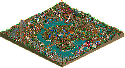
My modern take on classic LL ‘Disney’ style parks such as Disney’s Forgotten Kingdom by Natelox and DisneyDreams by PyroPenguin. It’s also draws inspiration from the real life park, Tokyo DisneySea.
Discovery Bay has 6 areas:
-Port of Discovery (Entrance, Sci-Fi/Steampunk theme)
-Old Acapulco (Mexico theme)
-Tortuga (Pirate theme)
-Lua Pele Island (Polynesian theme)
-Mekong Detla (SE Asian theme)
-Coral Cove (Waterpark, Underwater/Barrier Reef theme) -
18 fans
 Fans of this park
-
 Full-Size Map
-
 Download Park
1,121
-
 Tags
Tags

congrats on spotlight man, this overview is just amazing
Very interested in Liam's 95% 'No' vote
After an intense internal review the Accolade Transparency Committee has reached the following non-binding conclusions:
Oh wow, that was a quick score. Thanks everyone :-)
Grats Alex, on your second Spotlight this year, and with LL! Who would've thought.
5 Spotlights this year, that's indeed quite impressive. And what's the last time someone got 2 Spotlights in 1 year? 2005?
Seems like a nice park all around, nothing groundbreaking, but overall a high quality piece of LL. Keep it up!
This park really is incredibly good. Best LL ever? Possibly, though I think it's a little too soon to judge. I loved the over-all layout, I think the themes were well chosen and very well executed (in particular Mekong Delta and the entrance area). I think you have a way with colour that's just something else, really special. It's most clearly expressed in the entrance area and in the general landscape the way you've juxtaposed patches of foliage and bare martian ground texture. Also you're really good at using trackitecture in interesting, sculptural ways, again the entrance is a great example, as well as the waterpark and Lua Pele Island.
In contrast to many I really appreciated the monorail. I also think the corkscrew supports on that Arrow deserve to be mentioned, possibly the best interpretation I've seen of old-school Arrow corkscrews. I can't remember seeing them done that way before, though it might just me my memory failing.
Comparing this to Luna Park, which was a triumph in itself, I think this park suffers far less from the lack of guests, which I feel really hurt Luna Park's atmosphere. Possibly the classic style of this park, more reminiscent of the masterpieces of old, helps it in that respect, as in those days we were used to not seeing peeps in high level RCT.
It's amazing how you've managed to win two spotlights in less than a year, but they're both so very well deserved. I'm really looking forward to your next park!
Also this must be the first time someone's named a handyman after me! I feel very honoured!
Congrats on another spotlight! Looks like I have yet another reason to buy LL...
Looking at the overview though, the caravel looks awesome and the steampunk area is aesthetically probably my favorite. Definitely wish I could give more feedback but this is definitely one of the best LL parks ever made.
Congrats!
Congrats on this spotlight. You will now go down in NE's history forever.
This is outstanding. The coaster layouts are awesome, the theming and atmosphere is great, some of the support work is so good that I almost forgot it was LL (like the Arrow corkscrews, the spinners and the dive machine). I really have nothing to bitch about here... lol.
Also, I just want to point out that the Steampunk idea was brilliant amd probably looks better in LL than it could ever look in RCT2, and the Asian area often had me thinking I was looking at RCT2.
Amazing work all around!
Sorry about the window size (and taking so long to do a review)
https://www.youtube.com/watch?v=ePug_-Hv6HY
This was very much deserving of its score and certainly fits nicely in the RCT cannon of best parks ever. Congrats on the awesome achievement.
I owe you a review, so here we go. I haven't opened the park in a while so my thoughts are kinda fresh!
Ports of Discovery
This feels right like how an entrance area should feel. Welcoming, calm, and intriguing. The jurassic music and the soft colours play a big role in this... I feel like I'm passing the gates of a real theme park at 10 am, just having had breakfast in the car, wondering where to go first. There is so much to this area that makes it unique. The very textured paths (the space fences look cool here), the chairlift archy on the entrance gate, the air powered track archy with the observatory cutting into the main street, the platforms, the clock looking like a clock, the go karts going over and (even cooler,) under the path... This is one of the coolest areas we've seen in RCT in either game.
Old Acapulco
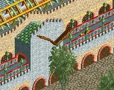
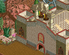
Desperado looks massive. That (double) first drop is massive. Love it. I know that the area started out as a bit of a problem, but you turned it into something worthy, with great attention to detail. The architecture is very varied and it's a miracle that you made it work. All the different roof types, the queue path awnings, the open windows, that fucking bell tower. Flowers in two tones of pink, why!? Blue queue!? Ice theme music!? It all works! Even Jesus Christ is admiring what you did here.
I know you've already seen this alex, but look at this shit right here:
So good. Love Dia de Muertos too, by the way. The interior is simple but enough to get the idea across, the ghost is a great touch, and the graveyard outside is perfect
Tortuga
A few cliches here, with the skull mountain and the shipwreck. Especially the shipwreck + water coaster combo. It looks amazing though. I like how Buccaneer with the surprisingly nice layout kinda sits in its own area, almost like an island. The look of the area is refreshingly dark, which is great because the horror music from Dia de Mertos spills over in most of the area. The Golden Curse is another example of something simple made perfect. The colours are dark and unique, but still themepark-y. The station interior is 10/10. The ride itself is so beautifully integrated, with the loopings being in a pit.
The docks area is possibly my favourite in the park. It's so fantastical and irregular... And again, great eye for detail here. The lanterns are brilliant. I cannot imagine how this would look at night. Other highlights include the (sadly only decorational) fortress, and the viewing platform for the drop tower. Oh, and the red+pink flower combo is bold.
Mekong Delta
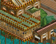
First thing I notice right now, for the first time, is the neutral 'buffer' area between Tortuga, Mekong Delta and the tropical centre area. Very hard to make it not look awkward. It's a welcome oasis of peace, but I'm moving on. Bamboo Shooters and Nirvana are good rides, but probably among the least interesting rides in the park. The only real highlight here is, I think, how the coaster drops under the path diagonally, and the tiny bridge through the Dive Loop. In real life this coaster would look insane. Actually I think this area overall might be the weakest in the park, despite Mekong Adventure being one of the prettiest RCT sights ever. You absolutely nailed the vibe of Southeast-Asian huts on poles. A minor shame you couldn't complement it with as many little details as you managed in areas like Tortuga and Acapulco. Lastly, on a more positive note again, this building somehow feels so authentic:
Lua Pele Island
The. Huts. Rock. Great name and supports for Pineapple Dance, also a good idea to find a ride name to match the weird looking coaster cars. The area's colours are relatively dull and monotone, which is great becuase it makes the main coasters pop, to put it mildly. Great trick with the lifthill support colours btw. Awesome idea to make the lifts cross and have the trains join up during a dive loop. It's very elegant. The other interactions are also good. One of the most fun coasters around. Something that's easy to miss is the multi-layered spots in this area. It's quite a few units above the water, allowing rides and paths to go underground around the fringes. Works great for rides like Typhoon (although it looks a bit cramped) and Lua Pele Descent. This place is super immersive:
By the way, the bridge connecting the area to Discovery Bay is beautiful. Repetitive tall arches. Even the simple things like a bridge you can turn into something special.
Coral Cove
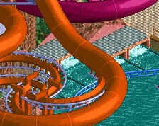
I think I've said most things I have to say right now. You took something simple like pools and slides and made everything unnecessarily special, like the spiral supports for the slide tower. You have a giant awning shaped like a shell, and due to the nature of trackitecture it even has 'ribs' like a real shell! Again, great details and multi-layered spots in this area: the wave pool, the little steep slide, the rubber rings, the anemone, and the cozy lakeside jacuzzi. So unique and pretty.
I still stand by my 95% vote, which is possibly as high as I've ever given a park. The no vote is obviously accidental. This park is one of my all-time favourites. Congratulations on spotlight.
I've finally checked this out in game (incredibly late, I know) and I seriously take back my original comments. This is the only LL park I would vote 95%. Literally every screenshot and angle of this park is astounding. It's breathtaking.
Your creativity, patience and talent in both LL and Rct2 will never fail to surprise me, everything you produce is just stellar.
Liam says it all really. Every single inch of this park is phenomenal.