Park / Discovery Bay
-
 19-November 16
-
 Discovery Bay
- Views 11,149
- Downloads 1,121
- Fans 18
- Comments 33
-

-
 91.88%(required: 80%)
 Spotlight

bigshootergill 95% yes chorkiel 95% yes G Force 95% yes Liampie 95% yes trav 95% yes Cocoa 90% yes posix 90% yes ][ntamin22 90% yes Kumba 85% yes Louis! 80% yes 91.88% 90.00% -
 Description
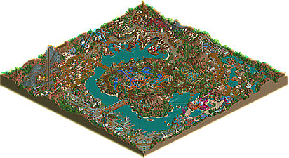
My modern take on classic LL ‘Disney’ style parks such as Disney’s Forgotten Kingdom by Natelox and DisneyDreams by PyroPenguin. It’s also draws inspiration from the real life park, Tokyo DisneySea.
Discovery Bay has 6 areas:
-Port of Discovery (Entrance, Sci-Fi/Steampunk theme)
-Old Acapulco (Mexico theme)
-Tortuga (Pirate theme)
-Lua Pele Island (Polynesian theme)
-Mekong Detla (SE Asian theme)
-Coral Cove (Waterpark, Underwater/Barrier Reef theme) -
18 fans
 Fans of this park
-
 Full-Size Map
-
 Download Park
1,121
-
 Tags
Tags
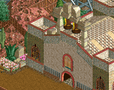

Holy shit, Tortuga is so so good.
damn I'm about to go out but I'll be thinking about this until I get back
so hot
The subtle fence change you made in the water park area really makes a massive difference.
To me this feels almost like the perfect park, there are a few things I'm not a fan of but considering the limitations of the map they're minor. Coaster wise this is probably the best LL park ever, at this point I can't think of a better lineup out there. Perhaps one of Fatha's parks or WOMB but really this is a step above anything we've seen in a long time.
Hope to give an in-depth review at some point soon.
alright, I'll go through this area by area. truly a fantastic piece of LL, pretty much the park I've always dreamed of making
entrance:
just a brilliant area, brimming with the amazing ideas I'd expect of you. I don't understand how you keep coming up with such good ideas! I love the curved rooves made from the tophats, the enterprise roof, the observatory, the landscaping etc. Such a good atmosphere and vibe. I just wish there was more of this area! the go kart ride was also really fun to watch.
mexico:
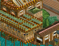
vibrant and so fun. the woodie station may be one of my favorite stations ever built. the gardens under the red path is such a perfect touch, I can't believe I hadn't seen that before... (like I feel with all of your little details, they all seem so obvious in retrospect) even things like the blue queue path used as path awnings is an amazing touch I hadn't seen before. the woodie is also an epic layout that really fits nicely in that corner.
tortuga
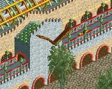
at first I thought I wouldn't like this one so much because it feels like such a classic, done-and-dusted theme/style. but there are moments in here that really show its pretty much the best version of it yet. although I wish it was a bit more... dense? (actually I think that is maybe something I wished a bit more throughout the park). my favorite bits are looking at the docks from the land side (for some reason I like these sides of the building more) and the whole complex surrounding the drop tower is perfect. love the rickety wooden stuff everywhere. the castle is also sick, really love the open collonades along the side. I think the coaster is a bit boring/bland, and I wish the foliage and landscaping was a bit different from both mexico and the entrance, although I understand if you were going for a more uniform landscaping style throughout the park
mekong delta:
I think... this may be one of the best areas ever in an rct park. in either game. the architecture is stunning. like it feels so detailed and yet so clean and elegant and perfect. probably the best asian roofing I've ever seen. the dive coaster fits in its area perfectly, with some brilliant interaction with the landscaping. it 'pops' just the right amount. but the rapids are on another level. the waterside buildings. ugh. and the landscaping feels exactly perfect for the theme, setting the rapids ride so well.
waterpark:
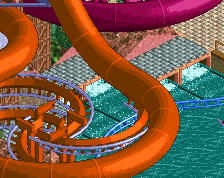
love the vibrance and playfullness here. definitely a bit small and cramped, and perhaps too much path- but the colorful coral structures are magnificent.
polynesia:
definitely my least favorite area. its good, but not great. while I like the spinning coaster, it seems sort of just 'plopped' down. the dueling coasters have some amazing interactions, especially around the station building, but also feel a bit awkward or not so flowing in other parts. the mine train based architecture is really creative but the pastel green seems a bit overwhelming- some tans and yellows and oranges would have done wonders I think. In fact, a quick recoloring of the coasters and some of the scenery makes me like the area a lot more. the waterride is very cool but I have yet to see brick walls with dirt/grass on the top that I actually liked (maybe just a pet peeve of mine tho) I think maybe the brown path is a bit dark? I'm not sure why but this area just doesn't click for me the same as the other areas of the park.
all up:
a really fantastic park and a great spiritual sequel to the oldschool LL parks. Its definitely inspiring me to get back into some LL (although I don't think I have the patience for a full park, being realistic here...) I don't know how you so consistently come up with amazing new little ideas and crank out so much work. 2 spotlights in one year? what is this, 2002? Or am I being too presumptious
Holy balls, this is good
Just from the overview, Mekong Delta looks like my favourite LL work ever. Granted, I'm pretty much a slut for any Asian theme, as I'm sure y'all know by now.
There are parts that I like and parts that I don't like, however ultimately it is a lovely park, and is much more cohesive than Luna Park. The layouts were all good except the duellers were a bit off in places IMO.
Overall a decent park, definite spotlight contender.
Great stuff.
Hands down, the best LL park ever built!
As much as I admired the creativity in Luna Park, it didn't really grab my attention, perhaps due to the lack of color pop and the old style of park you were going for. I just couldn't get immersed in it. But this park pulls out all the stops! You've taken elements from LL that are under-used & under-rated, combined them with each other - which shouldn't work together - but they come together so beautifully! And you've taken trackitecture to another level, which is quite impressive considering this exact park could have been built a decade ago since the same tools were available then as they are today. But no builder has ever come close to doing what you've accomplished in DB.
I figured I'd simply list some of my favorite things in the park:
- Steampunk entrance is probably my favorite archy in the park, the track pieces, the color choices, the green path roofs! <3
- Those friggin' go karts!!! (Stole a little of my thunder for my Mario Kart park )
)
- The foliage under the monorail track is very well composed, and foliage mixture in general was fantastic
- How you mixed the pathways throughout each section is so well done, often times an eyesore in other parks, but in DB is barely noticeable you've incorporated it so smoothly
- In Tortuga, the black docks on side friction track fits the theme to perfection... and the trackitecured pirate ship is impressively good
- As was said, impressive coaster layouts, but what added even more to it was the use of unique rides not often used, like Spinning Cars, Water Coaster, Rafts,
- The "gold" was well made, as was the dark-rides in the caves in general, great attention to detail there
- Mekong Adventure was awesome from start to finish, archy was on-point, the atmosphere oozed around this ride
- The duellers were a creative design, something we don't see often, but I definitely liked the awnings and structures around this section of the park
- I loved the unique supports you created for the water park, and bright colors that really work well here.
And as for the negative points, well, even the little things that bother me in this park are so well built they're not really worth mentioning.
Thank you for building this masterpiece of rct-artwork Alex! For me, I can't stand building anything in LL, but for those who do build in it, I hope that you inspire them to do more work like this. We could use some more high quality LL parks for sure!
For the best LL park ever built, I fully expect to see this win spotlight, you've got my vote!
My thoughts are just based on the overview, Ill check it out later.
I think what sold Luna Park to me is its originality and it felt very 'alex'. I think this park just completely lacks that. Of course I cant say much seeing as my LL completely lacks originality as well but still.
The themes just feel all too assorted and there's such a conflict of styles - I think the mix of old and new just doesnt really work.
Of course, the quality is top notch and you are the LL prodigy, I just think composition and visual flow are just a tad lackluster.
Plus monorail looked ugly as hell, sorry. really broke the immersion.
To counter what Poke said, I actually think I like this more because it is a more traditional park. Something just sits better with me about.
I'll try to update this post with more thoughts once I'm able to, but for now I'll just say that this is great work and probably my favorite thing from you yet. Congrats on the incoming accolade.
Cheers for your thoughts Poke. Since you've been quite damning without much analysis, do you mind elaborating on a few of the points?
I think it's disingenuous to say it completely lacks originality. Whilst the overall concept is (intentionally) much more classic, there are many new, original ideas in the rides, architecture & theming. Can you be specific about what you thought was unoriginal?
You're opinion, of course, but I'd like to hear more reasoning with these two points? Probably the most important thing for me in this park was making the composition beautiful and creating a visually balanced 'overview' with harmonious themes. I worked hard to make sure no areas stuck out as being too bright or dark or with colours that weren't reflected in other corners of the map. If you look at the zoomed out overview it has a very natural appearance in my opinion. Let me know what you thought was jarring or 'lacklustre' as you put it?
I'll give you my thoughts in full soon, I spent a long time looking over the park and left myself with not much time to comment anything lengthy.
Don't take my 'low' 80 to heart, the park is very, very, very good, one of the best LL parks in a while, but for me it wasn't the greatest LL park of all time, where as for some it was.
Also, the actual cohesion of the park as a whole was incredible, I keep looking at the overview seeing how impressive it comes together and looks as a whole, and how inviting it looks.
Great stuff alex, looking forward to seeing what your next project is!
LLLL
Let me be the first to congratulate you with your Spotlight!
Congratulations with your Spotlight!
Well deserved spotlight! Great work Alex!
Congratulations on your second spotlight this year. Good job!
Steampunk - Not a big fan of this entry area. The scale seemed too big on the main path and the hotel was kinda dull. Good color use and nice work with the LIM track.
Old Acapulco - Loved the coaster and the Christ statue. In general I really don't like RCT's 'blurry' flowers, so that took the atmosphere down a notch for me. The buildings were random'ish looking, but worked.
Tortuga - A good area, but not very impressive. I really like the castle and the two coasters are really good. My favorite thing in the park is the pile of gold in the coaster station. Fantastic idea, don't think I have seen that in RCT before.
Mekong Delta - Great landscaping and Nirvana is an awesome coaster. Somehow I could not really enjoy the architecture. It just seemed a little too repetitive.
Lua Pele Island - Very nice classic LL feel to this area. The duel is great, I love the in-line-twist through the ruins. It would have been better if the layout had a finish line, but still an amazing pair of coasters.
Waterpark - Awesome stuff. Great fun colors and I loved the slides. The reel track for coral themeing was a great touch, just if you hacked in a few bushes you could have taken out the diagonal wood frame on them.
I agree with what some have said about the monorail, it didn't help the park.
Overall I was a little disappointed since I think this a step back from Luna. Yeah, it's a different type of park, but other than the pile of gold you had no great creative details when Luna park had them everywhere. It should have had peeps too
83/Yes from me. I do like the layout and classic feel a lot. My yes vote is mainly due to the overall quality being high. It reminds me a lot of Starpointe since it was an older park you started when your skills were not this great and you did a great job finishing it strong.
Congrats!