Park / Silver Springs Park
-
 05-November 16
- Views 4,960
- Downloads 904
- Fans 1
- Comments 14
-
 52.50%(required: 50%)
 Bronze

][ntamin22 65% Faas 55% G Force 55% Liampie 55% posix 55% alex 50% csw 50% Stoksy 50% trav 50% Cocoa 45% 52.50% -
 Description
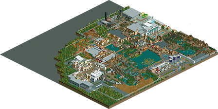
So here it is, my first upload on NE. It's not a park I'm currently working on, but it's a project I started 8 years ago, and kept building on it ever since. More than a perfect polished and detailed park, this is the park I had most fun in while designing, building, removing and rebuilding for all those years. It allowed to experiment with different themes and develop my building style. It started out as the Six Flags Belgium scenario, which can still be recognized by the placing of the entrance, and the central lagoon, although it has been resized multiple times. Also this park is, apart from a few footpaths, completely NCSO.
Originally I had a sort of Warner Bros-like movie theme in mind for the park. This can still be recognized around the entrance area with a few movie-themed rides. I let go of the idea however, and now the park is divided in 10 different themed areas.
MAIN ENTRANCE
Ticket offices, guest services, parking lot, bus stop, monorail connection and the central plaza.
CHARLESTON AVENUE
The park's entrance main street with the Boomerang coaster at the end.
ENTRANCE B
The side entrance of the park which is also the gate to the Tivoli Concert Hall and the Aquadome swimming pool.
CANADA
Classic rides such as a Vekoma mine train and the Niagara Falls shoot-the-chute.
SPAIN
The Villa Vizcaya-madhouse is the centrepiece of this waterside-town in the Mediterranean with the Dive of the Falcon as a spectacular backdrop.
FORT JEFFERSON
An impressive wooden rollercoaster built around an old fortress.
ANCIENT ASIA
Travel to the Orient on a flight with the Tengu flying coaster, through the Himalaya on a runaway train in Annapurna Railways or stroll around in the Chinese gardens.
THUNDER CITY
An old medieval city that houses two darkrides: Ghost Circus, an omnimover haunted house, and Journey to Yakarta, a pirate themed waterride.
FACTORY X
An abandoned factory site is now home of several thrill rides, including an indoor shot 'n drop tower, and Earthquake: a turbulent ride in the dark.
PIAZZA ITALIANA
World-class entertainment in different theatres, restaurants and bars around the Italian square. Connected to both entrances by monorail, this area remains open for visitors after park hours. -
1 fan
 Fans of this park
-
 Download Park
904
-
 Objects
344
-
 Tags
Tags
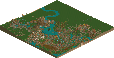
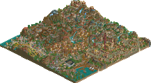
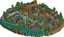
Darn, though this was your SFoT scenario for a minute. Anyways, some great stuff here, you have a nack for composing areas and theming.
The coasters aren't that great, maybe focus a bit on those for your next projects. Love to see you attempt CSO as well, you're definitely skilled enough.
not bad. mostly sort of classic ncso work, it doesn't really do much to set itself apart. relatively clean and nicely composed throughout, althoughc ould have had a bit more detail I think. a few facades in the italian area were particularly nice and I also quite liked the japanese area, those two stood out as being more unique and well thought out to me.
Good first submission. For the most part, I enjoyed the atmosphere, creativity, and fun in the park. The coaster layouts were somewhat believable, and the ride assortment was pretty varied.
Two main things hold this park back: foliage and scale. The foliage looked like it was placed pretty haphazardly throughout, and little effort went into it. Try clumping trees together and adding underbrush next time. Also the scale of the buildings. The buildings are much too large compared to the coasters and paths; they tower over the people and block a lot of things from view. You have some nice structures, but they take up a bit too much space.
Looking forward to improvement on your next release!
Guys come on, at least give him the 10 community votes. Doesn't take that long.
I think Silver Springs is destined for Silver.
Quite liked the monorail.
Pretty decent park. Lots of indoor rides! Archy is not bad, perhaps a bit simple and a bit too samey. Try making the buildings stand out more for each separate theme zone. Be careful however not making them too gimicky. Try to find a balance.
Foliage is indeed a bit random. Listen to csw about it.
Nonetheless, I do believe with the right guidance and tips you can become a pretty gooud builder! You've plenty of potential and have some great ideas. I loved the rapids crossing the waterfall for instance!
Thanks for the comments everyone. Good to get some feedback, and nice you took the time to take a look. I've a few smaller project with custom objects too, but I never took the time to finish them. I don't feel like I'm as good with custom scenery as most of you on NE. Maybe I'll release some in the future. For now I'm working on the foliage in my next project. I never paid too much attention to it, so I know it could be better!
Smaller projects are a great way to improve as you can spend more time to the little things. I can also suggest to download some of the parks here to improve. look at how other people did it and look at their methods. And of course, try to give it you own twist and feel! I look forward to your future stuff.
BTW: ONE more vote guys, ONE more!
Haha yes, that ONE VOTE!
I thought this was decent, there's a few really atmospheric areas like around the factory area and the area in front of 'Annapurna Railways'.
The architecture generally had really good forms but was too big and too plain most of the time. This is especially true of the entrance buildings which were empty glass boxes. The scale is also a bit large compared to the paths and rollercoasters and things often get lost. The main paths seem to disappear and reappear, either underneath coasters or buildings, making it hard to read the overall park layout.
My advice would be to focus on composition a little bit. Try and work with a simpler park layout and give things more breathing space.
Coaster layouts are not bad but they all lack a bit of focus - try and create some key elements and interactions and then string these together in a smooth way.
Not bad anyway! Looking forward to seeing your other park that you've shown a few screens from. That already looks like an improvement.
I really liked the park. I got some Duinenzicht vibes, which is always good. Not an accident, is it?
Italy was my favourite area although it lacked visible big rides. The asian area also looked really good around the flyer, the brown temple complex made for a great backdrop!
Anyway, the architecture was very repetive and something you should work on I think. With some more creativity (more objects would certainly help), you'll be able to do great things for sure. You've shown talent in this park. Another thing you can improve is the naming/concepts. Take the medieval area for example. One ride is called tarantula, the other one a ghost circus, and the other one is Journey to Yakarta which doesn't mean anything for me. How does any of that tie in to the theme? And why most of those rides indoors? It makes the area less interesting to look at. Especially since your archy is so repetivive, rides can be a good way to introduce some variation and to force yourself to be creative and find solutions. Aim higher!
Unfortunately this park didn't do much for me, there were some unnecessarily large and flat roofs (interiors are a thing) and as much as I advocate multiple storeys the scaling on this seemed slightly too big. Also, foliage needs a lot of work.
I think less architecture and a little more focus on environment and layouts would really bring your parks up to quite a good standard.
50%
Wow, I forgot about this for a while! Thank you all very much for the comments, and thanks to the panel too for letting me earn my first accolade. To be honest, I wasn't expecting this park to be good enough for Bronze, as while working on it I never intended to place it here in NE anyway. Looking back at the park as a whole I also see a lot of stuff I'd do different now, but of course that's part of the process.
As for some of the comments, I must say I agree with most of them and I'm thankful I can use them to improve on my next project. Finding the right scale is something I never actually considered very well. Now I think about it more while building in other projects I find it difficult to find the way to keep the right balance. I do try to give the overall park layout more attention now. This park was formed organically and I never stripped it down enough to improve the main path and layout.
Well, Duinenzicht didn't directly inspire this park, but it did serve as an inspiration many years ago when I started to create more realism in the parks and tried building more seriously. Thanks for the compliments by the way, Liampie. Your comment about the concepts and naming is true. In this park I didn't pay much attention to it. Most names I just came up with along the way, without keeping the main themes or just the logic in mind. Same goes for the indoor rides. They just popped up one by one over the years because I felt like building an indoor ride. Now looking back at the park as a whole it might have been more interesting, especially visually, to create more outdoor rides and theming. Then finally, foliage is something I've been working on since the finishing of this park. I hope it will show off soon

52,5% is way above my expectations for this park, so thanks for voting and for the advice
Well, if this is what you create when you don't put all your effort in, I am interested in seeing what you can do when you DO really try!