Park / Katakiuchi
-
 06-November 16
- Views 3,901
- Downloads 723
- Fans 2
- Comments 17
-

-
 73.13%(required: 65%)
 Design

csw 85% ][ntamin22 80% chorkiel 75% Cocoa 75% trav 75% bigshootergill 70% G Force 70% Louis! 70% posix 70% inthemanual 65% 73.13% -
 Description
This was a long idea from me and now i could finish it. I hope you enjoy it guys.
-------------------------------
Just a nice Invert with Rafting and some stuff.
-------------------------------
Thanks to Recurious for adding the trains for the two custom Rides :) -
2 fans
 Fans of this park
-
 Full-Size Map
-
 Download Park
723
-
 Objects
390
-
 Tags
Tags
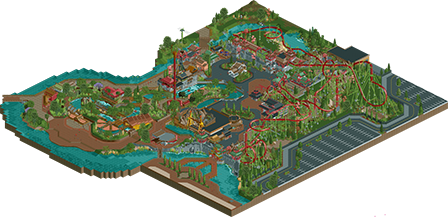


Wish you would of added lamps, bins, and benches. The path felt really dry and dull without them.
You're certainly very skilled, but its just a slight bit too dry and messy for me. Need some smaller details around the park to add to the atmosphere. Signs, maps, etc...
But a very good map, doesn't quite hit the right buttons for me, 70%.
Nice release. Good to see talented people finishing some more serious releases.
One thing, when you add a custom message, have the game paused, and save before unpausing.
It looks good from the overview, haven't looked in game, but it looks like there's some weird choices in the layout. Not necessarily bad, but odd. Like the straight first drop, entry/exit to the cobra roll (why not just in-line with the zero-g? I think the placement would've been nicer), the exit of the MCBR doesn't translate too well into rct, the s-bend after the loop, and the awkward transition in the turn after the batwing. Again, not horrible issues, but just made it a little off for me.
I agree with G Force.
Also the pacing of the coaster is a bit to slow in places and the BBS doesnt work No mcbr, but to trains on the actual track at the same time (Sorry Faas, I´m still jealous)
Otherwise I liked it. The Layout itself was good and the theming too.
Nothing mindblowing but a solid 65-70 for me.
haha this park is classic pizzawurst. very technically good throughout, high level of detail, composure feels a bit weird and can't quite shake the vibe that its copying maybe a bit too much from elsewhere...
anyway loved the layout (mostly). there were a couple awkward turns but it was huge and cool. also quite a high standard of architecture throughout, and some good landscaping and infrastructure to back it up. you definitely let paths get away from you a few times I think- they often felt a bit bare and wide.
good to see you back around here releasing stuff, I enjoyed working with you back in h2h
Lovely layout, i felt it was perfect. Also great queue line theming and interaction, always a big plus.
Great work
Funnily enough, I was just looking at screens from this a couple of days ago, wondering if it would ever get released! A shame it's only a design though, wished it was a bit bigger.
What's there is really, really good. The layout is perfect in my eyes, though I'm not an expert on coasters. I think the pacing is fine, the trains maintain a good speed throughout the entire ride.
The architecture is messy in some places, but in a good sorta way. It feels alive and warm and had sort of this H2H vibe which I liked.
But what let this down for me was what G Force already said: the bare paths really hurt it IMO. It needed more benches, lights, bins, map racks... Just stuff to make it feel real!
Great coaster, worthy of design, great archy, very well done, but a bit unbalanced. It needed more path stuff to match the coaster and buildings. Nonetheless good job and I'm looking forward to see more of your stuff in the future!
Love the layout, felt like it drew plenty of inspiration from real B&M inverts while also adding in some new stuff that wasn't out of the realm of possibilities. My one knock on the layout is I felt the cobra roll was just a touch to slow. The zero-g's were close, but assuming you were going for zero-g-roll's like Banshee's, you were fine as Banshee takes its zero-g pretty slow.
The surroundings, while technically very good, seemed very sterile. Like others have mentioned, the lack of benches and lamps really made the paths feel 'dead', especially with the amount of path that is present in the park.
Overall this is a very solid entry, and I'm sure you'll win design, but just keep what people are saying in mind going forward and you'll see your work improve even more.
Design of the year, hands down. I was blown away.
at first thank you for the postive critic, at least positive for me hehe.
But pls don`t give a f*ck about benches and stuff like that haha, didnt worked for me placing them, or im just a noob
as csw said, "Design of the year"
You gotta point at the height markers of invisible paths to place them. That's something almost everyone here could have told you.
Man those paths were so wide and bland. Nearly killed it for me. Not even just a benches/bins issue, but just wide spanses of brick that literally just filled space. You could've added anything to help out (small stands, foliage/planters, streetmosphere, etc) and it'd have done wonders.
I'd also like to see you strive for more originality. If I wanted to see Busch Gardens Asia's Greatest Hits I'd just have opened that park instead.
Also, can we get someone to make the logo bg transparent? I can do if you let me see the original file, no problem. That white square around it is just awful.
What a great design to get me out of my accolade voting slump! I thought the layout was great, pace was really well done too, and you did a great job on the supports for the coaster, a lot of care and attention to detail.
For the landscaping, it's a beautiful little setting, I really enjoyed the pockets of foliage and great variety, while leaving enough bare patches to not overwhelm the park. And a few splashes of mountainious rock was well placed.
For the archy, this is definitely your stamp, and you did a really nice job of it! There's lots of detail in each building, but each have their own unique identity.
Without going into the negatives of the pathways, I liked the variety and layouts of the paths. You nailed the curvy paths very well, without too much glitching with the objects (though there was a bit too much glitching in other areas). Might be a silly thing to like, but you did a splendid job with that monorail track!
And lastly the supporting rides were really nice. I found the settings of all the rides were really nice, especially the Top Spin and the River Rapids.
Overall, some great work, and shows loads of potential for future parks! Thanks for building and sharing!
Design from me - 70%.
Surroundings were very complex, but at the same time simple, and bland. They were incredibly detailed, and very well done, but lacked all the atmosphere.
It was quality, but it wasn't quality. I don't know how to describe it.
It's like 85+ quality work, but it isn't, its got so much missing that its much more like a 65.
The layout, whilst lovely, in fact, pretty darn incredible, I couldn't help but feel that it was too much like Robbie's from BGA.
I know it's actually quite different, but there were similarities that I felt weren't just coincidence, and that because of this, the layout isn't as incredible. [The turns and positioning of the cobra roll, the helix wrapping around track up into the MCBR, the diagonal after the brake run dipping under a bridge and up into a final zero-g.]
I don't know, I'm a massive fan of your work, but 1) It feels all the same as what you always do. 2) It misses so much out, atmosphere, important details, in favour of high quality and high detailed buildings and 3) There's still an element of a copy-cat work ethic.
Could very well have been one of the best designs at NE, but it falls flat. I consider my vote to be fair, if not slightly inflated by how much effort clearly went in.
Congrats on design! As I said before, I think this is the best design submission of the year....well worth the score.
I wasn't too impressed by this, the only thing that stood out as great to me were the diagonal bridges here and there. The rest was very unrefined/unfinished and/or ripped off from BGA and other things. Coaster was alright, but nothing too amazing. What really hurts this though are the paths.... The textures are very inconcistent, messy and out of place. Empty too. That big expanse of path on the right in the aerial... What's with that!?
Would've voted a very very meager 65%. I think there's just enough quality for a design. Congratulations!
Surprised only dr dirt commented about the strange layout, but okay.
Architecture so good you got a design. You've given me so much and then just taken it all away. I'm looking at this facade by the top spin going "holy shit", then moving to the rapids station and adoring those covers, there's a sweet custom flat ripped straight from BGA but that doesn't mean it isn't fantastically done, a ridiculous station, and then there's literally 5x5 areas of path, just path.
The riverside brick could have easily been cut back about 5 or 6 tiles so at the least the lack of benches/lamps/bins wouldn't have been *as* bad. Instead of putting a "K" on the path, why not make a custom sign? Clearly you have the detailing ability. Even not knowing how to place benches/lamps/bins on invisible path doesn't really excuse the absence, people have been making custom objects to help the limitations of default benches/lamps/bins for ages. Fuck, BGA uses them lol.
The Jagannath comparisons are a little harsh imo, but I can understand where they're coming from. Pizza you have so much talent for detailed architecture, and the rapids show you have original ideas as well! If you can channel some focus away from asia/china and into a theme which hasn't really been done before (Liam made a topic about that didn't he?) then hooooooly shit this site will be frothing over some incredible RCT.
Would have been somewhere between 70-75 for me had I voted.