Park / Expedition Everest
-
 15-October 16
-
 Reddit Contest [Expedition Everest]
- Views 3,988
- Downloads 662
- Fans 2
- Comments 19
-
 68.13%(required: 65%)
 Design

Louis! 75% alex 70% Cocoa 70% Dimi 70% G Force 70% trav 70% bigshootergill 65% Faas 65% ][ntamin22 65% csw 55% 68.13% -
 Description
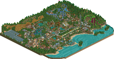
Made for the 2015 December Reddit Contest.
The bench is the same except for the addition of the bamboo shoots object.
NOTE: This is a design submission. Additionally, the latter part of its completion was done in OpenRCT and I'm not sure if it works in vanilla. -
2 fans
 Fans of this park
-
 Full-Size Map
-
 Download Park
662
-
 Objects
1
-
 Tags
Tags
this has been a good month for aussie releases! I should do some rct... been playing too much zelda recently in my free time
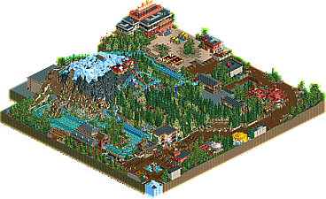
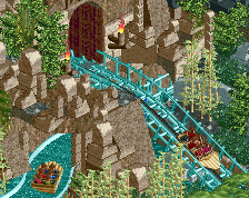
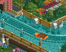
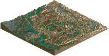
love this! great use of the bench. a lot of really nice archy around. the landscaping was certainly different and I think you should be applauded for it, although I think its not perfect- I reckon it should have been a bit pointier- given it was so steep everywhere, it feels like it has a really long awkward plateau at the top that is distinctly not-everesty. the water coaster was a cool addition to the area though that I think complimented the mine train well. my only other complaint was I think the foliage didn't really feel 'nepalese', it sort of felt like american-with-bamboo; maybe it was the heavy reliance on those dark pine trees that threw it off for me. its more of a general vibe than a specific thing though. anyway good stuff all around, looking forward to seeing some stuff from you on a really modern bench
or LL?
pros:
-Texturally it was all really refreshing, not just the architecture but the foliage and landscaping. All very aesthetically pleasing as well as being unique.
-Similar point to above but I especially loved the way you created the mountain. The use of steep slopes and dithered colour changing was great. I do agree a little with Cocoa about the shape, maybe a clear ‘peak’ would’ve made it look more like a fake theme park mountain.
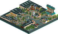
-Tibetan Pizzeria building was beautiful for such a simple form.
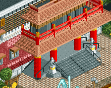
-Great balance of atmospheric theming and realistic detailing. The temple building in particular had a believable bulkiness but with enough facade details to make it appealing. The backstage building built into the back of the mountain was a nice touch too - It reminds you that the mountain uses forced perspective and isn’t as large as it appears.
cons:
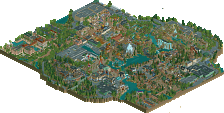
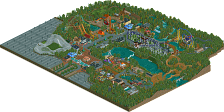
-I wasn’t a huge fan of the overall composition, mainly because the path clung to the map edges and the rides were quite hidden from view.
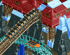
-Mine train layout was kind of underwhelming to me. Maybe it's quite true to real life with these sort of adventure rides but it kind of just meanders through scenery without any particular standout moments. I would’ve preferred one or two more exposed drops or forceful turns. The water coaster was much stronger imo.
70% from me
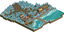
Sorry for the quick review, but I wanted to give you my two cents. I like that you tried something fresh to NE, this design has a unique atmosphere, which you pulled off fairly well considering the bench. Lots of little details, such as the use of different fences, piles of rubble, fountains, entertainers really brought this to life. I found the ride was a touch too slow, but perhaps that's the way it is in real life. I almost liked the Polar Express better than Expedition Everest.
If the bench had of been different, I think the archy could have been better, as well as the mountain itself, I think the mountain objects would have made this even better!
Overall, nice job. 65% from me.
Just wanted to say this is amazing. Love every bit of it.
Hope to be able to write a review soon.
Good luck on the AP vote!
Why doesn't this have more comments? 17 votes and 4 comments? Come on...
Anyway excellent work! The atmosphere here is awesome and I loved the unique ride style / layout and it's interaction.
This entire design was very unique which is great to see and honestly a breath of fresh air. I agree that ot was a bit slow, but it didn't really take away from anything too much. The theming and atmosphere more than made up for it. I love your style and I can't wait to see what you do next.
^ I find commenting as a whole has really deteriorated over the last little bit. I love looking at old parks and reading the reviews and banter among the members, there was just pages and pages of it. The good 'ol days that I was never a part of
I'm unable to open it in vanilla.
It takes about 1.3 minutes to download and look at this with OpenRCT, I don't buy that as an excuse anymore.
Except when it doesn't work in my PC, even after 5 tries or so.
Voted.
I've been sitting on this one since I don't really feel great about giving it Design - the work is definitely 70%+ quality, but the ride we're supposed to be considering the "Design" plays second fiddle to the water coaster in my mind and is pretty blah.
I love all the architectural work, the foliage is great - would have much rather seen this submitted as a Park where it would be a very interesting Silver/Gold argument rather than an awkward Design.
only a 68? that feels a bit undeserved. much better than the score in my opinion.
Great in terms of technical micro details, but overall a but awkward. Would of been nice to take a step back and reevaluate the map at some point early on and give it a bit more directon. I'm just not really sure how to rate it other than its technical skill...
Still a good map and deserving of a 70%, just would like to see a bit more directon.
I voted on this based on the quality of the submission.
I voted on this straight away after I approved it, since then, I've actually forgotten that there was even a coaster besides the Water Coaster.
That to me is a clear problem when it is meant to be a design.
Looking back, I should have voted lower, not because it is of lower quality, but because I, like ][22, feel that it isn't a design. It's a small park.
Should be a Gold, not a design. And I think that is where a lot of the votes stem from, the fact they are voting on a design, but it doesn't feel like one.
Still, surprised I am the high vote and only 75.
Voting lower based on what type of submission is kinda weird imo. Why not just vote on the quality of the content that is there? Also this is not the first design where multiple rides take the "spotlight". Take for example De vliegende Hollander/Python by Liampie, that park also has 2 rollercoasters as the highlight of the park and is still a design with a very high score. IMO, if you look at the content of this park, it deserved a higher score, regardless of the category that it was submitted in.
Something about this submission just didn't quite do it for me. I thought the "Everest" in the middle looked a bit funky, and the foliage in the middle was also suspect...I also didn't think the theme was clear and strong enough (I wouldn't have guessed, based on the buildings, the Himalaya theme). Overall it's a bit of a step back from Jaws, but based on your recent screens, you still have a high quality level for your next projects.
The mountain trick works great, but it's a shame the mountain doesn't have an attractive shape. It looks like a pile of molten plastic. Archy was very hit or miss for me. I found that most of the buildings with tiled roofs didn't work, but I don't know if that's actually related to the tile roofs (just a nice way to group the lesser buildings in my mind ). What did work well were the Tibetan blocky pizza building (damn!), the part of the temple complex with the egyptian brick walls, and the Bazaar. I didn't get the layout of the park, the content was very weirdly distributed and I think the water coaster (great execution of the track and stuff by the way, unparalleled) was too spread out. You should've grouped more of the buildings together to get a central hub with a more urban feel for the area going, seperating the weird base camp tent more. Seperating it from all the actual mountain-related content. The naming also confused me a bit: "Polar Express"?? Might as well have been "Finding Nemo", "Intimidator 1234" or "Interstellar Laser Warriors". You can make a good case for the bazaar, but I don't think it's a great idea to refer to concepts we usually associate with other regions.
This thing is a 65%. Definitely flawed, but there's a lot of good stuff to make up for it. The mountain felt very fresh, the rides were good (dat watercoaster track <3), some great archy, and overall very good parkmaking on the micro level.
Some interesting comments here, I understand the divide between design and park but I guess I just have an idea about what a park is versus what a design is and thought this fitted closer within the latter. The comment about Liampie's design is surprisingly relevant, as I did look at it previously to deciding whether to make this a design or park submission.
Regardless, thanks for the comments. This was originally a simple reddit contest submission, I really wanted to try and do Expedition Everest justice as there haven't been too many attempts and the attempts out there weren't really up to scratch. The limits of the bench made the mountain difficult to build and I can easily see the 'crater' problem mentioned above. The height of everything just didn't quite come together and I found myself wanting to add height around the entire coaster without actually squashing the mountain to keep the feeling of steepness.
I personally think the foliage is a fair representation of the rather forested surroundings of the actual ride, I'm sure it could be better but given the foliage selection of the bench I think it's more than suitable. I don't think the overall park layout is too awful but it's certainly awfully planned, I struggle so much with that...
Some minor points - Polar Express is a semi-recreation of a real ride which I thought would nicely complement the mountain theme and coaster, hence the name. I should have made the actual Expedition Everest layout closer to the real thing and had another turnaround by the Polar Express lift + final drop, that might have helped with the perceived 'excitement' of the ride.
Regardless, it was a good challenge to build with the limitations of the bench and although the landscape could have been better I think it turned out quite unique and interesting given the limitations. Little disappointed with the score, but that's okay. I have exciting new projects on the horizon, and hopefully a full park from me will come out soon, or at least a better planned one haha