Park / Huracan
-
 10-September 16
- Views 4,592
- Downloads 684
- Fans 1
- Comments 23
-
 67.50%(required: 65%)
 Design

Sulakke 75% Cocoa 70% Dimi 70% Liampie 70% Louis! 70% bigshootergill 65% csw 65% Faas 65% G Force 65% Stoksy 65% 67.50% -
 Description
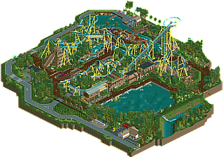
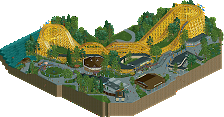
Maya legend states that Huracan was the god of Wind, Storm, and fire, and known further as the Heart of the Sky. Only the bravest souls dare to challenge the power of Huracan's in the parks B&M inverted coaster, with 7 inversions including a massive batwing wrapping through an ancient pyramid.
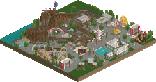
When angered, Huracan has the ability to create great floods. Guests can experience the power of such floods on the river rapids ride "Huaxtec Inundar".
Special thanks to Tim, G Force and Coasterbill for helping me get some things worked out on this. -
1 fan
 Fans of this park
-
 Full-Size Map
-
 Download Park
684
-
 Objects
1
-
 Tags
Tags
![park_3790 [NEDC4 2/15] - Ghoul](https://www.nedesigns.com/uploads/parks/3790/aerialt3443.png)
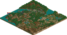
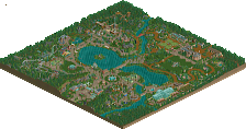
That layout...it's just so perfect.
what is it with these submissions that error trap.
I did the finishing touches of the park in OpenRCT2 so would recommend using it for viewing the park.
Here's a slightly older version which should work with Vanilla and is about 98% of what the release version is. The main difference is the ride huts are still there and some minor incomplete things.
downloads: 375
how long was this project?
Lol... It's been a while. The layout and colors originated probably 5 years ago when I was stealing Robbie92's idea of a Busch Garden's Asia, I wanted an invert in the park and came across Frank Lloyd Wright's Imperial Hotel in Tokyo which I found to be very inspiring (its influence is most notable on the station building) Pace really picked up about 3 years ago when I ditched the BGA idea but recycled some of the work, in this case I dropped the Japan theme and went straight Mayan, fixed the layout a bit, and posted the first screen in Dec 2013.
It was advertised as Kukulkan for a bit but changed that because it had been used a few times in other parks. Huracan is a cooler name/theme anyway
The layout started with the zero-g being the 2nd inversion and the loop being the 3rd, but I made some minor changes after Banshee was announced and put the loop around the Lift. It also started with a cobra roll instead of the giant batwing, but I decided "eh everyone does cobra's so I'll do something different", even if it doesn't look as good it's at least unique.
Thanks for mentioning me in the special thanks. Love you too!
10%
Thanks for the other version of this park. I have had trouble getting open open RCT to work with TTP.
Perhaps a bit sloppy in some areas, the enterprise and coaster supports mostly. However I think this compares well with the two recent B&M Inverts that just won design. This layout and coaster is better than both of those and the surroundings have just as much interesting content and context.
Perhaps a few things I would of re-worked on the layout, mostly the stretch between the zero g-roll and the MCBR. Perhaps the ending corkscrew section is a bit janky, but its nice to see something a bit different and I can't ever complain about high G turns on Inverts as they provide great thrills.
The backstage ares were also great and full of content, the whole maps definitely has a 2012-2013 realism feel. Just as slight touch of awkwardness and odd planning that makes it feel just a bit more believable. Don't know if I can really see this fitting in a bigger park, but that's a super minor strike on the overall great planning here.
Overall, a solid 65% from me. Nice work and good to see this finally finished!
Hopefully your renewed productivity can yield a few more releases in the coming months...
Lovely queue line buddy
pros:
+Generally I loved the coaster layout. It had a great presence in the area. There were 2 places where I thought it lacked flow however; the long shallow slopes before/after the batwing and the corkscrew section.
+ Perfect balance of theming and realistic rawness. I usually don't care for realistic detailing that much but I loved the gas tube, the rapids crane and the forklift.
+ Very good archy around the station and queue. Is this the newest bit you built? The textures are spot on and the use of peach is subtle but brilliant.
cons:
-Path's sometimes a little thin/awkward. I don't like the right angle next to the lake (especially when you use diagonals pretty liberally elsewhere). The bottleneck between the enterprise and stairs isn't good either.
-I wasn't a fan of the coaster colours. The track colour was decent but I think the bright yellow supports didn't complement it and were too distracting. Orange or dark orange might've been a better option.
-The path along the waterfront was a little boring. Some covered seating areas extending over the water could've been good and would break up the straightness. Or you could've widened the path and had a line of tall palm planters running down the middle.
-Some bits of theming had too much dull brown and too much brick. The pyramid in particular would've been improved with some peach colours and different texture. Or perhaps you could've made it more ruined and overgrown.
lol, I thought you released this like a year ago haha. Great to see you finished it though Austin - will check it out soon but looks a likely design.
@Louis 0%
@olldtfan no prob man, glad you got it open.
@G Thanks for the review mate.
@Goliath Thanks, prob the best part ha.
@alex Great review, appreciate that. I know there's a lot of things I could've improved but was pretty burnt out on it sadly. I wanted the supports to look like lightning, hence the yellow, but it is overwhelmingly bright in a lot of places. Im glad to hear you liked the mix of theme and realism, so much blandness amongst realist types and vice versa. I try to skirt that line. And the station/ queue buildings are actually the oldest in the park lol.
@Stoks- Ha it has been at about 90% for a year, h2h last year kinda ruined my flow on it and i forgot to work on it for... a year. Hopefully the score goes better than my last two attempts lol.
Thanks for the reviews all.
Could someone please post a copy of NEMT.datI'm a fucking pleb and managed to delete it from my objdata folder :/
great design! The layout was pretty great- felt like a mix between kumba and montu/alpengeist. Not sure how I feel about the non-interlocking interlocking corkscrew bit at the end though- felt a bit awkward. however the ride was well integrated into the surroundings which were also really clean and nice, with some good queue structures and detailing all round, even backstage bits. I think I would have liked to see some more lush, full foliage in places, so that it wasn't just grass everywhere, particularly around the rapids to make it feel more 'adventurous'- the way it is it sort of has a bit of a boring route around the park. on the whole nice work though- I'd love to see more architecture and structures and stuff in the park, but this is definitely one of your better parks yet.
The queue is definitely great. Nice details and "exploration" feel. I really love how open and spaced out the design is; I immediately think Angkor Wat even tho this has nothing to do with Cabodian civilizations. Possibly future theme from you?
Keep going, liking the burst of activity.
Great layout, design worthy for sure. You're definitely improving, keep up the great work!
Great to finally see this finished! There are a few odd moments in the layout but for the most part it's really solid and I love what you did with the surroundings. This is design worthy for sure.
Neat
grats