- Views 8,028
- Downloads 851
- Fans 3
- Comments 40
-

-
 70.00%(required: 65%)
 Design

Louis! 80% trav 80% Dimi 75% Cocoa 70% Liampie 70% Stoksy 70% Sulakke 70% bigshootergill 65% alex 60% Faas 55% 70.00% -
 Description
An Intamin Mega Coaster design from Six Flags Worlds of Adventure themed to Superman's alter ego Bizarro!
-for optimal viewing, use OpenRCT2 version 0.0.4-0.0.5 -
3 fans
 Fans of this park
-
 Full-Size Map
-
 Download Park
851
-
 Objects
1
-
 Tags
Tags
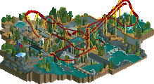
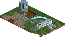
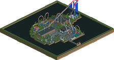
Map Corrected
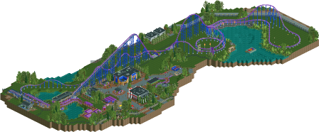
This was lovely, and really nice to see an Intamin Mega again. Layout was nice, although could have been more flowing in certain places, it felt a bit janky, however I get that this is just a problem with the scale of the coaster.
The surroundings were lovely, just as good as Eastwinds, I don't think it is the greatest design in the world, but it's still of high quality. It just felt a bit too clean and perfect, whereas I would've liked to see you go for a more gritty style and really push those unique realistic details that you can't utilise in a full park.
Still, fantastic work again from you, nice little break from full-scale parks too, would be nice to see another design from you before hitting up another full park. Perhaps a certain Batman design could do with finishing
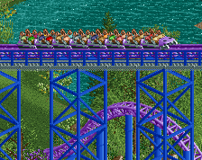
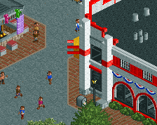
You can definitely see the similarities to the SFNE Bizarro in a lot of great ways. The decorations along the track and their similarity to their real life equivalent really help boost this design. The buildings down on the plaza were really nice and fit right in at a Six Flags Park.
@Louis: The jankyness is kind of necessary for a layout of this type I believe, hard to scale it right without making larger turns and stuff. I wen't for a bit of a macro feel with the layout initially, but its passable at worst from a micro standpoint.
For realistic detailing, cracks in the pavement was something you suggested I think. I tried a few methods but it all felt a bit messy to me, interiors and more backstage details was another thing that could of been added, I've never really been a fan of cutaways in my own work, and most people hate backstage stuff so eh. I'll probably do another design or two before starting another solo project, kind of trying to modify my style a bit so it doesn't feel so repetitive. Although at the same time, not sure if that really possible without building a completely different type of park or using new objects, which I'm not sure I can handle.
@Rattler: Glad you were able to pick up on the similarities. I kind of went for a mix between the SFNE Bizarro and Goliath at Walibi Holland, so good to see people pick up on that.
@Austin: Layout wise, perhaps a bit more opportunity for interaction like the ending to SFNE's ride has would of been nice to add. However a longer layout would be required which makes pacing and scale even more difficult to manage. Eh, some could pull it off but not sure I'd ever be happy with my own attempts. Archy wise, the station is probably the part I like the least, although Intamin Mega stations (outside of SFNE actually) are almost always grey boxes, so its realistic in that sense. Maybe a few more buildings could have been added, and the map expanded, but I didn't really intend for this to be a large map. Kind of more of a throwback to old designs with focus more on the coaster than the stuff around it, and just provide enough content to give the coaster context.
Perhaps another design attempt is on the horizon like I said, but getting a layout I like and starting the map is always the toughest part. So it just depends on what inspiration that might come in the near future.
Great little design here G-Force. I think it's awesome to take a step back to what a design accolade was originally intended to be. Don't get me wrong, some of the designs released in recent years are incredible, some of them are among my favorites pieces of rct art, but with so much detail, many are almost small parks rather than designs. As always, your work is crisp and refined. A design worthy accolade in my books!
yeah, nice little park. I liked the little jokes in it, like the VR mechanics and version1. Clean, likeable, good layout, etc. The buildings were also definitely a step up from WOF I think. Not so new or amazing but a good example of realism.
I didn't really like this.
 .
.
Let me start of by saying that I'm not one of those people that tells you to change the way you build. I perfectly agree with you that as long as you enjoy a certain building style, you should stick to it, just don't expect me to like it
Now let me begin the actual review with the positive points.
+ I liked the Johnny Rockets building.
+ I liked the little jokes spread around the park.
+ The layout wasn't bad, although a bit boring/standard.
Now the negatives:
What really makes a design in my opinion is when the coaster has great interaction. With the peeps/paths, with the architecture or with the landscaping, and preferably all three. This had none of that, the coaster was sealed off from the peeps and that makes that this park is divided in two: the part with the peeps and the part with the coaster. This is what also hurt your World of Fun park in my opinion: every area had the peeps/buildings/paths on one side, and the coaster on the other, no interaction.
What I look for in a submission in general is a strong, cool or original theme/concept (in terms of recent submissions, this is what bigshootergill does perfectly). I really hate the whole generic superhero theming, and you did not do a thing in this design to bring that concept any further, you played it way too safe. Of course you can go with a generic theme that has been done countless times before, but at least do something with it to tilt it to the next level.
The station area and queue did nothing for me, which is a shame cause I also consider that an important part of a design submission. What didn't help was the hideous colours of the coaster/station. I know it's based on a real-life coaster with terrible colours, but it's your own choice to recreate something that has such terrible colours.
I hope that I explained my 55% vote well enough. Keep building, most people seem to like it, and I like your productivity.
I don't really like that definition. I still see design as a way to release an area with only one coaster and if someone wants do do it realistically, it might end up being a coaster without much interaction. Especially out and back layouts often don't have a lot of interaction in real life.
That's why I added 'in my opinion'. I personally think it adds a lot. Of course you can (perfectly) recreate a coaster without interaction, but that means I will end up scoring it lower than if it had interaction, recreation or not.
Furthermore, an out and back style layout that diverts away from the paths can still have cool interaction with foliage/landscape, for example: http://www.nedesigns...k/1907/voyager/
I can see his reasons. Because everything is so seperated and interaction between elements is almost entirely absent, you can argue how much actual 'design' went into this. I think it deserves design. It's technically well done, I like the layout itself, and the square is quite atmospheric. But there's not much that makes this excel beyond the bare requirements for what makes a design (which is technical ability, in my opinion) so I'll probably end up voting 70%. Will have another peek soon.
Wouldn't be a G Force park without controversy haha
Agree with Liam. I think that there needs to be more content for a map to reach the upper echelons of the design category. However, with a strong layout and technical execution there's no doubt this fits perfectly within the 'design' definition.
Would have loved to see some additional skyscraper facades, maybe a tracked supporting ride, and some more controlled mowed grass. The path details are becoming a real strong point for you Russell - both game stalls were awesome!
Nonetheless, layout had a lot of punch and I think you accurately achieved what you wanted to. Classic design 70%
At the end of the day, you are supposed to judge the submission on what the builder built, not on what you wanted. Should I go and give Starpoint 60% because it doesn't have a dark ride? No, because that would be insane.
But if a panelist doesn't appreciate that style of park, they are well within their right to utilise their opinion to score it.
I'm not a massive fan of fantasy, extreme fantasy I find fascinating, which is why I do tend to score that highly, however fantasy like Levis for instance, I dislike, but I'll still vote, cause it's my 'job' to. I'll then vote using my opinion, which is why the score would be lower.
Saying that, I adore realism, which is why I can be pretty critical about it and thus vote low, or fall in love and vote high. It's just the way it goes. I didn't vote 90% and yes on Westwinds because I felt it was what everyone else would think it should be, I voted 70% and no because it was my opinion to do so. In more recent cases, G has addressed the problems I had with Westwinds and thus I now find his work to be very impressive.
Anyhoo, can we just keep to commenting on the submission, as opposed to commenting on the votes/opinions of others?
Not true, no, and yes.
Let's get the reviews in people. Version1, what did you think of this design?
I like it. I guess the problem about realism in RCT is that I can't give a long review. The architecture is good, I like the layout of the coaster and the whole thing really reminds me of Goliath at Walibi Holland, but I guess that was part of G Force's goal. The only problem I have is the sidetrack without roof, but I honestly don't know if that's normal in the US.