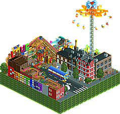
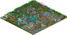
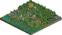
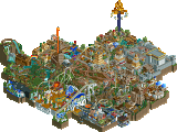
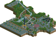
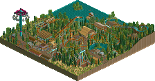
And I think those are 4 fine entries for the finals, and yes, it will be between The Beatles (very funny, very nicely, well and believable executed that theme!) and Rosetta...( great idea, excellent details and a beauty to look at with pleasant coaster, and no spell-checker needed for the texts on the abundance of invisible scrolling signs, )
And yes all 4 parks overly clear do have their strong fingerprints everywhere from their makers, which is a good thing and a proof of quality I think!! (what a disappointment it would have been otherwise....finalists with no own style at all.....)
I am pretty sure which one I am going to vote for.....
Thank you all 4 for sending in such interesting and lovely micro-madnesses for this last round.
I don't know about anyone else, but I find it easy to pick out who did what, based on the styles. I wont say names, however, just becuase their "a secret." That doesn't really affect my desicion though. I cast my vote for The Beatles, not only because I think the band made great music, but becuase unlike Rosetta Sphere (very impresive, BTW), it's a bit nicer to look at. I love the smaller touches, like the bus and the hacked cars, and the buildings were a joy to look at. Each one was different and unique in its own way. Plus, the addition of all the rides and the integration of song themes, really made it the best entry in my eyes.
I would like to congradulate all the others for making it this far. You've made it to the place I hoped to get to, and probably many others, too. For that you should feel exceptionally proud (except maybe Kumba, who had most of his opponents forfeit or get DQ'ed ).
As I said earlier this evening: would be between The Beatles and Rosetta for me. Both great micro-parks...!!
Yes, been too busy last months with other things to have time for creating in RCT, but The Beatles make me jealous on how you did so lively/successfully execute that theme, and then on such a small map!!! ( I'll pick up my Music Masters coming weeks, and I don't do The Beatles - never planned to - but very impressed with what you did there to get that theme alive so convincingly!!!)
Voted Rosetta.
The so elegant executed fantasy (sorry, know you love to be "realistic", but I love your fantasy!! especially as in it's way it's made so "realistic", LoL!!!), combined with the innumerous nice details and balance, nice curling coaster as well as the fact that it kept turning around in my mind from every side/view and stayed so interesting, blew me over no doubt....... Great work!
Wow. Great round and perhaps one of the toughest so far.
It really came down to two parks and I went with the one that captured my interest the longest. Even though my age may show it, I was never a big Beatles fan so I may have missed some of the refs. Having said that, I really enjoyed looking around RS a bit more and therefor got my vote
i voted Beatles, the work in it was small and cute, but extremly detailed and thought through IMO. the names and hints at beatles as well as the glass 'beatles' were brillant. i liked Rosetta but i felt like i had seen it all before. the idea was nice, but there just wasnt enough originality for me. the coaster was really scrunched and hard to follow due to its location. i loved the scrolling signs on the big tower, and as always the peepability. the beatles won for me because of how much it managed to convey in a smaller area.
the other two were great as well, but too much of the same. what i mean is, glass hieghts was too much ride based. we had tons of peepable rides but we didnt have any scenery or background to suggest this was anything more then a carnival. the glass structure was nice, just not enought. for Adrenaline estates it was too much building. there was an OK coaster, but too much archy, you had these two huge buildings with 20 different looking levels and walls and pieces. i think it would have been a ton better if it was alittle more coherent. maybe 3 or 4 really nice looking textures and designs used throughout the two buildings. as is, it was just too much on the eyes and too many different styles
Awesome Micros everyone! congrats on getting this far!
Voted Beatles. It's pretty stylish and does not make an explicit attempt to impress which I can appreciate. I like small classy stuff. As for Rosetta, a good second, but imo just a complete rehash and not very refreshing from 'You know who' (for the the sake of rules I won't say his name ).
Lets say the guys with 21 votes each right now are in different brackets, maybe they should go heads up in a finals match like these things normally work. If I was one of them id be game
Well im gona end this now coz I need to be at a meeting at 5 and I really doubt Ryan will get 3 votes in 45 mins...
The winner... by a final score of 25-22-2-0... the maker of the Rosetta Sphere... is ... ME (Kumba)
Finishing in second with The Beatles is Xcoaster Finishing in third with Adrenaline Estates is Camcorder22 Finishing in Forth with Glass Castle Heights is Ride6
Thanks to everyone for entering.
The next major NE contest will be the Pro Tour 3 which is currently underway and new prelim rounds will be announced soon.
Shit...guess I should have made my crap taller and more extravagent Oh and by the way I have three votes now, so you should change it Kumba since you ended it a bit early.
Well I guess I can talk about the entries now without having to act like I never made one. I loved the ride on Xcoasters, didnt think it could be done but you did it pretty well. There just wasn't much in the way of buildings and such. Looking back at mine, I realized I could have benefited from an extra ride or two. Ride6, I liked the idea of yours with how many rides and references you could fit on the map. Some of the buildings seemed a bit underdone but overall great entry. Kumbas was pretty extraordinary, one of the best if not the best of the contest. You fit a good coaster in there while still having other rides, peeps, etc. I also like how you don't block too much despite having two levels. Although the stone looks like an eyesore from a distance, the sign thing is pretty cool. So great job there, deserves the win.
So although I'm dissapointed with 3rd out of 4, I'm still suprised and satisfied I made it this far out of 64 people. It helped me improve a lot and hopefully you guys will see some larger work from me eventually.
EDIT: Oh shit I thought for sure that ride6 made the beatles entry and xcoaster made the glass house entry. Shows how much I know.
The winner... by a final score of 25-22-2-0... the maker of the Rosetta Sphere... is ... ME (Kumba)
Finishing in second with The Beatles is Xcoaster Finishing in third with Adrenaline Estates is Camcorder22 Finishing in Forth with Glass Castle Heights is Ride6
Wow. I was almost positive Glass Castle Heights was by Cam. Adrenaline Estates looked like something Ride6 would do, although I should've picked up on the multiple levels... It's a shame that Ride6 didn't get any votes.
Well, congrats to everyone, especially Kumba who finished first. (I know you secretly went and deleted your cookies, you cheater! )
WHAT!? Adrenaline Estates looks like something I would do? Since when did I use that many different textures in such a small area. I tend to choose and stick two a primary color or two for my architecture.
I thought it was rather obvious who built what. I didn't vote for myself because I knew my entry wasn't worthy of winning, so I voted for one that I liked and I felt was (The Beatles)...
52 Comments
Kumba Offline
Vote for whatever entry you feel is the best.
Good luck everyone.
Emergo Offline
And I think those are 4 fine entries for the finals, and yes, it will be between The Beatles (very funny, very nicely, well and believable executed that theme!) and Rosetta...( great idea, excellent details and a beauty to look at with pleasant coaster, and no spell-checker needed for the texts on the abundance of invisible scrolling signs, )
And yes all 4 parks overly clear do have their strong fingerprints everywhere from their makers, which is a good thing and a proof of quality I think!! (what a disappointment it would have been otherwise....finalists with no own style at all.....)
I am pretty sure which one I am going to vote for.....
Thank you all 4 for sending in such interesting and lovely micro-madnesses for this last round.
Emergo
Cocoa Offline
I absolutely love the Yellow Submarine in that. Amazing. Plus I love the beatles. And LSD- amazing. Loved it all.
Ride6 Offline
Rosetta Sphere a close second indeed. Glass Castle Heights Third and Adrenaline Estates (in that order) bringing up the rear.
Ride6
FullMetal Offline
I would like to congradulate all the others for making it this far. You've made it to the place I hoped to get to, and probably many others, too. For that you should feel exceptionally proud (except maybe Kumba, who had most of his opponents forfeit or get DQ'ed ).
Edited by Xin, 02 April 2008 - 05:52 PM.
Gwazi Offline
Yeah I can really tell as well.
I'm 100% with Ride6 here. Order and everything.
Comet Offline
Rosetta Sphere>The Beatles>Glass Castle Heights>Adrenaline Estates
Emergo Offline
Both great micro-parks...!!
Yes, been too busy last months with other things to have time for creating in RCT, but The Beatles make me jealous on how you did so lively/successfully execute that theme, and then on such a small map!!! ( I'll pick up my Music Masters coming weeks, and I don't do The Beatles - never planned to - but very impressed with what you did there to get that theme alive so convincingly!!!)
Voted Rosetta.
The so elegant executed fantasy (sorry, know you love to be "realistic", but I love your fantasy!! especially as in it's way it's made so "realistic", LoL!!!), combined with the innumerous nice details and balance, nice curling coaster as well as the fact that it kept turning around in my mind from every side/view and stayed so interesting, blew me over no doubt.......
Great work!
Emergo
RCTNW Offline
It really came down to two parks and I went with the one that captured my interest the longest. Even though my age may show it, I was never a big Beatles fan so I may have missed some of the refs. Having said that, I really enjoyed looking around RS a bit more and therefor got my vote
James - rctnw
catalyst Offline
FK+Coastermind Offline
the other two were great as well, but too much of the same. what i mean is, glass hieghts was too much ride based. we had tons of peepable rides but we didnt have any scenery or background to suggest this was anything more then a carnival. the glass structure was nice, just not enought. for Adrenaline estates it was too much building. there was an OK coaster, but too much archy, you had these two huge buildings with 20 different looking levels and walls and pieces. i think it would have been a ton better if it was alittle more coherent. maybe 3 or 4 really nice looking textures and designs used throughout the two buildings. as is, it was just too much on the eyes and too many different styles
Awesome Micros everyone! congrats on getting this far!
FK
tyandor Offline
Kumba Offline
geewhzz Offline
Levis Offline
will give more comment on all entrys later, I now went with rosetta
Kumba Offline
The winner... by a final score of 25-22-2-0... the maker of the Rosetta Sphere... is ... ME (Kumba)
Finishing in second with The Beatles is Xcoaster
Finishing in third with Adrenaline Estates is Camcorder22
Finishing in Forth with Glass Castle Heights is Ride6
Thanks to everyone for entering.
The next major NE contest will be the Pro Tour 3 which is currently underway and new prelim rounds will be announced soon.
Camcorder22 Offline
Well I guess I can talk about the entries now without having to act like I never made one. I loved the ride on Xcoasters, didnt think it could be done but you did it pretty well. There just wasn't much in the way of buildings and such. Looking back at mine, I realized I could have benefited from an extra ride or two. Ride6, I liked the idea of yours with how many rides and references you could fit on the map. Some of the buildings seemed a bit underdone but overall great entry. Kumbas was pretty extraordinary, one of the best if not the best of the contest. You fit a good coaster in there while still having other rides, peeps, etc. I also like how you don't block too much despite having two levels. Although the stone looks like an eyesore from a distance, the sign thing is pretty cool. So great job there, deserves the win.
So although I'm dissapointed with 3rd out of 4, I'm still suprised and satisfied I made it this far out of 64 people. It helped me improve a lot and hopefully you guys will see some larger work from me eventually.
EDIT: Oh shit I thought for sure that ride6 made the beatles entry and xcoaster made the glass house entry. Shows how much I know.
][ntamin22 Offline
FullMetal Offline
Wow. I was almost positive Glass Castle Heights was by Cam. Adrenaline Estates looked like something Ride6 would do, although I should've picked up on the multiple levels... It's a shame that Ride6 didn't get any votes.
Well, congrats to everyone, especially Kumba who finished first. (I know you secretly went and deleted your cookies, you cheater! )
Ride6 Offline
WHAT!? Adrenaline Estates looks like something I would do? Since when did I use that many different textures in such a small area. I tend to choose and stick two a primary color or two for my architecture.
I thought it was rather obvious who built what. I didn't vote for myself because I knew my entry wasn't worthy of winning, so I voted for one that I liked and I felt was (The Beatles)...
Ride6