Park / Parkmenistan
-
 20-August 16
- Views 3,412
- Downloads 789
- Fans 0
- Comments 7
-

-
 61.88%(required: 60%)
 Silver

trav 75% csw 65% Louis! 65% posix 65% bigshootergill 60% Cocoa 60% Dimi 60% G Force 60% Stoksy 60% Sulakke 60% 61.88% -
 Description
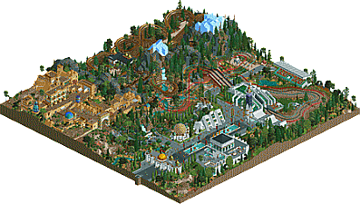
Welcome to the great nation of Parkmenistan, the jewel of Central Eurasia! Grab one of the fast horses and explore the country, from the arid deserts in the South to the steppes and temperate pine forests in the North.
-
 No fans of this park
-
 Full-Size Map
-
 Download Park
789
-
 Objects
1
-
 Tags
Tags
![park_4203 [H2H8/8] Beachcomber Cove](https://www.nedesigns.com/uploads/parks/4203/aerialt3963.png)
![park_4795 [NEFC] The Melting Pot](https://www.nedesigns.com/uploads/parks/4795/aerialt4696.png)
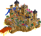
Looking at the list of builders, one would expect this park to be top notch. Well considering the time crunch its understandable why that isn't the case, but its still a very strong park all considering.
To me the only thing that is top-notch is the foliage in the front part of the park, its really good low density foliage, the brown roof pieces really add a lot despite being subtle.
Architecture wise its alright the clash of old and new is a bit jarring, but I guess thats accurate to how the Middle East is... It was perhaps a bit too simplistic for it to really be memorable though. The entrance was quite well done though, perhaps a bit odd just being out in the open. I'd imagine this being a portion of a larger park, perhaps like a world showcase or something along those lines.
Only thing I really wasn't a fan of was the wooden coaster area, the layout was fine. However, the landscaping and foliage really let the area down. Especially the black walled land, just really distracting. The steeplechase was a bold move, and well executed, although the station might be a bit sloppy. However for this to be the primary attraction in the park is a touch underwhelming. A larger main attraction would of probably increased my liking of the park.
So in all, a clever idea, and some nice touches, but just a bit simplistic and rushed for it to really stand out to me. A concept I'd like to see attempted again, but perhaps a larger scale with a bit more variety.
The steeplechases were fantastic! Everything else looked a bit rushed, but overall a nice effort for the final round.
Some of the architecture in this park is very well done. Liam has a knack for making whatever he wants, and does a great job with it. However some buildings were a bit odd/different, but not a major drawback. Always great to see different rides being used, steeplechase was a fun idea. However it may be better suited to a larger park, it almost seemed like it was the centerpiece of this park and didn't carry it like a main attractions should. As was mentioned, it looks a bit rushed, I also wasn't a fan of the black tiled walls in the mountain area.
It's in the mid to low silver range for me.
Parts brilliant, otherwise messy, typical contest format park composition disaster.
heres a brief who-built-what:
Liampie:
-Historic Area
-Wooden coaster and surroundings
-Museum
-Cinema (I like how you blended the bulky white base!)
-Toblerone-esque building
-Wavy roof building
-almost all the foliage
-signs and podium in stadium??
Fisch:
-'buffer area' in the center and mountain pass area.
Faas:
-Entrance gates
me:
-Steeplechase layouts & Station/stadium stands
-brutalist sculpture
-Tower
Congrats on Silver