Park / G Force's Worlds of Fun
-
 17-August 16
- Views 14,439
- Downloads 1,323
- Fans 16
- Comments 55
-

-
 84.38%(required: 80%)
 Spotlight

Louis! 90% yes Stoksy 90% yes Kumba 85% yes posix 85% no Sulakke 85% yes trav 85% yes ][ntamin22 85% yes Cocoa 80% yes Dimi 80% yes Liampie 80% no 84.38% 80.00% -
 Description
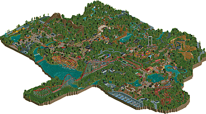
G Force’s Worlds of Fun is a sprawling theme park featuring eight themed areas, and seven roller coasters.
-
16 fans
 Fans of this park
-
 Full-Size Map
-
 Download Park
1,323
-
 Objects
564
-
 Tags
Tags

![park_4705 [NEDC5 - 07/10] Toucan](https://www.nedesigns.com/uploads/parks/4705/aerialt4589.png)
![park_4716 [NEDC5 - 04/10] Beyond the Canopy](https://www.nedesigns.com/uploads/parks/4716/aerialt4587.png)


I wouldn't be surprised if this gets Spotlight.
Would'nt be surprised if it did? I'd be much more surprised if it didnt. Maybe I'm a bit biased since I'm a "guest builder" in the park (I did the majority of the SLC and Arrow looper layouts) but WoF is a big step in the right direction for Gforce and absolutly is worthy of spotlight.
WoF offers far more creativity and originalty than WW had, and that could've been spotlight on it's own. This park has way more character, almost a Watkins Woods esque feeling that you get from the coaster lineup, with no B&M's. The parks layout feels very organic and realistic, and the two entrances is certainly a differnt thing to see actually executed. Each world is well crafted and decently themed, but feels very traditional to the typical american theme park style. Coasters are unique and well done, especcially those two wooden coasters. And, have you seen the scale of the thing? It's freaking massive. This is the best attempt at an organicly grown realistic park NE has seen.
Spotlight.
G Force, my friend, you did it again. Wonderfull, love it!
I adore this. Clear spotlight in my eyes. Will give an in-depth review once I get the chance to properly peruse this.
Based on a quick glance at the overview this is a step down from Westwinds...
...so I suppose I'll have to check it out in-game to see the "clear spotlight" material!
Sweet Arceus, this was fantastic. The real Worlds of Fun is a really underrated park as is, but to be honest, I would much prefer your take on it being the real thing. Even if it is mostly because a ride would still have the interlocking loops. Aside from that, though, I enjoyed practically everything; the layouts were great and the architecture was extremely well put together. Really hope this gets spotlight.
me after downloading and reviewing this park
I think it is sure a step up from Westwinds.
I love you based the park on Worlds of Fun. It's one of the best parks I did on tour in the States in 2013. Underrated as shit, with good coasters, a really nice atmosphere and good theming (for American standards).
You hit the nail, that WoF atmosphere is present in the park and it makes it very realistic. The dense foliage is a plus, I like heavy forested parks and we don't see that too often in rct.
The coasters are great. Patriot and Beowulf are my favorites. Patriot seems so much fun to ride. A bit of a pity you went for a standard Vekoma SLC but the real WoF has also a standard Boomerang, so OK...
I'm glad you chose to do a more themed park. It is still ultra realistic but not with all the standard theming. The Chinese part was the best and however short, I like the area around the log flume too. The Africa part was a bit off for me, felt like the archy wasn't that good and fitting enough.
Overall, this is another great release from you. I hope your next park will be a complete immersive park, something like Disney. With more heavily theming, I think that would be interesting to see from you. For me, this is spotlighty. I give it a 85% (and a yes if I were panellist).
wow.. this park is so easy on the eye. Everything is so warm, clean, colourful and well composed. Well done G Force. I'll hopefully write a full review soon.
Also I agree with Fred that it would be sick to see you do heavy, Disney style theming.. even just for a design or something.
Holy fuck Pac, that GCI is gorgeous <3 (and excellent work on the SLC Austin)
Two things I want though:
1) more multiple storey buildings, might not necessarily reflect the realism that you want but it makes the architecture stand out a lot more. Detailing is on point, but when there's only one floor I'm not as interested.
2) less trees. Maybe this was intentional, and to be fair you did utilise some lovely grass patches, but I personally think that parks shouldn't necessarily be in forests.
Hopefully I can get an actual review up eventually.
Spotlight though. 90%
I think that's an unfair criticism. There are loads of parks built in forests (Holiday Park, Alton Towers, Chessington).
As always I'm too lazy to type, but maybe I will record a video review. All in all, I think this is a clear spotlight. As I told you in the streams, I absolutely love the park. It's an incredible work of art and a step up from Westwinds. But, you don't have a Darkride so I only gave it a 50 in Community voting
Great work Russ. 85/Yes from me.
Fully agree with Fred: "Overall, this is another great release from you. I hope your next park will be a complete immersive park, something like Disney. With more heavily theming, I think that would be interesting to see from you."
Your playing on easy mode with a theme like this. I really hope you'll step up to something more difficult next time. Disney is a great suggestion, Universal/IoA would be nice too. Still, if this is your comfort zone, by all means keep at it.
The coasters really make this park. They are all great, both woodies are truly awesome. The only thing I really didn't like was the rapids ride. It was out of a cookie cutter mold, done well, just no originality. Also that white path sticks out like a sore thumb.
Solid stuff, just I really want to see you mix it up more. Your "little things" details have improved a lot, just want to see you think outside the box more.
Congrats on what I would expect to be an NE Spotlight!
Since WoF is my native park, thank you for this. Very fun for me to go through as I feel like I could pick up on the smaller details that may have been inspired or borrowed from certain parts that aren't necessarily recreations.
Bias aside, I think it's your best work yet.
Sorry I can't give a more in-depth review, may get around to it at some point. Just figured I would let you know this is definitely a creation I connect with a lot.
Glad to see another great release from you – high quality as usual.
Overall, I enjoyed the park. There were some really good parts, and a few quite mediocre ones.
I know you’ve got critique on the dense foliage, but I actually like it, a whole lot to be honest, but damn, there is so much of it everywhere. It sometimes takes focus from everything else. But in the same time it’s quite refreshing, at least to me.
The Northern Europe entrance is beautiful. The theme itself isn’t very convincing maybe, but it’s very well made, and the atmosphere is quite good. The seating area next to the river is brilliant. A few strange colour choices e.g. the bright red umbrellas, but overall a very nice area. The arrow is something special. What a nice layout. Shame it isn’t more visible for the guests.
The Southern Europe area was pretty nice as well. The lighthouse and the jetty with the little boat were all so good. So were the splash boat station, and the queuing area with the monuments. Good job.
Another highlight for me was the GCI. Just like the arrow, the layout is spot on. Once again it’s a bit sad to see these beautiful layouts hidden in the woods, where guests can’t see them.
The kiddie area was pleasant. Nice colours and lots of fun. The helicopter ride and the hopper with its backdrop were really nice. The peach building was very charming too. I mentioned earlier that a few things were quite mediocre to me, and one of them was the car ride. The station building is superb, but the ride itself looks so uninspired. Is there a reason why it’s so steril? Just a small waterfall or a small pond could make a huge difference.
Frontier-Trail (is that what the area is called?) is probably my favourite area. Love the atmosphere here. The buildings are brilliant. The Blacksmith gift shop is so nice. Also, Log Jammer fits perfectly. It’s nice to see that the drop is fully visible for the guests. I do however think you missed an opportunity to make the area a bit livelier. It would’ve been nice to see guests being able to spray water on the Log Jammers, and maybe some props here and there would help. Anyhow, still a very nice area, and probably the most memorable for me.
I guess I agree with Kumba on the rapids ride. It didn’t do much for me either. And just like many other rides in this park, it’s hidden in the woods, on the edge of the map. Wish at least part of it was closer to the civilisation.
The African and Asian areas were neat. I don’t know much about African or Asian architecture but it still looks good, Harmonious colours and a lot to see. Love the bamboo shots used in the Asian area. Just like the other coasters, the Vekoma is pretty much spot on. Layout and support work are excellent. Also the queuing peeps on the station platform are so good.
Lastly, the second entrance area. Probably the area I like the least. It was a bit lifeless, and not really as good as the other areas. What bothers me the most was the carousel building. Did you build it? It doesn’t look like your style to be honest.
I like the first screen better that you posted from this area.
I’m really impressed by your dedication. You’ve built two big parks of very high quality in a very short time. Not a lot of people can do what you do. You should be proud.
It’s been a treat to watch your streams. Hoping to see more of it in the future.
You have a great skill in making an old game like RCT look so clean and beautiful - a quite rare talent in my opinion. I just hope that you are willing to leave your comfort zone in your future work. Not to an extent where you lose yourself, but to where you put your own twist on things. With your dedication, and understanding for the game, plus more identity and uniqueness, I’m sure you’re going to end up with the Legendary Parkmaker status very soon.
Good luck!
holy crap this thing is massive. well, better get into it. I think I'll just stream of consciousness this review, fuck structure.
I think for me it was always going to be hard review because I grew up at the real worlds of fun. So on the one hand I feel its unfair to judge it on the fact that its missing so much of the nostalgia I feel for the real park, but on the other hand you did choose to model and name it after it, so maybe you had it coming, idk. Obviously a lot is personal, and hard to know if you hadn't been there. Things like the long walk to the entrance and the natural scenery/landscape there, the way the log flume is nestled by the entrance, the big 'moment' of the park where mamba has the helix headchoppers. So on the one hand, I'm not sure how much it 'feels' like wof- but thats not to say its not fantastic. onto the park itself I guess.
the layouts were phenomenal, especially the woodies. those were two of the sexiest, most realistic and best landscaped ones I've ever seen. serious kudos to you guys on them (and a fantastic go at an SLC )
)
the park did feel big and sprawling, and I love the difference from the usual cedar fair realistic park. I think the foliage was good, but not perfect- perhaps a bit too overgrown? it tends to be dominated by massive oak and evergreen trees with not so much undergrowth.
I think throughout, rides were down really well, especially tracked ones like the flume, rapids, antique cars (although I would have loved more landscaping here). the flats were a little more forgettable, possibly because you seem to have forgone most custom rides (I understand why though). most of the archy was quite good- especially africa felt like wof to me and the entrances were both nice. I'm not sure how well the italian area fit into the vibe of the park, and I wish the frontier area had more forefront in the park- pretty much half of wof is americana stuff, which is actually decently themed (for america...)
I think composure wise, the best area was probably the european entrance with the arrow looper. quite a stunning area all together. the oriental area also had a good atmosphere to it, and I think its because its possibly the only area where the brick/crazy paving combo really did it justice. It felt sort of odd/clashing everywhere else- I know its sort of lame but I feel tarmac (not concrete) paths would have really fit better in a lot of places, especially near mamba or any of the america/less themed sections.
perhaps overall one issue may have been that it wasn't often quite clear what purpose a building had, unless you made it invisible and saw if it had a stall inside. although I'm definitely a big offender of this, I feel like less themed parks like this would worry more about not building too much excessive stuff, or rather be economical/conservative with buildings.
anyway I've dragged on a bit with this. at the end of the day its a fantastic park, again, despite my small/persnickity criticisms (how do you even do it ). serious kudos on building such a massive park, i'll have to think over my score for a bit.
Eastwinds > Westwinds