Park / G Force's Worlds of Fun
-
 17-August 16
- Views 14,439
- Downloads 1,313
- Fans 16
- Comments 55
-

-
 84.38%(required: 80%)
 Spotlight

Louis! 90% yes Stoksy 90% yes Kumba 85% yes posix 85% no Sulakke 85% yes trav 85% yes ][ntamin22 85% yes Cocoa 80% yes Dimi 80% yes Liampie 80% no 84.38% 80.00% -
 Description
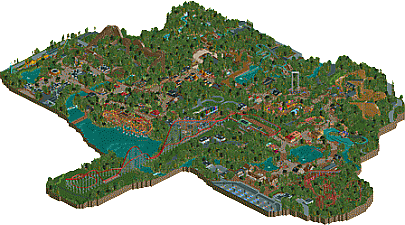
G Force’s Worlds of Fun is a sprawling theme park featuring eight themed areas, and seven roller coasters.
-
16 fans
 Fans of this park
-
 Full-Size Map
-
 Download Park
1,313
-
 Objects
564
-
 Tags
Tags


![park_4716 [NEDC5 - 04/10] Beyond the Canopy](https://www.nedesigns.com/uploads/parks/4716/aerialt4587.png)

![park_4705 [NEDC5 - 07/10] Toucan](https://www.nedesigns.com/uploads/parks/4705/aerialt4589.png)
Congratulations! Everyone cheer!
Wow, Thanks Everyone!
Really didn't expect spotlight when I finished this a few weeks ago, never though it would be as well received as Westwinds.
I'll try to reply to everyone in the near future, thanks for the reviews and all the feedback!
I think the park did some things better than Westwinds, and some things were worse. The layouts were definitely better, mostly Patriot of course. I also liked the Arrow, and the Shuttle Loop and the SLC were well done and good additions in my opinion. The atmosphere too was much improved, especially in theeverything to the right of the hyper in the aerial screen. Another improvement over Westwinds is that there's more differentiation in architecture and things around the park, made it more interesting and less like Starpointe. I liked the flatrides, you make all of them look fun.
What the park did worse was the foliage. It was so dense and consistent it became pretty ineffective as an interesting setting. It made me think of the sandbox parks people new to RCT2 often start with, just a giant grass plain with rides in top. Except for building on grass you're carving out space in a thick foliage soup. With more variation and deliberation it would've actually added something. There were some open areas too but it was so black and white... Either super thick or maximally open. Nothing inbetween. If you had like 40% less trees it would've looked like a forest. I already said I really liked the Arrow, but its surroundings were awful and a huge waste of potential.The foliage mix wasn't great either, all the textures were quite overbearing and not rarely clashing. The tall asian trees often stuck out like a sore thumb, even at the overview they look like dark green acne.
However this is not what held me from giving a yes vote. What held me is that nothing blew my mind, everything was very simplistic. Rides interacting with something other than trees extremely rare. No clever or beautiful compositions and combinations. All just cool, but single rides along a netwerk of identical paths in a sea of obnoxious foliage.
Best area: both European areas for the atmosphere and flow and more open landscape
Worst area: the African area, which was nothing more than Silver quality.
Best ride: Patriot
Worst ride: the car ride? Despite the cool station
You're clearly talented, so I hope to see you be more adventurous with your next park. Surprise us, and surprise yourself.
Congrats!
Congrats! I loved this. Great atmosphere throughout, great layouts (especially the GCI, Arrow and SLC (the subtle banking at the end of the SLC really gave it an extra layer of realism).
Great architecture also, and I don't mind the dense foliage at all. It's nice to see somebody try something a little different for a change.
Great work!
I mean. it did get spotlight. Sooo.... yeah.
@Austin55: Glad you like it... haha Coasters are definitely better this time around, layout wise at least. Really have to thank you and Justin for helping me out with them.
@Robbie: Eagerly awaiting your review!
@Jersey Jimmy: Glad you enjoyed the park! Architecture is probably one of my weak points so I'm glad to hear its approval!
@Fred: Guess that's a +1 for the foliage! The SLC was something I wanted to try from the start, not many people do the standard SLC layout, the last major one I can think of is SFC from 2010. Looking back I wish I would have chosen different colors and not had so much underbrush but overall I'm happy with the result.
@ Alex: Probably won't ever do a heavily themed custom full scale park, just not very familiar with such parks and I don't know if I would make them to a standard that pleases me. Possibly a more themed design or smaller park will come in the future, but at this point I'm not sure I'll make next.
@Stoksy: The height of the architecture is something I tried to base on IRL Worlds of Fun, lots of one story buildings with multi story thrown in, but never more than 2 stories. Perhaps creatively a bit more variety would help, but other than the African area I think the building heights are decent enough. Yes, the trees were intentional, haha, but it seems to be a 100% preference thing when it comes to the foliage. Ehh, in the end I wanted to go for something a bit different, which it seems I accomplished.
@Version1: Looking forward to a possible video review!
@Kumba: I don't know if I'd say its easy mode, compared to Westwinds, this park was much easier to build. Might just be from the added experience, but at least currently I believe that themed architecture is easier to construct. But that's different for each person, just based on experience and style. Doesn't mean I won't be doing a more heavily themed project at some point in the future. Definitely hope to improve my details and become a bit more well-rounded so I might have to tackle something "outside the box" in the future, even if its a smaller scale.
@That Guy: Glad you enjoyed the park! I know its not exactly like IRL WoF, to me it was more about the concept and style than incorporation actual elements from the park outside of a few rides, so I'm happy you still enjoyed it.
@posix: Part of what I like about the park is that it's possible to get lost in, guess this is another preference thing. Some might prefer the layout of the park to walk the viewer though, others might want to be able to get lost in it. I can understand the lack of charm and clinical feeling, my works always been that way so I'll have to work on in the future, possibly on a small scale. Hopefully my next project will appeal a bit more to your tastes!
I'll try to get to more reply's soon! Thanks again everyone for the comments!
@Lagom: Glad you enjoy it! When it comes to coaster visibility for guests, I understand the complaint but at the same time the coasters are visible to the guest, but not up close. The trade off of coasters deep in forest was something I was okay making, it would provide for a more thrilling and mysterious experience in my opinion. Coasters like The Beast are great despite not being very visible from the midway.
The Rapids isn't my best work, I wanted to theme it, but I was never able to come up with something that worked how I wanted. Any attempt I made at Egyptian theming was pretty lackluster, and I didn't have space to import objects. Its kind of resembles real Rapids though, most out on the outskirts of the park and not heavily themed, at least in America.
Actually the Carousel building was probably the first thing I made in the park, its based a bit off of the real Worlds of Fun Carousel, which is a bit out of place itself.
@Cocoa: Like I said earlier, or at least I think I did, the park is more WoF in concept than taking actual elements from the real park. At first I wanted it to resemble WoF much more than it did, but I got sick of looking at street view and found a lot of it hard to translate to RCT.
There might have been a bit to many buildings in some areas, especially Africa. If would go back an re-build this park I'd probably have less buildings overall and put more emphasis on each individual structure. Archy isn't my strongest aspect though so I'll probably never be happy with what I make.
@Steve: I hope that you do! I'd love to hear your thoughts.
@Jappy: Glad you liked the foliage! Like I said, its probably just down to preference, which is fine. The second entrance was meant to be a bit smaller than the main entrance, basically because its the 2nd entrance.
@Jaguar: The surroundings was something I wanted to focus on as much as the object limit allowed me to. Had that not been an issue, the park certainly wouldn't have been shaped so oddly and had much more context. Glad you enjoyed the African area!
@Liam: The foliage was more an attempt to add realism than it was to be optimally aesthetically appealing, which I think I accomplished. I almost asked, or maybe I did... if it was possible to change the color of the dark tree to blend better with the rest of the foliage. Probably is, just never though it was such a huge issue to be worth the effort. When it comes to density, your foliage always seems to be a bit sparse to me, at least when it comes to large trees, so this is probably as different as it can be to yours.
I agree with you a lot on the simplistic feel, it was kind of the point of the park, but definitely could have been executed better than it was. Score wise 80%/no is probably what I'd give this as well, so I don't have any problem with the score or no vote you gave.
Thanks again all!
-Actual correct tracking subtleties, supports, and other small stylistic details on the rollercoasters. So many people for some reason will bicker over buildings and if a river has a source and whatnot, and then make a coaster by such and such a company and mess up the details so much I can't take them seriously haha. You actually get it right in all the things that I thought only I look for. Great job.
-the overall feel of a Midwestern to upper Midwestern park. Lots of trees, (to those who thought it was too much, I respectfully disagree, this is very accurate to various areas of the globe and parks), big open spaces around the car ride, with trees carefully placed around the perimeter to "enclose" the ride without making the borders feel rigid and draw attention. Very natural.
-so many other small details that people who don't live near this kind of park in real life won't appreciate. The layout and atmosphere bring back so many good memories. Yes, I spent my time with family and friends at a themeless cedar fair property. And you know what? We had a blast. And this park reminded me of that in so many ways. Those clamoring for more Disney style building from you just don't get it in my opinion. They are missing the point. I think this is much warmer and more atmospheric than dreamport, zippos, rob, and so many others.
Good job G. Probably my favorite spotlight along with starpointe.
those dark trees kill the overview. its so sad
sudofox Offline
Some of the rides seem to have the wrong name, for example the Bamboozler and nearby rides have names mixed up.
Also ... why is the Patriot a wooden rollercoaster? I just rode it like a week ago, I know it's not a wooden one lol, and it doesn't seem accurate to the Patriot's design, except for the queue line triangle things.
I know this is an old park but I'm still a bit confused about some of this stuff. Sorry if I'm not understanding it, maybe you took some artistic liberties — I did only register on this site to leave this comment, so I'm fairly new.
It's not exactly a WoF recreation per se; the readme says it's inspired by it as well as Busch Gardens Williamsburg. It's sort of G Force's own take on a WoF-style park without directly recreating it.
Also aren't you the Sudomemo guy? Thank you for your service!
Better late than never... Worlds of Fun just received a logo, made by In:Cities, living up to his 'Member of the Year' award from last night!
I really love parks called [member]'s [parkname]. wonder who was the first to do that
Thinking back my direction inspiration for the naming was Harakiri's IOA and Zippo's of course.