Park / Budapleasure
-
 18-July 16
-
 Budapleasure
- Views 31,628
- Downloads 952
- Fans 10
- Comments 19
-

-
 80.00%(required: 70%)
 Gold
Gold

Dimi 85% no G Force 85% no Kumba 85% no bigshootergill 80% no Cocoa 80% no Sulakke 80% no trav 80% no alex 75% no Stoksy 75% no csw 70% no 80.00% 0.00% -
 Description
An old urban themepark that is revived and has been modernising to forget the not-so-spectacular decades in the Soviet sphere of influence. It hasn't caught up with the top theme parks of Western Europe yet, but it's getting there.
-
10 fans
 Fans of this park
-
 Full-Size Map
-
 Download Park
952
-
 Objects
1
-
 Tags
Tags
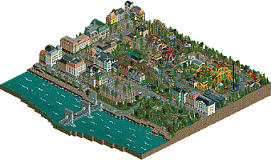
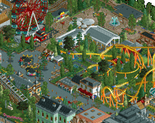
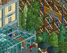
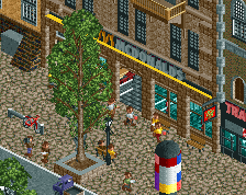
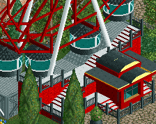
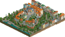
Bummed the "park" stuff is kind of the weakest aspect of the map. Felt a bit scattered in terms of style and focus which was a bit odd to look at but its still quite good. The city stuff is definitely the strongest aspect, probably some of the best RCT in quite a while architecturally. The moving cars really add a lot of atmosphere too, which really pushes the map over the top.
Still a really great piece of RCT and probably a shoe-in for the "best architecture" award had BGA not been released this year. Hope to see more "theme park" work from you in the future, no matter what you come up with it always seems to be your best stuff.
Stunning this is a detail freaks wet dream. The best architecture I have seen in awhile I love the park vibe very much the ride are very good.
Love the "small park in the middle of a city" genre, so naturally, I loved this. The bridge leading into the rest of the map was great, and so was all the old-school architecture. The park was pretty great, too, even if it left me wondering why you didn't just use the Maurer-Sohne Spinning CTR.
Everyone wants to be a "master "
or just be.
Perhaps I called the park " the work of a virtuoso ," and so would have been.
My very like - without a doubt !
This is art. What a beautiful creation. The architecture and atmosphere are unbelievable.
I'll post a review later this week.
Good job with this.
Love the logo too, by the way.
Great park! Obviously the architecture is its strongest point and it was very neat throughout but the custom flatrides were also very enjoyable to look at. I also liked the scenic railway, a type of coaster that just doesn't see enough use in this game.
despite your efforts to convince me otherwise, I reckon it does actually look a lot like budapest, so great work on that
the architecture and details on every building are top-notch. I really loved the whole city-scape, definitely one of the best European cities I've ever seen in rct. You really give each building purpose and character which is great- I especially like the hotel room with escort motion simulator (although at sexpo in sydney they actually did have a giant penis shaped motion simulator so maybe its not so far fetched!)
the actual park was my least favorite part, it seemed a bit inconsistent stylistically and obviously dated in a lot of parts. the modern spinner was quite good though, as was the side-friction and the haunted house. a bunch of the buildings and stalls felt out of place in the more detailed style you built the surroundings in for sure- I think some of the care and attention that made diamond heights feel urban yet still 'magical' was maybe missing here (I get that its a different vibe but in terms of you as a parkmaker). that said it was still quite good and on the whole I thought budapleasure was fantastic, really creative and interesting. always love releases from you! (even if its always the same european buildings again and again, I don't care its still great)
Impressive architecture, but I just see rows of it. It's very inaccessible. I won't vote as I totally can't dive into this.
So, first of all, this is delightful. This is probably the “park” I’ve spent most time looking through, and it’s definitely one of my favourites.
To me, the architecture is mind-blowing. I think some people may forget how hard it really is to make big buildings like this actually look good. And you just didn’t make them look good, but also interesting and inviting. Everything works so well together; colours, textures, and details. Another good thing is the fact that they don’t just look good from one angle, but all angles. Kudos.
I just love the Royal Mozi. The use of vending machines is so cleaver, and the trim texturing is very effective. The same goes with the building next to the vintage wine store. It’s amazing. The peach parts of the facade are so tastefully done. And seriously, the buildings with McDonald’s and Trattoria are just incredible. They look so real. Damn.
It probably sounds like I love everything about this, but I don’t. I don’t love the actual park; the attractions, stalls, station buildings, etc. It’s just doesn’t sync that well with the outskirts. The “style” feels a bit incoherent. From my point of view it doesn’t look like it was built with the same kind of passion. I do however love the wooden coaster - it’s so original. The ferris wheel is neat too, but slightly asymmetric. Turbo Ferás looks aesthetically pleasing, but painful to ride. It appears to run way too fast over the top hat, but I guess it had to, to make a full circuit. Not a big deal to me though.
I really want to mention the big monument with all the statues, and the garden next to it. It’s so good, and I can really picture my self being there. And I think that’s what’s makes all of this so good. When I look at this in game, I just don’t look at it on my monitor, it feels like I’m there. Not a lot of parks give me that experience.
Four words to sum this up: original, believable, inviting and atmospheric.
I’m out.
Good job.
i love this.
It reminds me of a central European city. Not necessarily Budapest but it's close enough i guess.
The only thing that bothers me is that it takes a long time to get back on river level when you're on that hill on the right side of the map. You could have made a small stairwell or even that tram thing that's in Budapest that takes people up the hill.
It also bothers me that the flow of the river is off. Now it looks like it's a sea, which it is not.
My comments are forthcoming, I'm a tad busy the next few weeks, plus this comment adds one more comment to your post
That being said, it would be nice to figure out a way to generate more responses/reviews to people's releases generally speaking. And it would be nice to have less controversy and more positive reviews.
I'm very happy I was a part of this... I wanna see if people can recognise what I did
Enough about me, let's talk about the park! Wondeful thing, and you nailed what you were going for. It really does feel like an old Soviet era amusement park that want's to be taken seriously. The old style wooden coaster with the turnaround loop at the ferris wheel is great, the ferris wheel itself is very nicely done. It looks like one of those cheap rusty, pieces of scrap you'd really find in the Soviet Union. The park was great, and so was the city surrounding it. Lovely details to be discovered, and the architecture was top notch. Love the bike rental, the traffic, the bridge... It felt believable and Central Euorpean, like it should.
Negative points? Yes, there are some. At some points, you can see this is eight years in the making. The entrance was far from the same quality as some of the rest, as were some little rides in the back corner, near the roto drop. Not bad at all, but... aged. Perhaps fitting in this park like that?
Whateber, still a great piece of work, and it certainly was awesome to help!
Integrating the park releases into the front page like they used to be would help. Right now you have to click like 3 times to see the most recent parks, which is a bit to much IMO.
As for the second part, eliminating controversial releases is probably impossible and not a direction I'd like to see. Its good to have stuff that gets people all riled up, otherwise it just gets a bit boring. Kind of like if the local news was just positive stories, people would likely lose interest and stop watching.
^ I just meant often people will say why they don't like a park, rather than what they do like about park. It's good to have both for improvement, but a proper balance is good. People can release whatever they want to release.
Starting from the water side, the bridge is simple, nice construction, but even the little touches of water splashing up against the brick bulwark was just the right amount. I loved the traffic, but especially the attention to detail, like having the vehicles slow down or stop at crosswalks.
It's tough to give critique on each building, since it's the group of them that really creates the atmosphere for this park. While this was started 8 years ago, I don't get an 8 year old vibe, nor do I get a 2016 vibe, but somewhere in between. Some are simpler than others, and others show your more modern construction style. However you created the right feeling, enough variety from building to building to really build the character of a city. Then to pop in little parks, walkways, ponds, fountains. Great stuff!
As for the rides, the ferris wheel is a fresh style. I personally love rides that actually work, but it's well done nonetheless. Obviously an in-game ferris wouldn't have fit in. I love the creativity and fun of Turbo Feras. Overall the other rides fit well with the idea behind the park. Nothing too big, but enough rides to give it a destination worth visiting.
Another quick run through. You gave the park room enough to breathe, and allowed us, as the observer, get a complete view of each building, as sometimes well made buildings are partially hidden between other buildings.
80% from me
What a nice even score!
Congratulations on the gold and on the score! Well deserved and fitting.