Park / PineHills
-
 17-July 16
- Views 6,026
- Downloads 748
- Fans 1
- Comments 34
-
 71.25%(required: 70%)
 Gold
Gold

Kumba 80% Cocoa 75% csw 75% Sulakke 75% alex 70% bigshootergill 70% Stoksy 70% trav 70% G Force 65% posix 65% 71.25% -
 Description
Last but not least,
Just cause I'd like to share my last park, it doesn't really need any descriptions, it is what it is.
:) Enjoy ! -
1 fan
 Fans of this park
-
 Full-Size Map
-
 Download Park
748
-
 Objects
416
-
 Tags
Tags
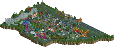
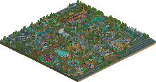
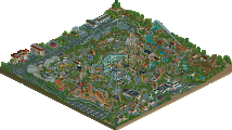
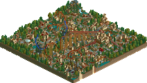
From what I can see so far in-game, this is by far my favourite park of yours. It's really done away with the sterility of your previous parks and is wonderfully colourful, hectic in a realistic way, and just fun and inviting to view. I'll give this a more thorough review once I've gone through it further.
I'm an admitted sucker for realism, but I really liked this. Everything had all the right details in there (like the cobra roll catwalk on the boomerang), Cyclone had a great layout, and the architecture was well done. My only real complaint is that a lot of the ride names were unoriginal (Xtreme, Double Shot, Swiss Enterprise, etc.). Try to open your mind a bit more and really think of something that fits; for example, I like to call log flumes Logsplitter Falls. Other than that, though, nice little park!
Awesome park! Thank you for sharing this!
Agree with rob here, wonderfully colourful is totally accurate! Not at all sterile. Shame this park was a) so small, and b) is apparently your last. Some of the detailing present in your work is incredible!
It's a shame you are leaving when you've finally managed to add some atmosphere to your incredible technique. It still had some peepability problems like your previous parks had as well (no ride ratings, peeps getting stuck), but I forgive you for that. This little park was wonderful and above all the atmosphere was very, very warm for a gijssie park. You finally let loose of that dead tree object and the dull colours. Somehow the cheesy splash boats were my favourite part of the park. Maybe it was just a bit too crammed, the paths could have been wider, but overall the park felt believable.
@Sulakke: You mean the Splash Boats that was 95% copied from Baker Lake?
I feel you've captured the atmosphere in this park that you should have had in your last one. The colors area bit more interesting and the detail level was slightly higher which would have helped quite a bit in some areas.
However, I can't really get into this park. Its a bit to cramped for me, I felt your really nailed the spacing of rides and structures in your other two parks, this one felt like you just wanted to fill every space with something. Some of the buildings felt really out of place, especially the orange one outside of the entrance and a few just inside the entrance. The awning color on the impulse coaster also drove me nuts, but that's a minor issue.
I do somehow still enjoy the park, the wood coaster I especially liked. You've managed to make a very simple layout feel really full and much longer than it actually is, kind of like you did on the brown Wooden coaster in Six Flags. To go along with that your ride design is fantastic yet again, as is your landscaping and inclusion of midway games and such, it really sets your parks apart from a lot of other realistic parks that I feel ignore this aspect. I also loved the little waterpark entrance and seating area, just feels perfectly done and 100% believable for a small Eastern/Midwestern American park.
But its noting amazing, good, but not amazing. Shame its your last park, hopefully you'll change your mind and build something in the future. Gets a 65% for me, a very solid silver.
Liampie edit: added text from second double post below
Note: we should really be able to delete our own posts, I know some members who aren't Admins, can, but it seems this isn't available to everyone for some reason?
This was a fun park that really deserves more attention.
I liked the colourfulness (is that a word?) of this park, which I consider a vast improvement over your last release. But unlike your last release, It needed ore space to breathe. Everything felt way too cramped and pushed together. The small scale, although fitting and well executed didn't really help with this. The coasters are fun though not very original. And I'm not sure if Vekoma has ever made a Boomerang like that, a mirrored one? I only know Boomerangs with the station on the other side...
But I'm nitpicking. That waer ride, although done to death, is one of the best executed I've ever seen. Great colours, and I love those lanterns on the bend. Also, those games and that small, yet cramped kiddie zone was also a great little corner.
Quite a messy review perhaps, but all in all: I really liked it despite some small issues. Good job!
Personally, given the size of the park, I don't mind how it's built a little tighter than normal. It's definitely got that fun factor, tons of atmosphere with something happening almost everywhere in the park.
The simplicity of the rides/coasters seems to fit well for the land size of the park too, nothing being a real "wow" factor for me. As many noted, it's vibrant and colorful, but very tastefully done.
You gave a good amount of attention to the architecture, but you didn't overkill it either. You struck a good balance, very tasteful.
It'll be tight to hit a gold accolade due it's size, because the quality here is easily gold standard. If my vote counted, 70% from me.
Thanks for building and posting on NE over the years bro!
yeah I think you really nailed your style in this one. its colorful, vibrant, realistic, etc. solid work all around. I especially liked the woodie, I thought that was a nice layout. really pretty architecture around, with good surroundings and foliage too. love it.
As always, hardly anyone blends in rides as well as you do. Everything is so accessible. Flat rides become a new experience. Still going for your chaos park layout, but on a smaller, more overlookable scale like this, it works much better.
Thanks for the parks you sent us. You brought a postmodern Euro-hyperrealism to the site back in the day which turned people's heads. Good luck with all future endeavours.
It definitely feels like a mashup of older work, but I think it does come together pretty well. I enjoyed viewing and could imagine this park in any real town.
Wish it was bigger!
wish the panel voted on it before buda.
everybody gets a GOOOLLLLLDDDD!!!!
I like the park, but it was too much like all your other work, and on the small side. I like the wooden coaster though. The other two coasters were as boring as they can get.
60%
Congrats on the gold! I personally felt it was golden.
So far this year, just for the record:
3 spotlights, 9 golds, 3 silvers, 4 bronze, 3 designs
Actually 10 golds if you include Budapleasure and this park!
There were 8 all of last year, not including H2H parks.
Seven all of 2014, 4 in 2013, 5 in 2012 not including H2H6.
I definitively feel that voting standards haven't really increased since I've been around. Kind of feel like compared to any other 20 period, we've been stuck in the mud a bit when it comes to standards for parks. Not so much on the whole scale, but I think people fear giving scores below 65-60 percent a lot more. Just about everything seems to fall into the 65-80% range now.