Park / Clovelly
-
 21-June 16
- Views 4,517
- Downloads 822
- Fans 0
- Comments 16
-
 59.38%(required: 50%)
 Bronze

alex 65% Cocoa 65% Liampie 65% robbie92 65% Dimi 60% Stoksy 60% pierrot 55% Sulakke 55% G Force 50% Louis! 50% 59.38% -
 Description
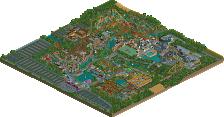
10 years in the making, welcome to Clovelly!
-
 No fans of this park
-
 Full-Size Map
-
 Download Park
822
-
 Objects
1
-
 Tags
Tags
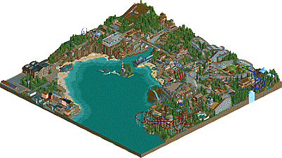
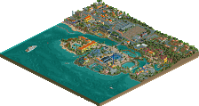
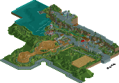
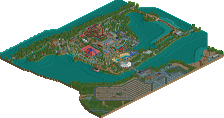
Doesn't seem very wheelchair friendly.
Pleasant with some unfortunate coaster layouts. Borderline silver, loved the aquarium!
The area around the white bridge is pure fun.
Thanks for the comments so far guys.
Sephiroth, that's exactly what I've been trying to achieve with this park. Throughout the 10 years it's been going, it was never a serious thing, it was always alongside my bigger projects.
I'm already past the point of anticipating what/if any accolade this would get and be worth, because to me it's worth so much more than that. It has 10 years of maturity and growing up for me. I'm 23 years old now, so this park first came out when I was 13, which is insane.
One thing I will say to people is please, don't look into it with massive amounts of scrutiny focused on the realism or anything like that...just have fun. Open it up, follow some peeps around, see what the most popular rides are. Maybe even try to better the coasters that are in there! Whatever makes this the most fun viewing experience for you, please do that. Knowing that people have had fun with something that I've spend almost half my life working on is much more rewarding than any award or accolade it could receive.
Seems to be about half 40% work and half 60% work. Some nice stuff but to me some bits felt awkward and unfinished. Cool to see something like this finished though, definitely get to see the improvement over 10 years and how your style has changed.
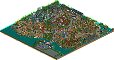
What a fun little setting you created here! You mixed up the landscaping in a lot of spots, despite it being in a bay/oceanside setting - rocky-mountain-like terrain, lush greenery, towering cliffs, the white sandy beach, and even a splash of snow.
As Seph said, you stuck to RCT roots with the coaster choice, I thought it was cool to stick 2 wooden coasters so close together. Layouts were nice and simple with all your coasters, kind of appropriate for this setting. It would have been a nice touch to only keep original rides, rather than adding in a few user-created rides, but still fun.
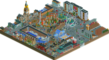
As for the architecture, it's of course old-school style - so great to see a release of this, just loved it! Two particular sections were great. (1) The little Harbor Front section across the water from the rides was very quaint, a nice little get away from the hubbub of the park. (2) This was probably my favorite area, ocean-side of the wild mouse track. I loved the little buildings, the layering of the pathways, the walkway over the water, lovely buildings surrounding by the red, blue, green and yellow lanterns, the cliff and rocky archway, and a great look at the ferris wheel across the water.
Had fun looking around trav, I'm glad you were able to finally release this park!
Maybe I'm getting old. Maybe my eyes don't work as well. But this is becoming my favorite kind of park. Also CSW's Manta Lake. Both of those I can look at and not loose my eyes in overwhelming detail. I'm pretty sure this is the kind of thing posix was talking about in his "Macro Plea" a few years back. I look at Starpointe, BGA, and Westwinds. They're amazing. Fantastic. Wonderful. I love them with all of my heart. But I look at parks like Clovelly, Manta Lake, and some of the older parks (Billerica Bay for example) and it's just.... so nice to look at. So easy to imagine myself there. It's one reason I really love RCTNW's work. It's easy on my eyes. I'm not struggling to figure out what's there. I'm probably getting old, haha. Bless parks like these. I know I'm in the minority but I just can't sing enough praises about this. Kind of like Bolt when it was released. Just the overview is so pleasing to look at. Same goes for SSSammy's recent release with the hyper and wooden coaster. I hope people never stop building like this. Alright. The old man is getting off his soapbox. I rated this 85% and absolutely stand by it. I'll shut up now haha.
Yay for seaside parks! I've never been to Clovelly but this reminded me a little bit of Whitby.
Good:
-Wooden wild mouse on a cliff edge.. Perfect! Imagine going round those hairpins feeling like you're about to be lobbed into the Bristol channel.
-The layering around the harbour/bridge looked great. Same goes for the cliff with the steep steps and funicular
-Aquarium looked suitably outdated and a little bit shit. Very believable. The rest of the street had good storytelling actually.. the fish and chip facade is perfect.
-Lighthouse on the island is tastefully done and has turtle-esque charm
Bad:
-I know this park wasn't intended to be realistic but I would have preferred a little more clarity and storytelling in terms of what the separate parks or attractions were. The fairground area around the wild mouse made sense but the section with the Dark ride and invert was reminiscent of a big park like Blackpool pleasure beach but it lacked some chaos, cramptness and vulgarity.
Alex, you're right with the Whitby reference. I've never been to Clovelly either, I haven't even been to Cornwall, Devon or any of that part of the country, so for my building process I tried to think of other seaside resorts.
The Whitby reference comes in through the way the 'Old Town' exists. The steps up the cliff are also a massive Whitby reference, right down to the fact they're so steep and that they have the flat areas between each set of steps, just like the ones leading up to Whitby Abbey.
The park is supposed to be a more upmarket version of BPB, hence why a lot of the rides are the same, but I didn't feel like having a dirty, gritty style would fit the setting of an old town in the south. I tried to get the fun, busy feeling without all the grit.
Even down to the facade over the water from the park with the Sea Life Centre, which is based on Scarborough/Filey, but with more lively colours to reflect the side of Blackpool and Skegness, etc. The Sea Life Centre is obviously a popular British sea side attraction as well.
As for the small fairground and the lack of a background, I actually have a document with the history written up of the competition between the east side and the west side of Clovelly and how the Fantasy Beach evolved and became bigger than side with the Wild Mouse. I left it out however, as I thought it'd be more fun for people to make their own judgements and stories about how the town has evolved. That's why I instead chose to include the TripAdvisor page, to give the names of each area and show the popularity of each area, but to then leave the blanks for viewers to fill in.
there was a lot of fun bits here. definitely also some underone/bare spots which could have used a touch of work but overall I really enjoyed the vibe and the atmosphere. I think layouts were mostly a bit awkward, as much as I love classic shit I'm not sure they really hit the mark (esp. the vekoma and shwartzkopf) but given the age I think the park is pretty good. nice job finishing this one off!
Yeah, the coasters were all made years ago and I had no real want to update them. For myself, it highlights my progression more leaving them as they are.
Only a few more votes until this gets on the front page and more people see it, 28 downloads is a pretty low number for over a week really!
Interesting.. we seem to have been inspired by a few of the same places!
Areas of the east coast also inspired sections of Luna Park (even though it's mostly emulating coney island) - the crazy golf on the promenade is from Filey and the big hotel on a split level with a Funicular beside it is based off scarborough.. as is the headland.
What are you working on next Trav?
Sorry trav, my 50% vote stopped this from being Silver. Had I voted 55%, it most likely would be.
Lovely charming park, just not the most amazing quality, but still had lots going for it.
So glad to see it finally finished, how about you start finishing up some other stuff too?
I love this. It's more about the buildings/layout in this park than scenery/landscaping. Definitely huge inspiration.
Nice park! I really enjoyed it.

Good atmosphere in general, and especially good in the area with the white bridge. Love the architecture, colours and height differences. The placement of the wild mouse and the ferris wheel is brilliant. Love the wild mouse being so close to the cliff.
Also, the lighthouse is beautiful. It’s simple, but yet so effective.
I also liked Valhalla. The station was great. The “openness” and the fact that you’re able to see the cars, made it a lot more memorable. The part above the waterfall was excellent too.
There were some interesting coaster layouts. I enjoyed to watch the Schwarzkopf, and the wooden coaster circle around the big maze. The “Fancy Bridge” was a nice addition too
Tyrolean on the other hand was nice and all, but the area felt a bit… well unfinished. It looked a bit bare.
The train station was nice though. Looked really good.
Overall it’s a nice park. It’s kind of cool to see a park that has been in the making for 10 years. Good job finishing it.
And by the way, I’m really looking forward to see more of your New Fantasyland park.