Park / Flatliners
-
 14-June 16
- Views 2,194
- Downloads 552
- Fans 0
- Comments 7
-
 51.25%(required: 65%)
 Design Submission

Kumba 80% chorkiel 55% G Force 55% Sulakke 55% trav 55% csw 50% Liampie 50% ][ntamin22 50% alex 40% bigshootergill 35% 51.25% -
 Description
It's been a while since I played any RCT so this was a bit of a practice session that got out of hand.
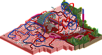
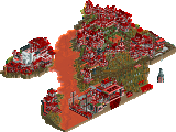
The idea was to build a section of a larger park themed to the inside of the body.
I've had the idea for a while to build a heart with the artery and the veins coming out and criss crossing.
The addition of the skin came later but is a bit of a double edged sword.
The park doesnt look right on grass but the skin is looks kind of featureless.
The addition of the pimples and whiteheads using sweets breaks things up a bit but its not perfect.
The idea of making the station a Defib was CP6's and i love the idea in principle.
But in the long run its something very hard to pull off. A defib paddle is pretty featureless and is tough to make look right.
I must admit in the end i spent several evenings just staring at this trying to think of a way to jazz it up. In the end I'm focusing my attention on The Expedition design which will come soon.
This may not get a design but the idea is sound. Even if in the long run the execution proved to be too tough.
Oh and enjoy the worlds worst RCT custom music file. -
 No fans of this park
-
 Full-Size Map
-
 Download Park
552
-
 Tags
Tags
Sorry Roomie, really not a fan of this. The theming is minimal overall, and most of the theming I had to click on to find out what it was supposed to be. The heart was cool, but that was by far the best thing on the map.
The coasters themselves were okay, but nothing special. If anything, they felt far too spread out.
55% from me.
The heart looks pretty cool but other than that I can't say I enjoyed it that much either. The dinghy skin doesn't look that good and everything else feels a bit random / underthemed.
Also, that dick sculpture brought this down at least 10% for me. We would have understood the name 'jerk-off' without a huge dick next to it.
I like that it's in the same vein of Basics of my Brain, which I heartily enjoyed. I'm afraid that your lack of inspiration bled through a bit, but it was overall a bloody good piece of RCT.
Tried and failed to cram as many blood-related puns as possible. 50%
Yeah as the readme says i quickly lost heart with this and it wasn't going anywhere. I just couldn't do the idea justice and pretty much canned it halfway through. But i thought the piece deserved to be out there if nothing else. It was never going to get design anyway but not releasing it after so much initial work and optimism wasn't really an option.
I'm disappointed with the way it turned out but I just couldnt make it work the way i wanted and ended up just a bit lost and confused.
My LL won't allow me to open anything downloaded from NE, so I can't view this in game. But from the overview it seems you had a very interesting idea but lost interest mid way, just as you said. A shame since this could've been a nice update of some sorts of BoMB.
Sadly I'm without LL too ever since Win10...
The idea behind this was nice and there were some good pieces of theming like the heart sculpture and the capillaries above the path.
The rest of the theming I wasn't a fan of I'm afraid, I think both the skin and the coaster station were oversized and just plain didn't look good.
The duellers were decent, nicely timed interactions and the heart shaped element is cool of course. Probably a tad too stretched out in some places though.
Generally I think you needed to commit to this either being a full on fantasy creation and make it genuinely seem like the inside of a body or go down a more realistic route, remove the field of skin and just have rocks/foliage and some smaller pieces of theming that told the story.